Create free map templates in Excel! Just put your data in, and the editable template will visualize your data automatically!
Our previous article showed a conditional formatting example to create simple state maps in Excel. Data visualization and dashboards are popular subjects, and Excel provides endless possibilities for collecting, organizing, and displaying continuously growing data.
Geographical Excel maps support multipurpose analysis. Today’s example shows a modern and easy-to-use method to quickly create your state maps in Excel with custom shapes and formulas.
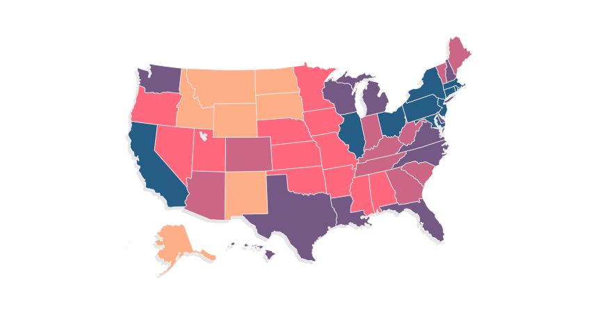
Some programming knowledge is required, but you don’t have to worry about this. We provide maps with the source code in the article. In addition, you can download the free map templates. Take a closer look at the map below! What about Excel 2010 and earlier versions? Fortunately, there are workarounds for the older Excel versions.
Free Excel Maps – Under the hood
The question arises: what is under the hood?
Fortunately, with a bit of modification, you can personalize your map! You can obtain the templates quickly by using the link at the bottom of the page. We recommend you play with the data and try to make the best of it. It is worth starting because you only need a little practice, and success will not fall behind.
Using mapped data for detailed analysis will succeed in a perfect understanding of the details, which is too unspecified without map visualization. In our work, we endeavored to use the utmost resolution vector objects and got a sharp picture even when using arbitrary enlargement.
How to map data in Excel?
In this article, we will go over every single step. We aim for you to create your country’s geographical state map later.
The development of this tool consists of 4 main parts:
- Preparing Shapes in Excel
- Create the Data Table and Textboxes
- Create the Legend and Color Scale
- Write a short VBA code
#1. Preparing Shapes for US State Map
In this example, we’ll create a US state map chart. We’ll import a simple vector map containing all US states for the first step. Their common characteristic is that they are all free-form editable maps, so you don’t have to draw the states manually. Shape-based maps are grouped by default, so we must separate them using the “Ungroup” function.
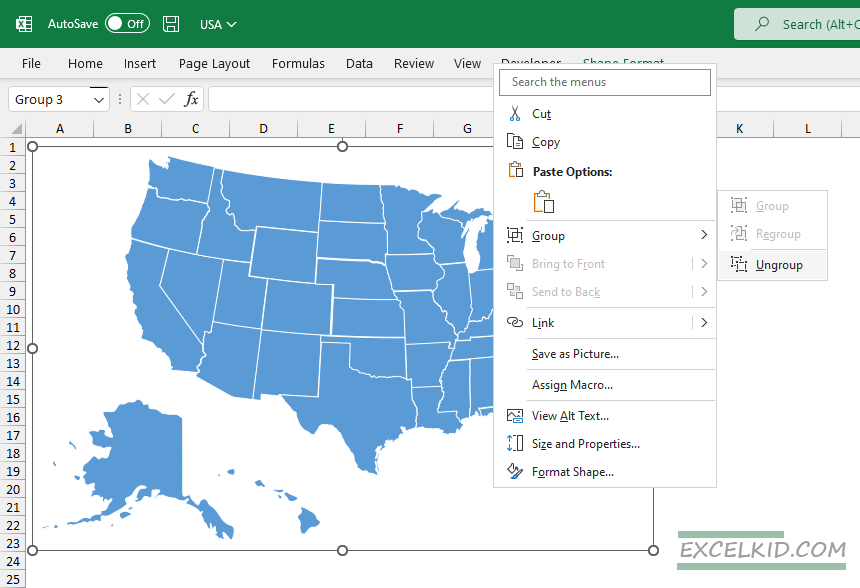
So we’ll be able to color every single state individually. Then, after the ungrouping, we’ll have a map like the one below.
There are other solutions if we want to create specific state maps. For example, with the help of Inkscape (free software), we can create unique shapes. Finally, you can use Excel to make amazing state maps.
Use the following steps: Insert > Shapes > Freeform > Shape.
#2. Create the Data Table and Textboxes
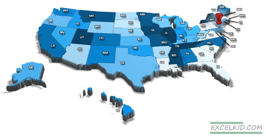
Create a similar database, as you can see in the figure below:
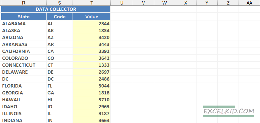
The column “State” contains the names of the states. You can find the codes; these will be important later. Every shape gets a unique name, and by this, we will be able to identify them automatically when making the US state map.
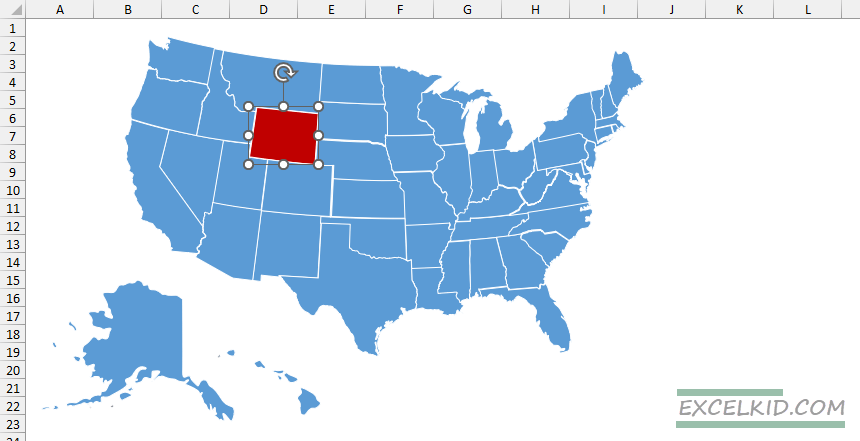
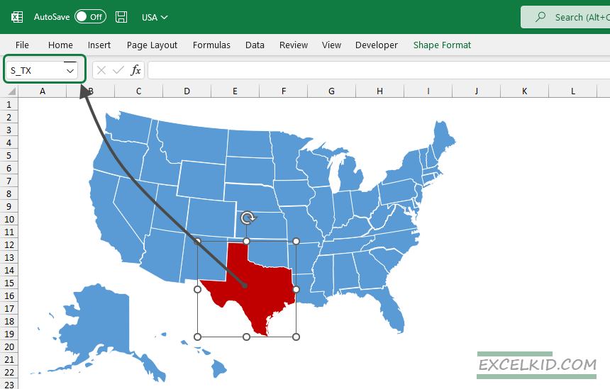
The values by which the VBA decides what color each state will be in the third column. Our next task is to assign to each object the proper identification. First, highlight the shape and use the name box. Next, we should name the highlighted area by the state codes in the data table.
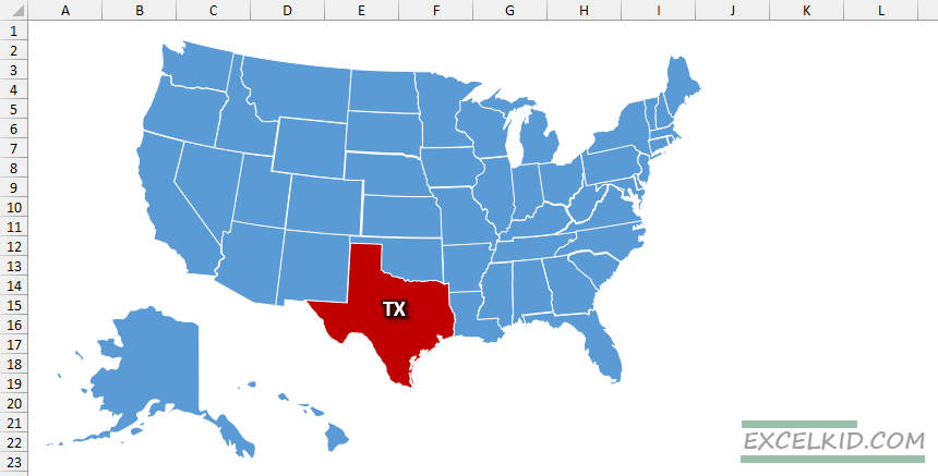
We’ll display the names of the states for a better understanding of everyone. Then, all we have to do is insert a textbox and position it over the state. We should aspire to use the data table’s proper codes for consistency.
The next step is the most time-consuming, but it is worth it because the result will be remarkable. Name all 50 states using the Name box and make the labels using the text box.
#3. Build the Legend and define Color Scales
Let’s define the color scales and values with formulas that our macro will use to update our US state map’s colors and the texts. The data range definition, in this case, is relatively simple. The column “Values” contains the minimum and the maximum values. Next, we will split this range into groups using a statistical formula.
In the example, we’ll divide the interval between the minimum and maximum values into 16 parts for the most detailed visualization. In other words, we’ll be able to create a map chart showing the difference between the values in 16 colors.
Try for the most realistic display! If we worked with only a five-color scale, we would excessively simplify the result, which wouldn’t be the best. With the help of the PERCENTILE formula, we can set between the minimum and maximum values an arbitrary interval:
=ROUND(PERCENTILE(scale_values,0.06),0)The first argument of the PERCENTILE function is the “scale_values” range; we’ll define the lowest and highest values we’ll divide. In our example, the second parameter of the formula means that we create the categories in every 6%, 16 of them.
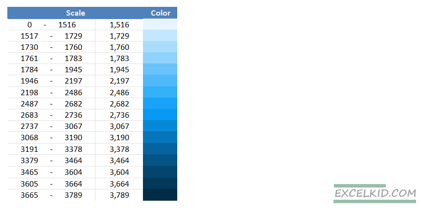
Because 100/16=6,25, we round it up to an integer; this is how we get the 0,06 value, which equals 6%.
We displayed the received intervals; these change dynamically depending on the actual values. The second column shows the given interval’s lowest value. In the third column, we displayed the color of the given range.
How do you automate Excel maps and charts using VBA?
Our data table is ready. Nothing is left to do, only to color and refresh all shapes about all relevant values.
Create a dynamic map template
With three short macros in Excel, we make the state map dynamic. Let’s see the first one! Here, we determine every shape’s characteristics and every state’s attributes in the state map chart. After this, we determine how thick the line should divide the shapes.
Finally, we fill the shapes with color. Then, open the VBA window (Alt+F11) to insert a module and copy/paste the following codes into the module to insert macros.
Sub ColorShape(szShape As String, rgbColor As Long)
    Dim linewidth As Double, transparency As Double
    ActiveSheet.Shapes(szShape).Select
    ActiveSheet.Shapes(szShape).Fill.Solid
    ActiveSheet.Shapes(szShape).Fill.ForeColor.RGB = rgbColor
    ActiveSheet.Shapes(szShape).Fill.transparency = transparency
    ActiveSheet.Shapes(szShape).Fill.Visible = msoTrue
    linewidth = 1
End Sub
Assign the colors to the state shapes
Let us see how the ‘ColorArea’ macro works. First, we store the start points of the intervals in the range named ‘scales.’ Then, with the help of the Next loop, the macro reads all the gaps and the colors assigned to them; this will be drawn out on the Excel map.
Sub ColorArea(areaname As String, dValue As Double)
    Dim i As Integer, rgbColor As Long, wksname As String, wksOptions, scales As Variant
    scales = Range("scales").Value
    For i = UBound(scales) To 1 Step -1
        If (dValue >= scales(i, 1) Or i = 1) Then
            rgbColor = Range("color" & i).Interior.color
            i = -1
        End If
    Next i
    ColorShape "S_" & areaname, rgbColor
End Sub
Map Data in Excel using Shapes
The ‘ColorMap’ will do the dirty work. Two pieces of information can be found in the “data” range: the identifier (area) of the given shape and the actual value (aval). With these, the macro defines the color code of the given state and colors the state map.
Sub ColorMap()
    Dim Data As Variant, i As Integer, area As String, aval As Double
    Data = range ("data").Value
    Sheets("Map").Select
    For i = 1 To UBound(Data)
        area = Data(i, 1)
        aval = Data(i, 2)
        ColorArea area, aval
    Next i
    DoEvents
    For i = 1 To 16
        Range("scale" & i).Interior.color = Range("color" & i).Interior.color
    Next i
End Sub
To start the macro quickly, we’ll insert a command button. (In the Developer tab, go to Insert > Button). If the developer tab is not visible, we must authorize that manually. Display the Developer tab on the ribbon if it is not available.
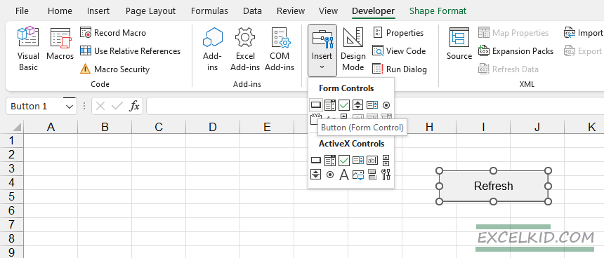
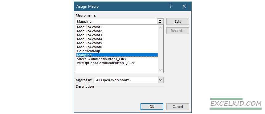
After we insert the button, add a name so everyone can understand its function. Then, finally, assign the code responsible for coloring the state map.
We are all done. You can freely change the values in the data collector table from now on. All we have to do is click the command button on the map sheet. Then, the state map will automatically refresh based on the given settings.
Note: We have created six color schemes so everyone can find the most suitable for them. You can change between them by using the radio buttons.
Best Practices for Creating an Excel Map
Let’s take a look at four rules that are best to keep:
- Always choose simple borderlines. There’s no need to over-complicate it, or the focus will shift from the essence. You should select the color scale very carefully. The goal is not to create a rainbow-colored map. Or to choose a scale that is too contrasting. It is best to use one or a maximum of two colors and shades.
- If you choose to use patterns (we don’t recommend them), you must make them carefully so they are the same on all the map elements.
- If several different patterns are on one map, that could be troublesome. So be frugal with the colors.
- Choose the data range carefully, and build the intervals according to distribution.
Questions and Answers regarding Excel Maps
One of the backsides of conditional formatting is that it can considerably increase the workbook size. We recommend that you make a state map in Excel and prefer the method based on shapes.
Because you get the codes ready, it takes about 30 minutes to create a data visualization using map charts.
Probably not. Virtually, you can display any object using shapes. For example, please review the resource section; we introduce you to a map visualization.
You can also use the source codes freely for private and commercial purposes.
Excel Map – Online or Offline?
The question is not simple. Both solutions – online and offline – have their advantages and disadvantages. In our example, we focused on portable solutions. Sometimes, it can be helpful if we don’t force online connection at all costs.
You can copy the map to your notebook and take it anywhere. Who didn’t face the problem that is the most critical situation, just losing an internet connection? When you use these maps, you will not face such issues.
The base vector map and VBA engine use Excel only, so an Internet connection is not required for mapping data. Our mapping solution makes it easy for all Excel users to create interactive maps, sales presentations, or data visualization. Therefore, it is worth paying attention to these three words: quick, interactive, and efficient.
Download Free Excel Map Templates
In this section below, you can download versatile free Excel maps.
- Australia
- US (4 templates)
- UK
- Canada – Gauge and POI version
- Germany
- Netherlands
- France
- World Heat Map
Final thoughts
As you can see, with the help of maps, we can solve various business and economic problems using data visualization. However, some people think that this procedure only means coloring cells. We hope that applying today’s examples proves this tool is effective.