Excel dashboard is a useful decision-making tool that contains graphs, charts, tables, and other visually enhanced features using KPIs. In addition, dashboards provide interactive form controls, dynamic charts, and widgets to summarize data and show key performance indicators in real-time.
Today’s tutorial is an in-depth guide. We are happy if you read on. But if you are in a hurry, download our templates. You will learn how to create a dashboard in Excel from the ground up. In addition, you’ll get Excel Dashboard tools and a complete dashboard framework.
Above all, it’s time to learn how to build a dynamic, interactive Excel Dashboard step by step.
Table of contents:
- What is an Excel dashboard? Differences from Reports
- How to create an Excel Dashboard
- Best practices for creating visually effective Excel Dashboards
- Excel Dashboards Do’s and Don’ts
- Excel Dashboard Examples
What is an Excel Dashboard? Differences from Reports
It is time to clear up the differences between dashboards and reports.
- The report can be a more pages layout of the task that makes it necessary. In summary, the report comprised background data. Above all, a report is a text or table-based tool. It supports the work of employees within an organization or a company. It seldom contains visual parts. Usually, you share them by regular scheduling (daily, weekly, or monthly).
- Dashboards are the opposite of reports. Its main goal is to display the key performance indicators on one page crucial for making important decisions. It does not show details by default, but you use the drill-down method sometimes. All dashboards should answer a question.
The ideal case is when you have a dashboard showing only the essentials. Reports are yours to get into the details and look behind the scenes. We can decide now on an Excel dashboard while the report supplies the background information.
The biggest mistake you can make is to use reports and dashboards as synonyms! No, they are not at all alike.
Which one should I choose? You can find out from the reports if you want to know where the data comes from. The correctly chosen KPI is easily decidable whether things are on the right course.
We recommend creating and publishing them in pairs if you want to utilize both. Then, whoever wants to see the essence looks at the dashboard, and if one wants to know the source of the data, they can read through the longer reports.
Here is our solution to create advanced charts and widgets. Learn more about the chart add-in.
Before Building an Excel Dashboard: Questions and Guidelines
Before you take a deep dive, wait a moment! Spend time on the planning and researching phase.
Let’s see a few questions to ask yourself before you start building your dashboard.

A dashboard summarizes business events in an easy-to-understand format, and visuals provide real-time results. In addition, it helps us to aggregate and extract the collected values using KPIs. So you will see what you are doing right and where you need to improve.
The operational dashboard shows you what is happening now. Strategic dashboards track KPIs. With the help of analytical dashboards, we can quickly identify trends.
Focus on business goals and use less than 10 KPIs. Show KPIs only that represent values. It’s not the place for less useful metrics; get rid of them.
A co-worker, a manager, or a stakeholder has different information needs. The result must be helpful for all levels. Let us think this through carefully.
How to create an Excel Dashboard?
Before creating a dashboard in Excel, keep in mind your main objective.
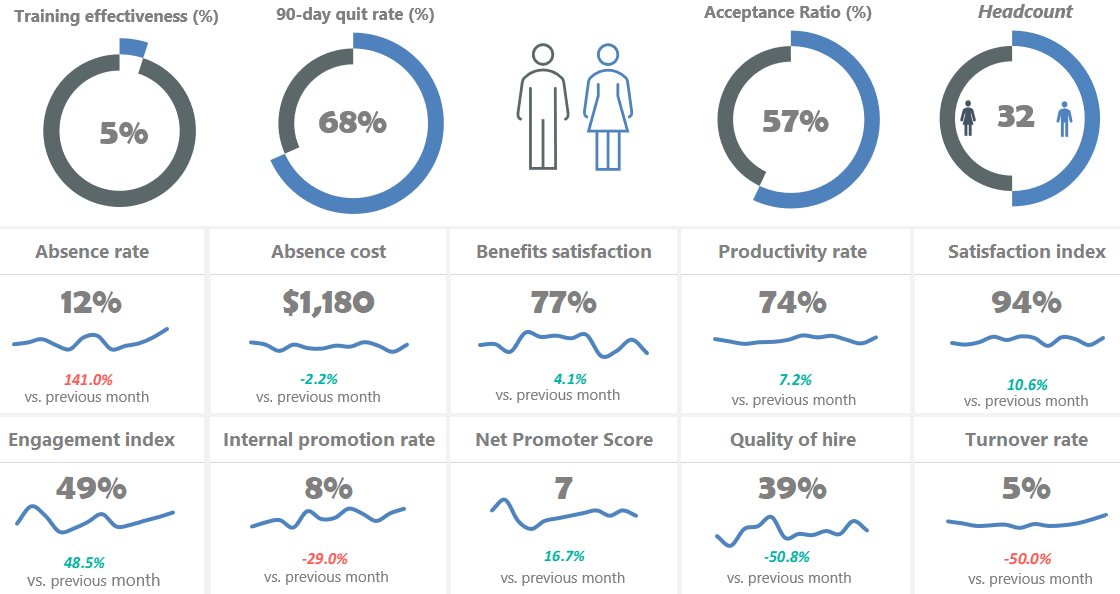
This tutorial will help you create an Excel dashboard to track HR activities. Your goal is to show the monthly data on your main charts. Then, build a scorecard to compare the selected and past months.
The core of every Excel dashboard is a one-page layout. Why? Remember: a CEO isn’t always interested in the details.
#1. Create a layout for your Excel Dashboard
Create a proper draft! You can use paper and pencil, but we prefer Microsoft Excel to create mockups. We have used simple, grouped shapes.
Tip: Let us review the effect of the Excel Dashboard UI mockup. In the figure below, we are showing a layout. First, select the type of grid dashboard layout that you will use. Then, assign a color scheme and font type to the report. Finally, make a wireframe that contains the following style, color codes, and font types. You can prevent most issues using structured data and data tables. Read more about palettes and color combinations.
How can you create a logical workbook structure? What does this mean? Open an Excel workbook and create three sheets.
The parts of the workbook structure: Mostly, you use three worksheets for an Excel dashboard.
- Data: You can store the raw data tables here
- Dashboard Tab: The main dashboard Worksheet
- Calculation: Make the calculations on this Worksheet
Your wireframe and structure are ready. Let’s start creating a dashboard in Excel!
#2. Get your data into Excel
To create an Excel Dashboard, you need to choose data sources. If the data is in Excel, you are lucky and can jump to the next step. If not, you have to use external data sources.
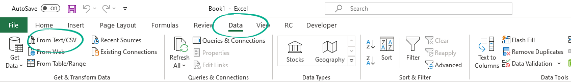
Go to the Data tab and pick one of the import options. It’s easy to import data into an Excel workbook. In the example, you are using a CSV file to create the initial dataset for our dashboard.
#3. Clean Raw Data
Our raw data is in Excel. Now, you can start the data cleansing process. There are many tricks to clean and consolidate data.
- Sort data to see extremes and peaks
- Remove duplicates to avoid errors
- Change the text to lower, upper, or proper case
- Remove leading and trailing spaces
How do we remove leading and trailing spaces from raw data? First, go to the Formula bar and apply the TRIM function. Now copy the formula down. Finally, use data cleansing add-ins to avoid issues and clean your data faster and easier.
Tip: Apply simple sorting in Excel to find errors! Using sorted data, you’ll find the peaks in a range (highest and lowest). Right-click on the first cell and select the ‘Sort Largest to Smallest’ option from the context menu.
#4. Use an Excel Table and Filter Data
You don’t have cleaned input in this phase, but you already have data on a worksheet. What will be the next step?
First, you must check if the required information is in a tabular format. The tabular format means that every data point lives in one cell, for example, the city’s name, address, or phone number. If it is in a tabular format, you should convert it into an Excel table and select the data range.
Choose a table or use the insert table shortcut, Ctrl + T, on the Insert Tab.
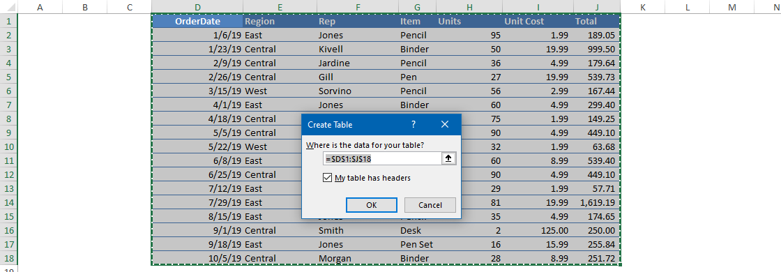
In this case, we don’t have headers. Excel will automatically insert headers into the first row. If you need more data, you can only expand the table and not lose the formulas.
#5. Analyze, Organize, Validate and Audit your Data
You took you through the method that converts raw data into a structure capable of creating a dashboard.
Ask yourself:
- Do you have to display all the data at once?
- Is it necessary to remove some data?
You can use Excel formulas and various methods to help us move forward. However, it would help if you had creativity rather than knowing all the formulas to make a useful dashboard.
So you’ll use these functions and tools to build the Excel Dashboard in Excel: XLOOKUP, IF, SUMIF, COUNTIF, ROW, NAME MANAGER.
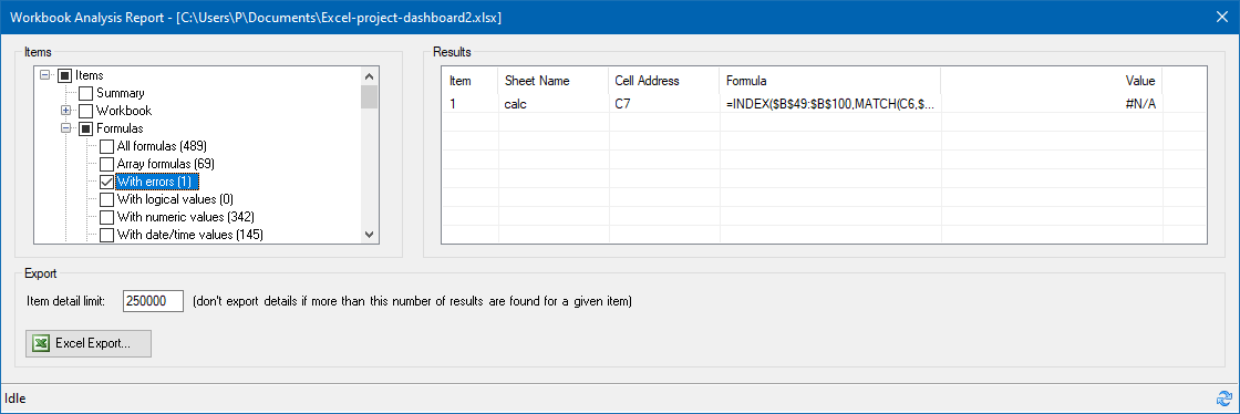
Excel grants great auditing tools to help you find and fix Workbook or Worksheet issues.
Use Microsoft Excel Inquiry to visualize which cells in your Worksheet contribute to a formula error. This step should cut down the time spent on the usual validation procedures.
So, before we start creating a chart, you have to validate the data.
If you want to analyze your data quickly, use the Quick Analysis Tool.
#6. Choose the right chart type for your Excel dashboard
Now you have an organized, cleaned, and error-free data set, it’s time to choose the proper chart.
Data is useless without the ability to visualize it. Strike a balance between a great-looking Excel Dashboard and its function. First, you can choose what graphs are best for different goals.
- Compare Values: Their characteristic is that they merely show high or low values. Recommended types for charting are a Column, Mekko, Bar, Line, Panel Chart, and Bullet chart. Don’t forget to check how the radial bar chart works.
- Composition: How can you display different sales results in different regions? Pie, Stacked Bar, Mekko, Stacked Column, Area, and Waterfall are the most fitting charts. We prefer geographical maps also.
- Analyzing Trends: To analyze the result of a data set in a given period, use the following charts: Line, Dual-Axis Line, and Column charts. Check this example if you want to create a quick forecast in Excel.
- Show the differences between budget and actual values: use variance charts.
- Performance measurement: Use gauge charts to see how far you are from reaching a goal. It displays a single value.
- Sparklines are tiny graphs in a worksheet cell visually representing your data set. Use sparklines to show trends in a series of values. Another helpful thing is that you can highlight maximum and minimum values easily. So, the most significant impact of sparklines is that you can position the chart near its data source.
- Dynamic charts are essential for creating interactive charts to refresh the chart based on user choice.
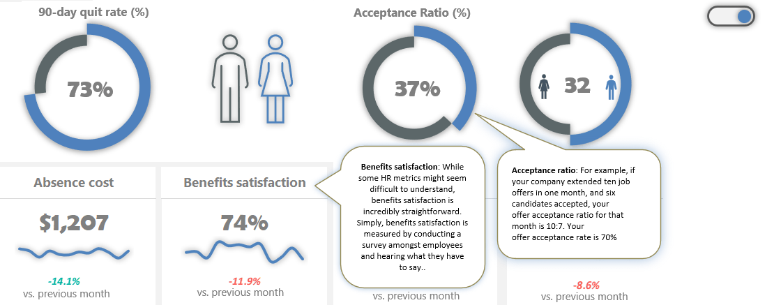
Your goal is to show the % of job seekers who accepted a job offer each month on a chart. In this tutorial, you’ll use custom combination charts using doughnut and progress circle charts to display key performance indicators.
Tip: Just a few words about the pie charts. Pie charts are the most overused graphs in Excel. It’s one of the worst ways to present data. In other words, eliminate the pie charts if you want to create a better dashboard!
#7. Select the data and build your chart
We have cleaned and grouped data in this phase and just picked the chart or graph for the data. It’s time to select the data! As you learned, the combo chart requires two doughnut charts and a simple formula.
Select the ‘Calculation‘ tab (which contains filtered data and calculated fields). Highlight the range of what you want to display. In the example, you use two values to show the Acceptance Ratio.
The actual value comes from the Data tab. After that, then calculate the reminder value using this simple formula. In this case, 75%. Next, select the ‘Calculation’ tab. Cell E23 will show the actual value. The second cell, E24, contains a simple formula and displays the remainder value as 100%.
Make sure that the value in the source cell is in percentage format! Okay, now we select the ‘Actual Value’ and ‘Reminder Value’ data. Next, open the ‘Insert Chart’ dialog to create a custom combo chart to preview and choose different chart types. Furthermore, you can move the data series to the secondary axis.
Select the inserted chart and press Control + C to duplicate the chart.
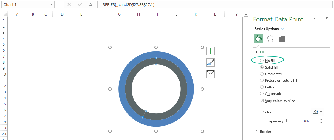
#8. Improve your charts
Now you have a chart that fits your data. It looks great, but you can improve your Excel dashboard to the next level! First, clean up the chart to remove the background, title, and borders from the chart area. Next, select the reminder value section of the outer ring.

Right-click, then choose Format Data Point. Use the ‘No fill’ option. Let’s see the inner ring, select the actual value section, and apply the ‘No fill’ option. Adjust the doughnut hole size if you want. Insert a Text Box and remove the background and border.
Link the actual value to the text box.
To do that, select Text Box. Next, go to the formula bar and press “=.” Next, select the actual value and click enter. Once the Text Box is linked with the actual value, format the text box.
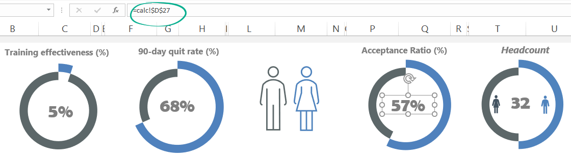
Repeat the process for the other data! For example, a typical Excel dashboard contains various charts to display data. Next, repeat the chart insertion and data validation steps for other essential metrics, like the quit rate.
Keep your source data in the Data tab and do not remove or hide it. If further calculations are necessary, use the Calculation Worksheet. If you want to replace the source data, use the Calculation sheet, not the Data Worksheet.
Tip: If you are uncertain which charts are good for you, don’t hesitate to choose ‘Recommended Charts.‘ In this case, you will get a custom set that Excel thinks will fit best with your data.
#9. Create a Dashboard Scorecard
Your Excel dashboard is almost ready. You need only a few components to create a scorecard:
- Label,
- Actual value,
- Annual trendline,
- Variance (between the selected and the last month)
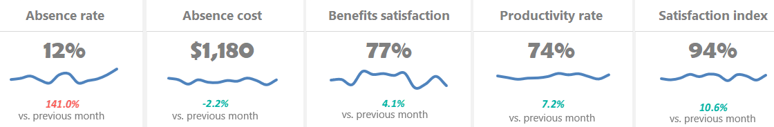
Because you need a little bit more space, merge the cells. Select the cells to place the components and click the ‘Merge cells‘ button. Now, link the label name from the ‘Data’ sheet. If you change the name of the value on the ‘Data’ sheet, the widget label will reflect it. Now link the data from the ‘Data’ sheet to a ‘Dashboard’ sheet.
Go to the formula tab, enter an equal sign, and select the ‘Data’ sheet value. Next, use yearly Data on the ‘Data’ sheet and insert a line chart to create a trendline. To highlight the variance, use a little trick. Go to the ‘Calculation’ sheet and create a helper table.
Create three new conditional formatting rules.
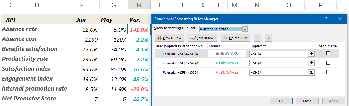
Select the cell which contains variance and copy it. Then, navigate to the ‘Dashboard’ sheet and apply the ‘Paste Special’ option. Next, choose the ‘Paste as linked Picture’ option. Working with linked pictures is easy.
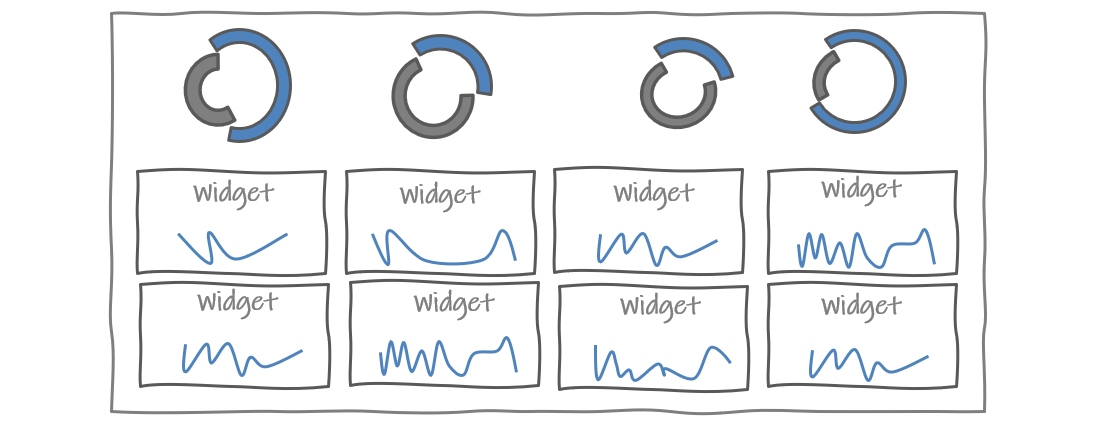
Check the steps in the picture below:

We want to add dynamic text to the main sheet to indicate the changes in key metrics. You link a text to the object inserted into the main Excel dashboard. Then, if you change the value on the source sheet, the target cell will show the refreshed value. What a nice feature! You can apply this trick to textboxes or charts, like sparklines.
Best practices for creating visually effective Excel Dashboards
- A drop-down list is a space-saving solution of great value when you create one-page dashboards. You can use data validation to control the type of data or the values that users type into a cell. To build the list of options is to type them on a worksheet. You can do this method on the sheet with the drop-down menus or a different worksheet.
- Conditional formatting is the right choice to highlight cells based on any condition or rule. But, of course, you can use other methods besides colors. For example, you can achieve splendid results using icons, bars, shapes, color scales, indicators, and ratings.
- Named ranges: You can call selected cells with any given name. First, highlight a range that contains data. Then, in the name box, write the chosen name: ‘sales.’ From this point, you can save time working with cells or ranges.
- Use a scroll bar to save space on your Excel dashboard.
- Data Validation: Restrict what users can write in a single cell. Just imagine that ten users in 10 Excel workbooks write phone numbers. If you do not restrict the format of the phone numbers with the help of data validation when summing up the spreadsheets, there might be mistakes.
- Data Entry using userform and VBA: A manual data input data always carry errors. Instead, use the userform and write a short macro for it. You can create a user-friendly form that is easy to customize. Active report parts like form controls or pivot table slicers suggest playing with the chart.
- Excel Pivot Tables are the most potent weapon in Excel when working with large data sets. It is easy to use with only a few clicks; we can summarize data and drill it into any chosen structure down.
Improve your Excel Dashboard
Here are two great tips for dashboard designers: To create interactive screen tips, visit our guide! Then, by clicking on the toggle button, you can show or hide the text.
Discover how to create a ribbon navigation menu for your Excel dashboard:
A simple interactive settings menu lets you interact with your Worksheets using buttons or icons.
Frequently Asked Questions about Dashboards
- May I use a multi-page Excel dashboard? Yes, in this case, you should create easy navigation. Insert shape-based buttons and links to keep the structure.
- What kind of data connections shall you use? In the planning phase, you must know what tool you’ll use to import data into the dashboard. If you work in Excel, the solution is the Power Query and Power Bl. These tools are great for handling millions of rows in a blink of an eye. However, you can use the ODBC link or SQL DB.
- Are there compatibility issues within the company? IT pros must ensure that everyone uses the same version of Excel. If you build this into the planning phase, you can avoid problems later.
- In what format do you publish the dashboard? Do you send flat Excel tables to the users, or maybe you put the result on SharePoint? Perhaps you need to embed some charts into a PowerPoint slide? You have to review access issues also. Accessibility levels are different for a manager and the owner.
- How often does your Excel dashboard need to be updated? Should you make decisions based on real-time information? Is it enough in the regular daily, weekly, monthly, quarterly, or yearly breakdown? Outline a dashboard structure!
Excel Dashboards Do’s and Don’ts
First, take a look at some of the best practices! Then, there are several ways to boost your Excel dashboard.
You need to know the user’s requirements. Under these conditions, these conditions will only be the dashboard useful.

- How are things going?
- How will you explain to your boss the causes of increased profit?
A well-structured dashboard will give answers to these questions and much more! In addition, it can decrease the timeframe and the costs of development.
- Once you’ve defined the purpose, it’s important to identify which metrics to include. Focus on the metrics which directly align with key business goals and consider the level of detail most appropriate for your audience. This is critical; you may not get it right the first time, so keep it in mind as you build your dashboard.
- Start with users, not the data; try to understand end-users goals. If you can realize this, you will create a most useful dashboard. What is this all mean in practice? Try to understand the user’s scope. Build an Excel dashboard that is not in constant need of updates. So you can cut development costs.
- Don’t flood the user with unwanted information. Instead, you should seek that the dashboard is useful for them. Then, create custom views, filter data, and display the relevant information.
- Provide an overview and allow users to check the details. A well-planned dashboard should be like a quality newspaper. The front page provides a clear overview of the key information and leading news. However, if one wants to look at the data in detail must know where to navigate.
- Use visualization and create a clean dashboard. Charting prospects are endless. That’s where data visualization comes into play.
- Improve Dashboard UI and UX: Build a menu and control your Excel dashboard from the ribbon. Add tooltips to improve user experience.
- Use grids and consistent color schemes.
To-do list if you are using large data tables:
- Freeze Top Row: Keep the first row of the table visible while you scroll down! Use the Freeze Panes feature to keep the information on top — like table headers with column names.
- Enable Horizontal Scroll: Use this function if you have large data sets and have the main data in the first column. Go to the View Tab and choose the ‘Freeze first column.’
- Apply row styles: Frequently, we lose focus when browsing large tables. Use table-style formatting to keep our eyes on the main content.
- Use the GROUP and UNGROUP functions to drill down into details.
Common Pitfalls with Excel Dashboards
Now let’s see the most common mistakes.
- Using too many colors: I don’t tell you often enough about the importance of colors. Do you know the game “Where is Waldo?” It’s an excellent game for kids! But please don’t follow this method to create a stunning dashboard. Try to minimize the number of applied colors and use flat color schemes. Keep the visual content as simple as possible.
- You are cluttering the screen with a useless design: What do you want to see? A clean dashboard or a traffic jam? Get rid of borders and frames!
- You are using pie charts. Remember that nothing stands out when all charts are in the spotlight. All the data displayed on a dashboard is important, but not all are equally important.
Excel Dashboard Templates
You can create various types of dashboards for all purposes. So save your time and use these Excel dashboard examples.
Above all, let’s take a look at the most used dashboard types in Excel:
Human Resource Excel Dashboard
Measure the company’s activities using an HR Dashboard: set metrics that show whether given goals have been met, like turnover, recruiting, and retention. You can check all activities using a one-page dashboard.
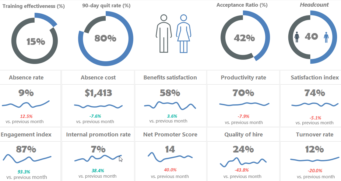
Read more and download the practice file.
Social media Excel dashboard
Using a social dashboard, get a quick overview of your social media channel’s performance. You can include metrics like unique views, Engagement, Watch Time, and Subscribers. It’s easy to control your strategy using real-time analytics.
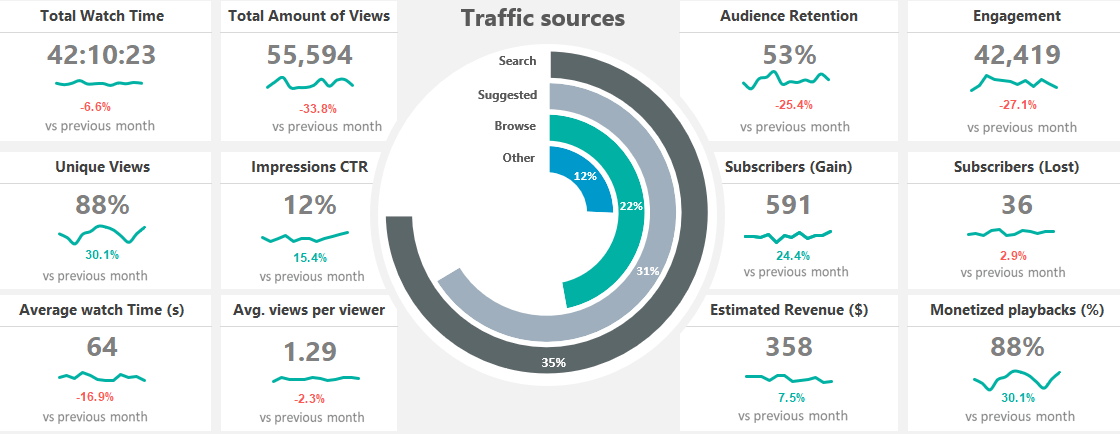
You need only a few steps to use this dashboard. First, pull your data to the Data Worksheet and select or insert your key metrics. After that, change the formatting rules on the Calc Worksheet if you want. Finally, select the given month from a list. Learn more about it and download the practice file.
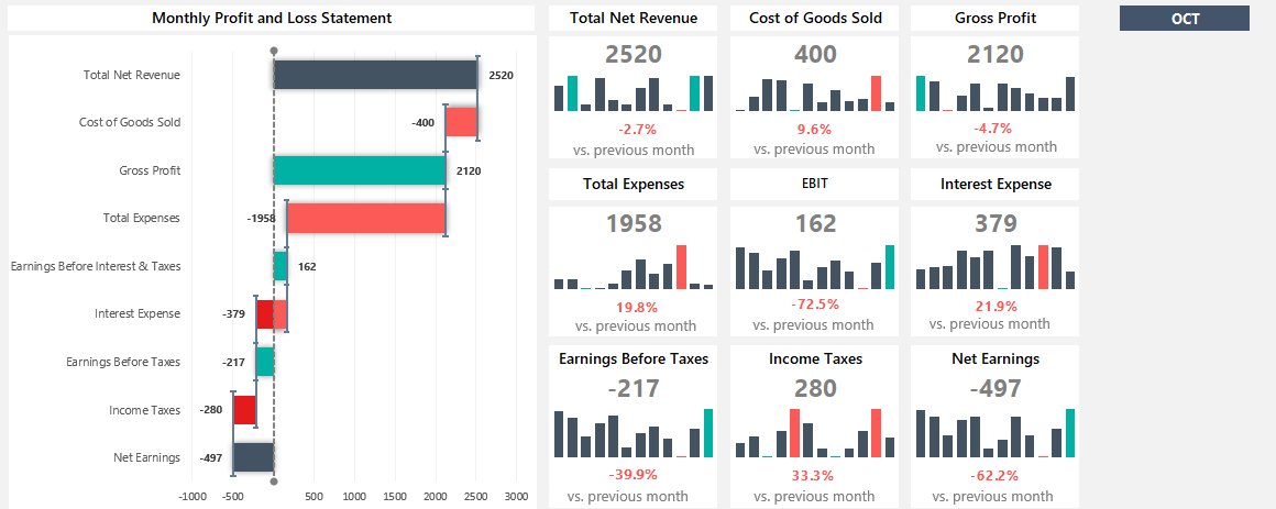
Financial Dashboard (Profit and Loss)
In financial modeling, keep your eyes on the most vital metrics! First, create a sketch. After that, pull the data from different data sources. Finally, build a great Excel dashboard to view data on a single Worksheet. It is easy to use and tells the data-driven story of a company based on the update of a drop-down list.
Traffic Light Dashboard
Please take a closer look at our free Excel Dashboard Widgets! We have an excellent toolkit for managing multiple projects on a single screen. First, enable the Developer tab and install the add-in. After that, you can create advanced dashboard elements in seconds! Furthermore, we revised our stoplight template, which uses sparklines and conditional formatting.
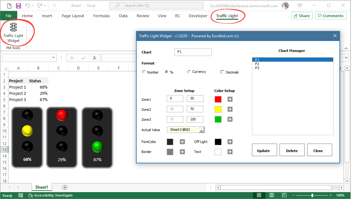
Learn more about traffic lights!
Sales tracking dashboard
Turn activities into actionable and easily editable reports to refine your sales process. For example, the sales tracking dashboard reviews sales activities to spot trends during an exact time frame. In addition, you can compare actual versus targeted results. The dashboard uses a sales funnel chart.
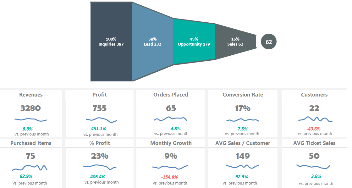
Are you tired of boring graphs in Excel? Learn the basics about the sales funnel and download the free spreadsheet!
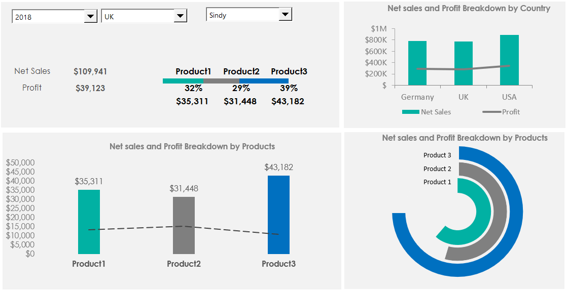
Product Metrics Dashboard
Track sales revenue with a product metrics dashboard. This spreadsheet offers a clean layout for viewing metrics on multiple products. Show the key metrics, like Net sales and Profit Breakdown by Country, or use them for creating reports for shareholders.
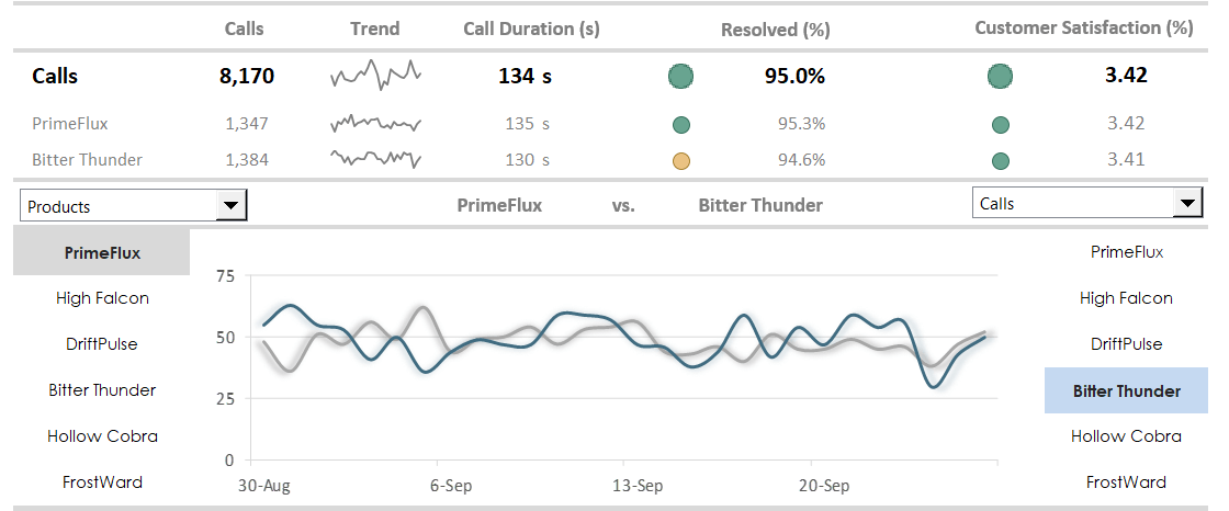
Customer Service Dashboard
This Excel dashboard will cover the main business questions we expect to find in the call center activity. First, measure the agent’s efficiency against our KPIs! Moreover, you will track the following metrics: calls, trends, call duration, and resolved calls. Last but not least, you’ll get feedback about customer satisfaction. You can read more about call center measurements here.
Business intelligence dashboard: BI dashboards help track core performance metrics in real-time. You can use PowerBI and Microsoft Excel for this purpose!
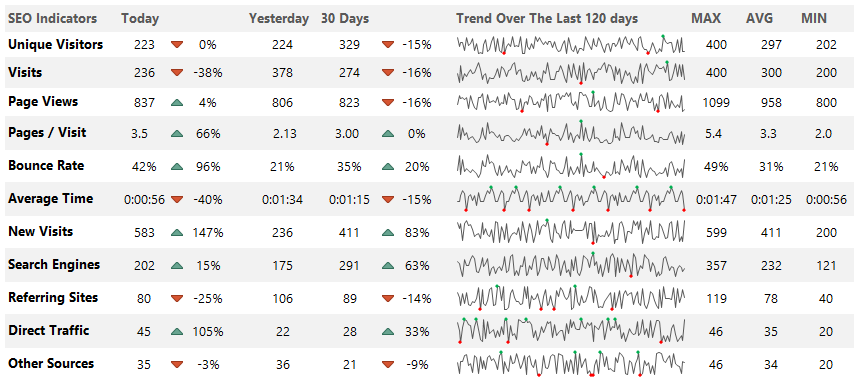
Web Analytics Dashboard
The web analytics dashboard tracks your site performance in real-time. First, define your key metrics like unique visitors, visits, page views, bounce rate, or average time on site. Then, compare the traffic by sources and track the referring sites, direct traffic, and other sources. Finally, discover the trend using sparklines! This Excel dashboard shows a summary based on 120 days.
Wrapping things up:
Everyone wants an Excel Dashboard! The truth is that creating a dashboard in Excel is more than these 10 steps. If you feel comfortable with the basics of Microsoft Excel Dashboards, you can start storytelling using your data.
In conclusion:
- Use clearly defined goals.
- Learn all about Excel formulas.
- Build custom charts and be a power user.
This guide gives you a lot of stuff you can do on your dashboards. Go step by step, and success will follow. We hope that you enjoyed our article! Good luck, and stay tuned.
Each interactive Excel dashboard is compatible with Excel 2010, Excel 2013, Excel 2016, Excel 2019, and Microsoft 365.
Additional resources and downloads: