
Excel Product Metrics Dashboard provides an overview of the sales team’s performance and supports business decisions.
Do you want to get spectacular results quickly while using Excel Dashboard Template? You are at the right place. After some simple steps, you can make a report like this too.
We have talked many times about the key performance indicator’s definition, but revising the subject many times is always good.
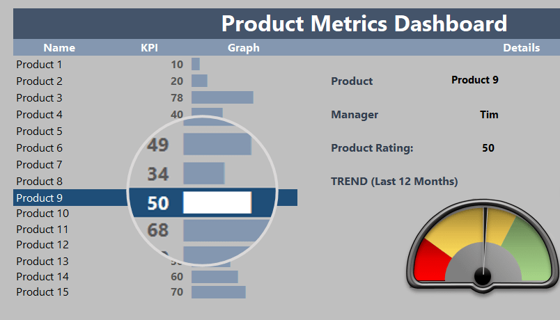
Today we’ll show you how to create a product metrics dashboard in Excel. Then, we’ll apply user-friendly interface and gauge charts. Finally, to visualize results and marketing trends of 15 products interactively using many-many widgets. The focus and the center of the analysis will be the product. Using a dynamic list, we will display all related information as far as possible.
Let’s see the parts of the product metrics dashboard!
Product Metrics Dashboard – Using the REPT formula
The REPT function in Excel is a Swiss knife. In the example below, let us see how the REPT formula works.
The first parameter means the character that we will repeat. You can use text, numbers, or even a special character.
The second parameter will show how many times we will have the character in one cell: this is the main argument of the function.
If you use a symbol as the first argument of the REPT function, you can create a mini-chart! For example, the REPT (“X”,5) formula is XXXXX, five times the X character. Then, using the “ALT+219” combination, we display the black square symbol, and by writing it in one cell, we get the diagram shown in the picture.
When no such tools as sparklines existed, they made diagrammatic representations in Excel. The chart in the column Graph is based on this Formula.
To highlight the selected product, we use conditional formatting. It is worth using this method to build similar templates.
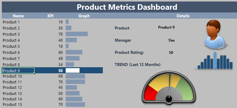
Using linked pictures and a speedometer
One of the most exciting parts of the product metrics dashboard is the interactive window on the right-hand side.
We have found out that we will indicate the attributes of that product for every chosen product in a bit of an info panel. Name, manager, and customer satisfaction are on a scale from 0 to 100. In addition, sparklines will put the information of the last 12 months under the picture.
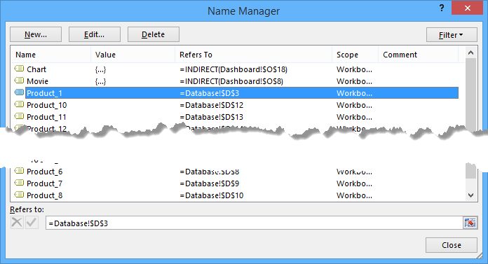
The ‘database’ worksheet contains all the information we display on the main screen.
Use the named ranges to display the correct data on the dashboard worksheet.
We can assign the photographs on the Database worksheet with unique names using the Formula and then the Name Manager dialog box.
It is worth learning the use of the NamedRange function because we often need it! It is the fastest method to name a cell, range, or array for meaningful names for everyone.
Download the practice file.
Additional resources: