Today’s presentation, the Quick KPI Chart, will help you if the phrase key performance indicator is not new to you.
Small, Simple, Smart, and Quick are the words that first come to mind when we think about an excel dashboard.
Many people or even excel gurus think creating an excel dashboard is a complicated workflow. Fortunately, there are situations when we don’t have to struggle to make something spectacular.
We’ll introduce such a little trick in today’s article.
We hope that after you have reached the end of the article and tried the excel template again, take a big step toward getting to know the possibilities of Excel. As you will see, there are no limits!
Quick KPI Chart – In motion
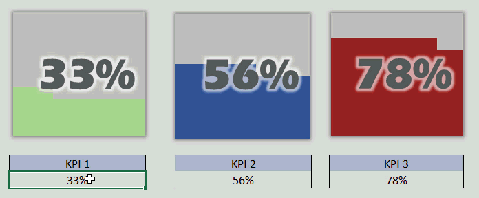
We’ll show you how cool this solution is. Then, take a closer look at this little animation! Only one number needed to be changed, and the chart became dynamic.
Quick KPI Chart – How does it work?
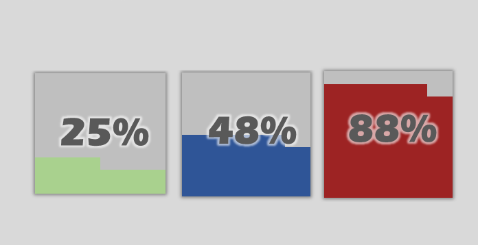
The picture below shows three cells (KPI1, KPI2, and KPI3) where you can change the actual value.
It is important to note that every single chart contains 10×10 small squares. We have formatted them not to show the grid. Set the first KPI to 25%, and let’s see what will happen after this!
To create a quick kpi chart, write the formula on the left-hand side table to check how the given number can be (25) designed for the chart. In this example, the value of the ‘Horizontal Lines’ is ten, so it colors the first line of the mini chart (that is, the 10×10 squares).
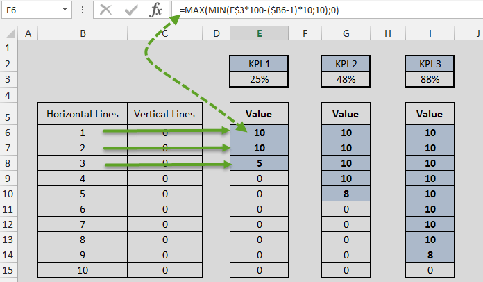
KPI Chart Formulas
If we follow the formula, then the E7 cell works similarly. However, it can be seen that the value is 10 again by the given amount, so the second line of the chart needs to be colored fully. Interestingly, the third column (namely in the E8 cell) starts.
Because the given KPI value is 25, we can’t color the third row of the chart fully because we would cover 30 little squares. So the value in the E8 cell is 5; this is how we get the result seen in the picture, which means that from left to right, we will color 25 small squares/units green.
Have you thought we solved this task with the help of such a simple formula (and choosing the appropriate chart) so quickly? Of course, the site administrators – were surprised by this solution, although we didn’t start to learn Excel yesterday.
The G7 – G10 cells belonging to the KPI2 indicator, 48%, are generated by a similar principle previously introduced. To display the 48% value, we color 48 tiny squares, so 4×10 and 8 in the fifth row.
You can apply the quick kpi chart in many business situations. Using a mini chart, you can display more key performance indicators, and with the help of this, you can build an excel dashboard. Check our gauge chart and waffle chart section too! OK, do not hesitate to download our latest excel solution!
Resources: