The Pareto Chart template uses bar graphs to show the relative portion of each factor to the total and identify the most significant factor.
The essence of the Pareto principle, also called the 80/20 rule, is that the smaller part of the data (about 20%) is of decisive importance, opposite to a lot of little dominating data (80%). The good news is that you don’t have to be a genius in math to understand and use this rule. First, an economist named Pareto discovered the regularity behind the rule; later, you can apply it to many fields of business.
Pareto has noticed that a minority group owns the larger part of the country’s economy. For example, 80 % of the property is owned by 20% of the people. This view is expanded to many other areas, called the Pareto principle.
You can learn more about chart templates in Excel.
How to create a Pareto chart in Excel
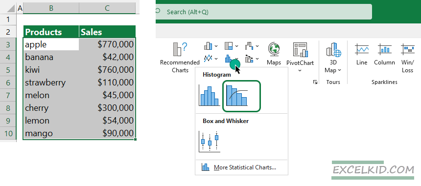
To create a Pareto chart, you must prepare your data like the picture below. It’s good to know that you don’t need to define any order in the sales column. Excel will identify the records and apply a sort. Locate the Insert tab on the ribbon, and select the Pareto chart type from the Histogram group.

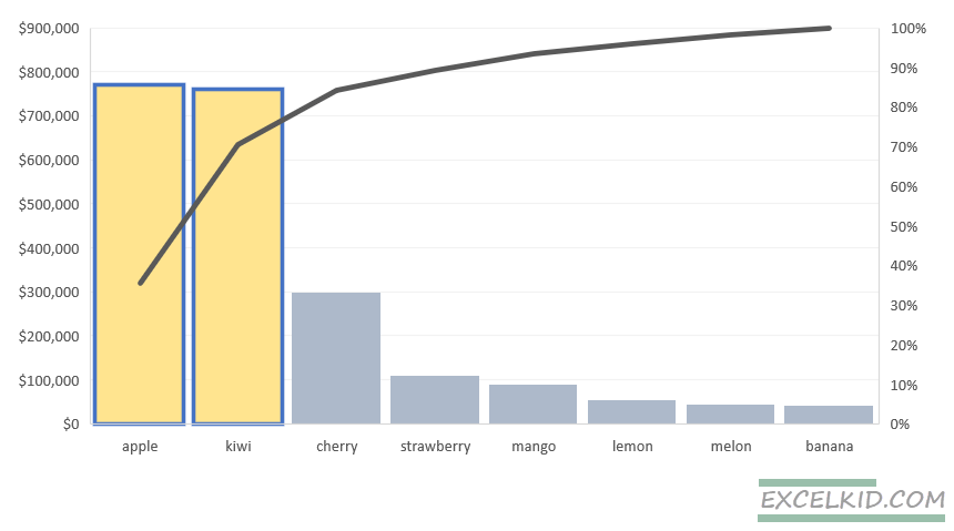
The Pareto chart is based on bar charts; it lines up the data from the left with the largest value and makes column charts after drawing the cumulative curve.
As a result, you can see that I reach 80% of all attendance out of only two essential categories: “apple” and “kiwi”. So, it is worth focusing on this. Make your analysis on your project or on any other subject you choose.

In the picture below, we mark this with a dotted red line. I grouped website categories on this particular graph based on the most interesting themes users are interested in.
The Pareto chart consists of column charts in size-decreasing order. It not only represents the measured values but almost solely analyzes events, occurrences, states, and problems; it sorts out the few important things from the bulk of unimportant.
What lessons can we learn from Pareto analysis?
Let’s list here some interesting examples of it from everyday life using a Pareto chart:
The Pareto principle is true in finance: 20% of your investments will bring 80% of your profit. Likewise, 20% of your work will result in 80% financial returns. But you can think of anything else: use this 80/20 rule regarding your e-mails and telephone calls. 80% of the incoming letters and calls are low-ranking, about minor things, and 20% are significant, influencing results with essential factors.
Some examples of my life are because the 80/20 rule exists in all fields. Besides, 20% of the invested money into our projects brings 80% of the profit. So, a small portion of my ideas greatly affects my success. And I got my ideas from 20% of the read books.
Focus on essential things brings a significant proportion of the results. And this is true of all the fields of your life. Then, after you have identified what matters, reallocate your tasks and assign them to a specific grade. Once you have found these tasks, concentrate on them, have them done, and devise the rest or leave them alone.
Do what you are happy about, that you like to do, that you can passionately do. But, of course, it is unavoidable to do certain things you do not like or do not love, but try to keep these on a minimal level and spend most of your time with meaningful and pleasant things for you.
