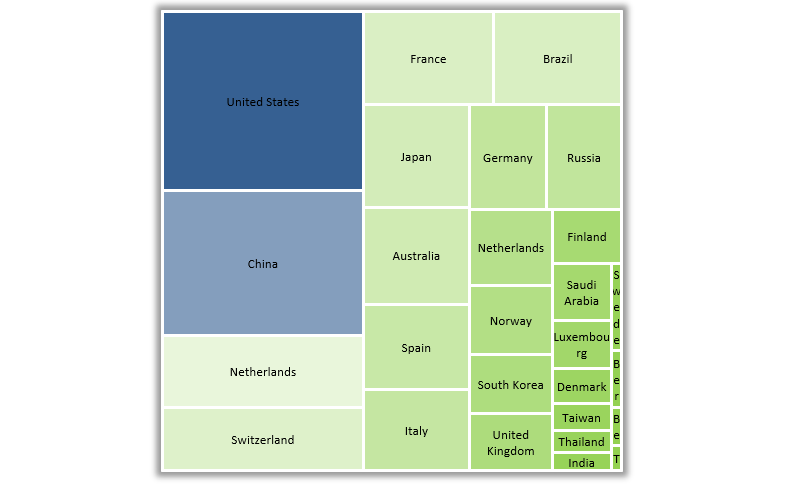
How to Create a Sankey Diagram in Excel

This guide will show how to create a Sankey Diagram in Excel. Use the UDT chart add-in to create stunning data visualization in seconds.
Use dynamic, interactive graphs and templates and effective data visualization to tell a better story and support the decision-makers.
This guide will show how to create a Sankey Diagram in Excel. Use the UDT chart add-in to create stunning data visualization in seconds.
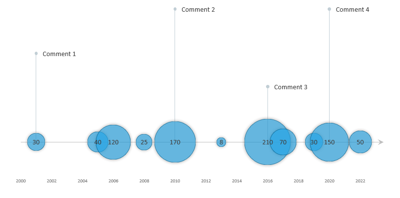
The timeline template uses a custom bubble chart, a great Excel visualization tool if you want to show data over time.
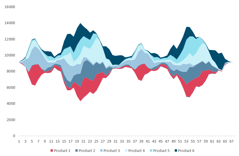
To visualize a huge amount of data, use the stream graph. The graph is based on a stacked area chart and represents the evolutions of numeric values.
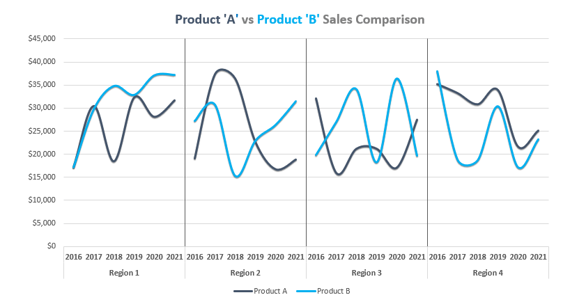
In this guide, you’ll learn how to create a chart template using a cycle plot. The chart is great for comparison purposes.
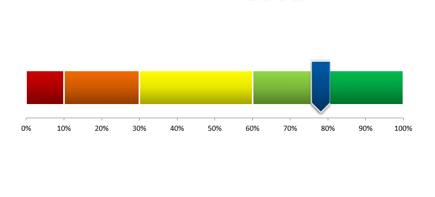
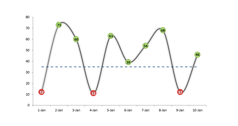
The score meter chart template is a smart chart that helps you to display values on a quality scale.
No one likes to work with useless reports. The Bullet Chart is one of the best usable chart types in Excel.
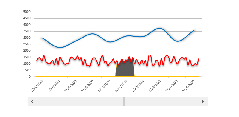
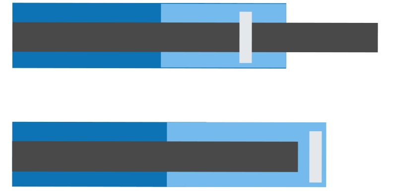
The scrolling period chart template helps you if you want to track a longer period and within it a highlighted period.

The org chart template is nothing else than a snapshot of the organized corporate structure.

We are using variance charts in everyday work in Excel. Comparing the planned value with the actual value is your goal if you are in sales.
The conditional color chart template is an interesting experiment for extending Excel toolbox.
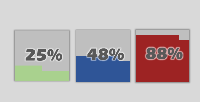
The Quick KPI Chart helps you to create small percentage graphs using conditonal formatting.
Our new chart utility is ready to use and works fine with Office 2013 a newer versions.
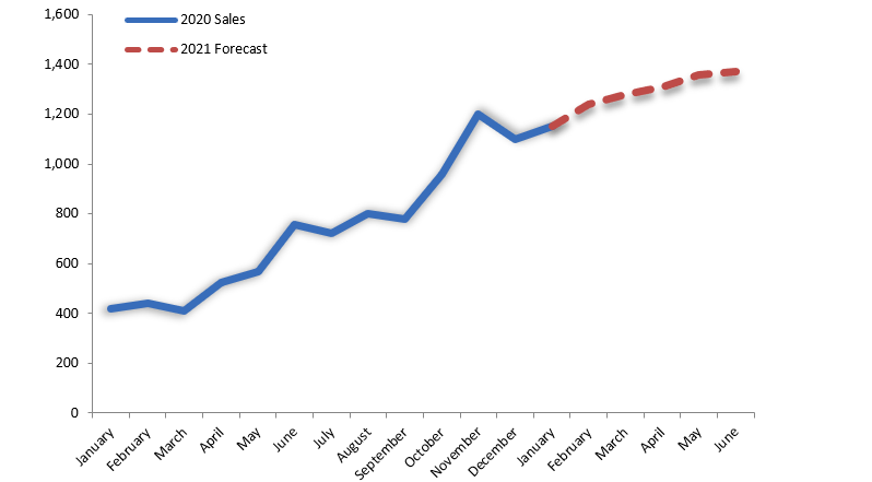
How to create a sales forecast chart in Excel? We need to show the actual value and the forecasted values on the same chart in some cases.