Today’s guide will be on how to create a Marimekko Chart in Excel 2007, 2010, 2013, 2016, 2019, and Microsoft 365.
To learn more about building advanced charts using Microsoft Excel, visit our chart templates section.
Marimekko Chart: The Basics
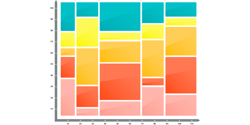
The Marimekko chart provides a quick overview of the market share and has a decision-preparation role. The chart is for creating market segmentation maps using easy-to-understandable visualization. Looking at the Marimekko chart, you can identify the possible opportunities and threats.
Steps to create a Marimekko chart in Excel:
- #1: Prepare data and create a helper table
- #2: Append the helper table with zeros
- #3: Use custom number format in the helper column
- #4: Calculate and add segment values
- #5: Set up the horizontal axis values
- #6: Calculate midpoints
- #7: Add labels for rows and columns
- #8: Insert a stacked area chart
- #9: Change series chart type for segments
- #10: Add and Format labels
- #11: Remove the line chart from the chart area
- #12: Format horizontal axis
- #13: Format vertical axis
- #14: Create labels for market share segments
- #15: Split areas using borders
Steps to create Marimekko Chart in Excel
If you are working with Excel, there are some limitations with built-in chart types. For example, the Marimekko chart is completely missing, so you need to prepare the chart manually or use custom add-ins to create a mekko chart quickly.
You can download our ready-to-use chart template here.
#1: Prepare data and create a helper table
Before diving deep into the details, we need to prepare data and create a helper table. It is not rocket science. Select the B2:G6 range and copy each row using the mentioned steps below:
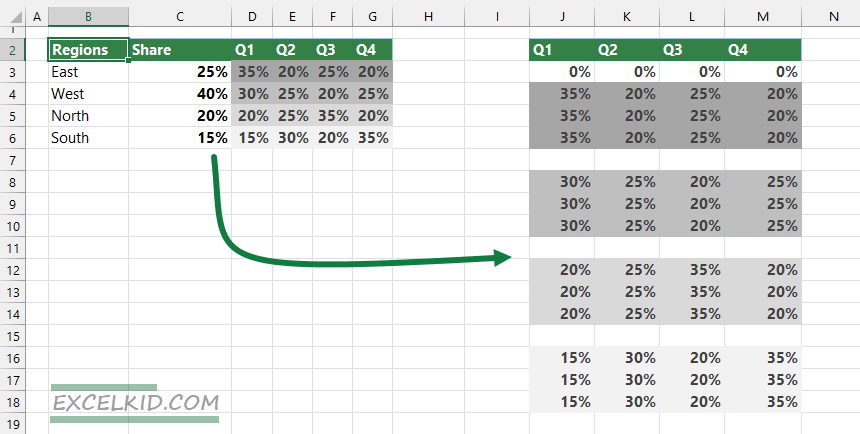
#2: Append the helper table with zeros
Now append the helper table with dummy data. Enter 0% values in each blank row in the range.
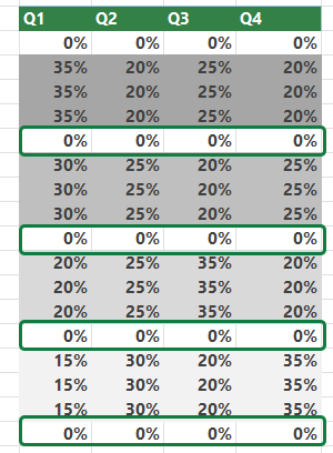
#3: Use custom number format in the helper column
In this step, insert a new column before column J. Afterward, apply a custom number format for all cells in the range. To do that, select the cells that you want to format. Then, right-click on the selection and choose “Format Cells”.
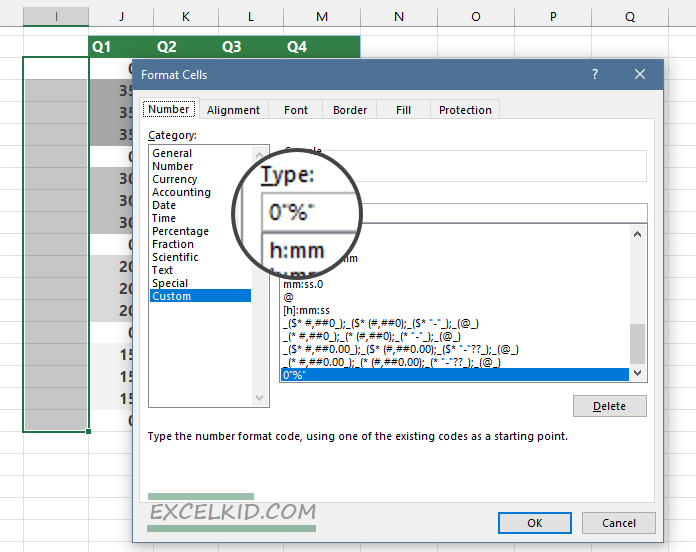
Under the Number Group, select Custom, then enter 0″% “. Finally, click OK to close the window.
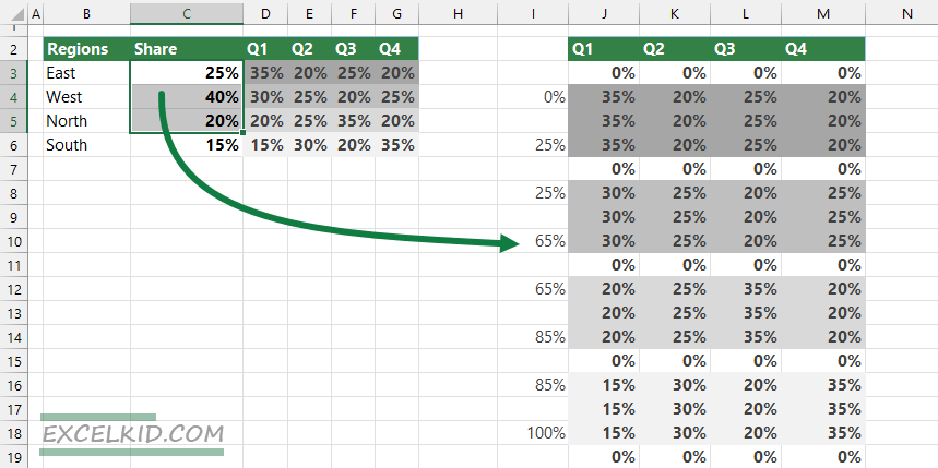
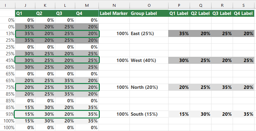
#4: Calculate and add segment values
The main characteristic of the Marimekko chart is that the column widths represent the market share. In our example, apply the following calculations to column I.
- I6 and I8 =SUM($C$3:$C$3)*100
- I10 and I12 =SUM($C$3:$C$4)*100
- I14 and I16 =SUM($C$3:$C$5)*100
Type 0% in cell I4 and enter the formula =SUM($C$3:$C$6)*100 to cell I18.
After the calculations mentioned earlier, our table looks like the below:
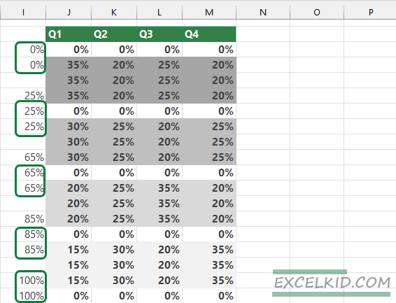
#5: Set up the horizontal axis values
We’ll separate the chart’s columns to create a better look for the Marimekko chart. To do that, copy the given values and build the following structure.
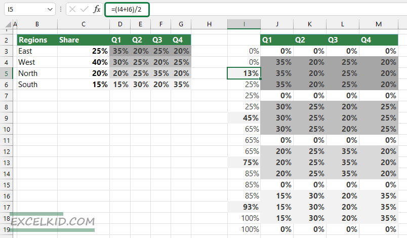
#6: Calculate midpoints
We have a few empty cells in column I; these play an important role in label positioning. To calculate the averages for segments, use the calculations below.
For example, to calculate the midpoint for the Region “East”, apply the formula:
=I5 =(I4 + I6)/2
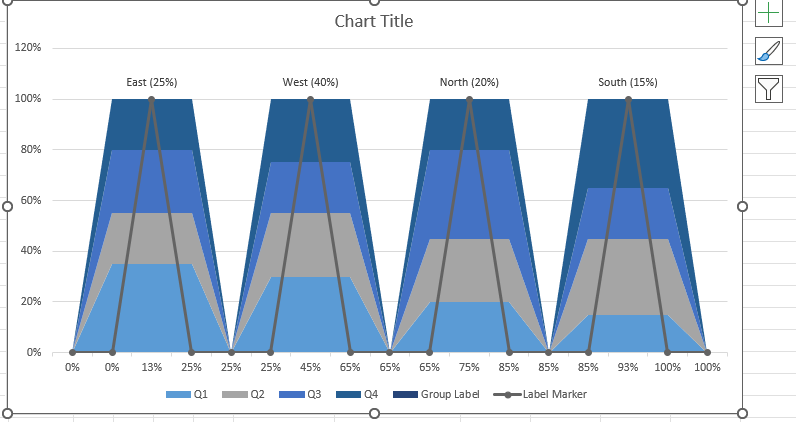
Following this logic, the midpoints are: 13%, 45%, 75% and 93%.
#7: Add labels for rows and columns
To create the labels for the segments, we have to join two cells that contain different data types. Enter the formula in cell O5:
=B3&TEXT(C3, ” (#%)”)
Copy the formula down to create the group labels for other regions.
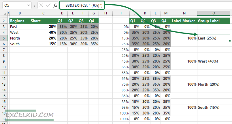
Create the labels for all quarters!
Copy the data from the range D3:G3 to D6:G6.
After this step, our table is ready to create a Marimekko chart.
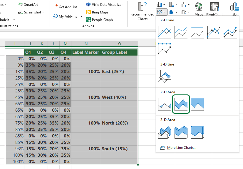
#8: Insert a stacked area chart
Steps to insert a stacked area chart:
- Highlight the range I2: O19. The selected range contains the helper column, the quarters, the label markers, and the group labels.
- Select the Insert Tab on the ribbon
- Choose the “Insert Line or Area Chart” section
- Under the 2-D Area Group, select the stacked area chart type
#9: Change series chart type for segments
Select the “Label Marker Series” (in the example, the dark-grey area of the chart). Next, right-click and select the “Change Series Chart Type”.
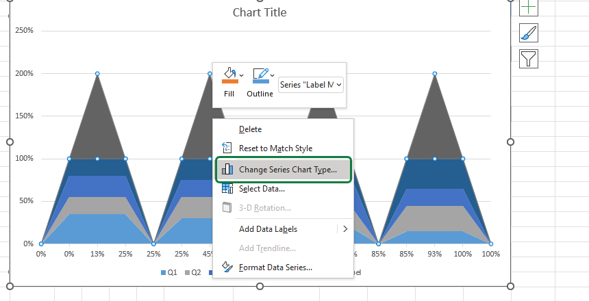
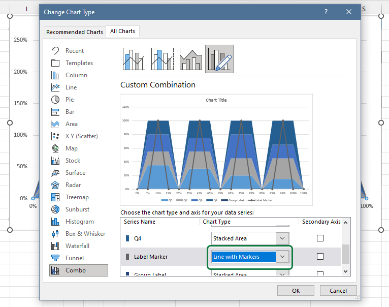
After clicking “Change Series Chart Type…” a “Change Chart Type” window will appear. We can change the current chart type under the “Choose the chart type and axis for your data series” section.
Select the “Label Marker” row from the Series Names list and change the chart type from stacked area chart to line chart with markers. Click OK.
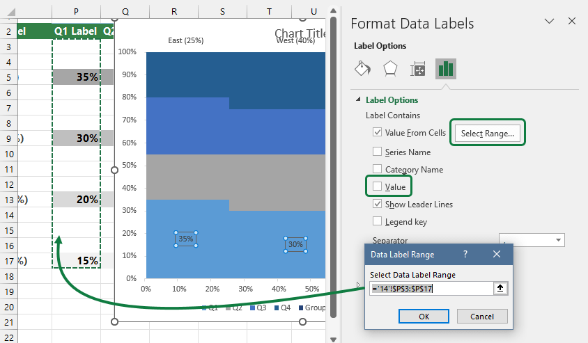
#10: Add and Format labels
To create Labels, select the data points of the line chart series. Next, right-click to open the context menu, then choose the “Add Data Labels” option.
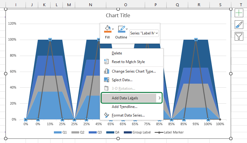
Select the data labels, right-click, then choose “Format Data Labels..“
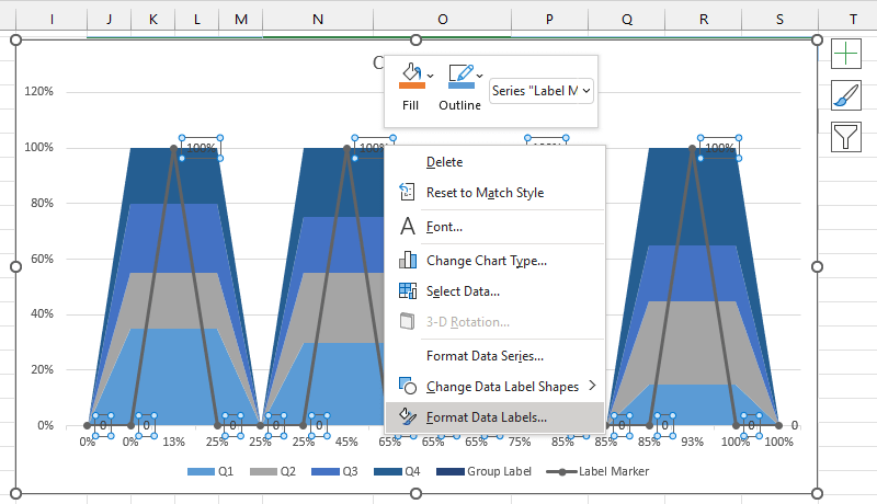
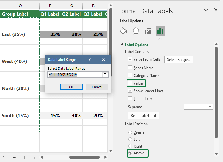
Here are the steps to align custom segment data labels:
- Navigate to the Labels Options Tab
- Click on the “Values From cells” checkbox
- The “Data Label Range” window will appear; browse the range
- Select the range that contains the labels; in the example, range $O$3 : $O$19
- Click OK to close the window
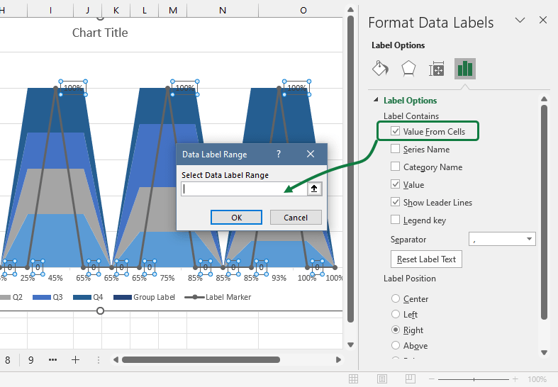
Under the “Label Contains” section on the right side pane, remove the selection from the “Value” box.
Finally, under the “Label Position” Group, select “Above”.
Result:
#11: Remove the line chart from the chart area
Because all labels are aligned, it’s time to hide the line chart.
Select the series, right-click, and choose “Format Data Series”.
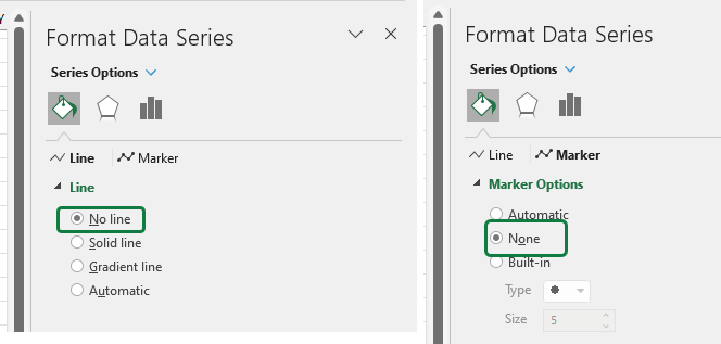
Select “No line”, and hide the marker by checking the none box under the Marker options.
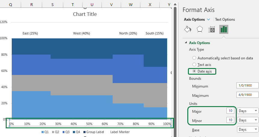
#12: Format horizontal axis
To transform the current chart into a Marimekko chart structure, select the horizontal axis and make some changes under the “Axis Options“. Select the “Axis Type” and pick “Date Axis“. Set 10 for major and minor units.
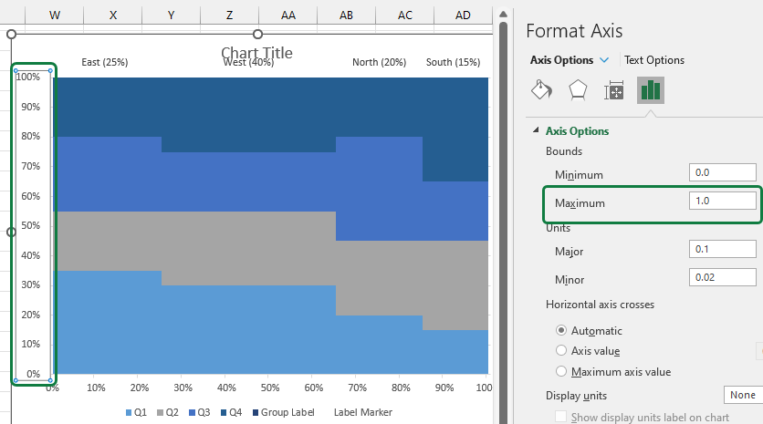
#13: Format vertical axis
Please take a look at the vertical axis and select it. Then, choose “Axis Options”. Then, under the Bounds group, Maximum field, type =1.
#14: Create labels for market share segments
The method is the same as in step 10. Repeat these steps for all Quarters!
We have only one step left, split the Marimekko charts groups.
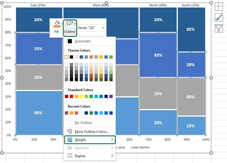
#15: Split and separate areas using borders
Finally, we’ll apply borders for better readability.
Select the group that you want to separate. Then, right-click on it and select the border color from the “Outline” menu. Next, choose the line weight from the “Weight” menu.
Download the Excel Marimekko Chart Template
You can download the practice file that contains the Marimekko Chart Template. We recommend you follow our guide and modify the chart if necessary.
Marimekko Chart Add-in for Excel
We provide automated solutions to create Marimekko charts in a single click if you are working with complex charts.
Select the range that you want to visualize. The add-in generates the chart ASAP with some additional information. Read more about the chart utility.
Enhancing Analysis with Marimekko Charts: Practical Applications and Insights
The Marimekko chart, beyond its technical construction in Excel, serves as a powerful analytical tool in business strategy and market analysis. Its unique ability to display market segments and share sizes simultaneously makes it an indispensable part of the data visualization toolkit for business analysts, marketers, and strategic planners.
Practical Applications in Various Domains
- Market Analysis: The Marimekko chart excels in market analysis, allowing strategists to visualize market segmentation and the relative sizes of each segment. This visualization aids in identifying high-potential market segments or underserved niches.
- Strategic Planning: By visualizing the distribution of resources or revenues across different business units or product lines, companies can make informed decisions about where to allocate resources for maximum impact.
- Competitive Analysis: When comparing your company’s product or service distribution in the market against competitors, the Marimekko chart provides a clear picture of where you stand, highlighting areas of strength and opportunities for improvement.
Strategic Insights from Marimekko Charts
- Identifying Growth Opportunities: By analyzing the size and share of market segments, companies can spot emerging trends and allocate R&D investments to capitalize on these opportunities.
- Evaluating Market Positioning: The visual representation of market share helps companies understand their positioning in comparison to competitors, guiding strategic adjustments in marketing and product development.
- Resource Optimization: For internal analysis, Marimekko charts can illustrate the distribution of resources (e.g., budget, manpower) across projects or departments, guiding decisions on resource reallocation to improve efficiency and outcomes.
Advanced Tips for Marimekko Chart Mastery
- Dynamic Data Integration: Consider linking your Marimekko chart with live data sources. This approach ensures your chart updates in real-time, providing ongoing insights into dynamic market conditions.
- Interactive Elements: Enhance your Marimekko charts by adding interactive elements, such as clickable segments that drill down into more detailed data views. This feature enriches the analytical experience, allowing deeper dives into specific market segments or business units.
- Integration with Dashboards: Embed your Marimekko charts into larger business intelligence dashboards. This integration provides a holistic view of business performance, combining market share insights with other key performance indicators (KPIs) for comprehensive analysis.
By incorporating these additional insights and practical applications, you can significantly enhance the value of your Marimekko chart guide, turning it from a simple how-to into a strategic handbook for business analysis and decision-making.
Thanks for being with us today. We’ll continue our data visualization adventures soon.
Additional resources: