A waffle chart in Excel adds the beauty of the visualization to the advancement path directed to your target.
The square chart gives you a quick and clear visual signal of what you want to depict without the utilization of a lot of space and increases your dashboard’s readability. Have you experienced the visualization of data or percentages? If yes, then you have probably revised charts before.
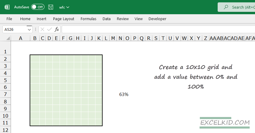
Every waffle diagram is a square with a size of 10×10 cells (overall 100), where one cell corresponds to one percent of 100 cells. The number of filled cells means how well you perform on the way to your maximum 100% destination.
Learn more about data visualization in Excel!
How to create a Waffle chart in Excel
We aim to create a user-friendly chart that displays multiple data points simultaneously based on a user selection. We’ll use conditional formatting and formulas to build a waffle chart.
#1 – Create the grid
First, we will select a 10×10 grid that contains 100 cells. Then, resize it to make it look like the grid in the waffle charts.
Enter the values with 1% in cell B11 and 100% in the top-right cell of the grid. Use the following formula:
=(COLUMNS($B11:B$11)+10*(ROWS(B11:$B$11)-1))/100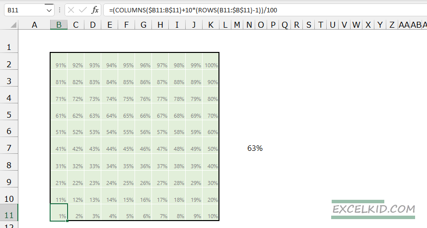
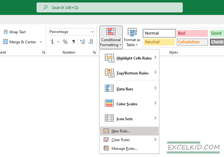
Select the range that contains data, then go to the Home Tab. Select the “Conditional Formatting” > “New Rule” option.
Take a look at the “New Formatting Rule” dialog box. Select the Rule Type. Choose the “Format Only cells that contain” option. Finally, click the “Edit the rule description” section.
Enter the values between 0 and N7. In the example, cell N7 contains our linked value.
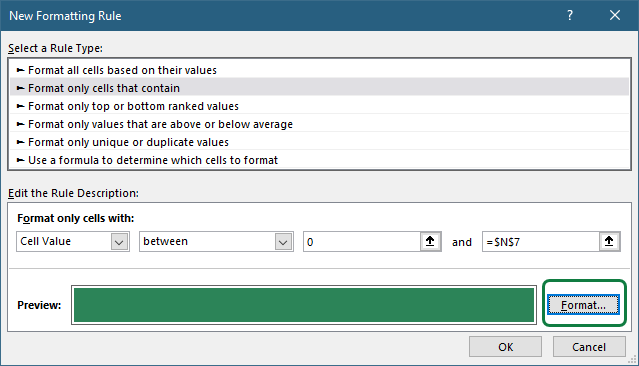
Use the Format button to create an individual style for fill and the font color. Apply the same fill and font color to hide numbers in the grid area.
Click OK. Excel will create the specified format for the cells that contain a value less than or equal to the given value. Finally, Apply the “All Border” format using transparent (or white) border color. For example, to create a thin frame for the grid, use gray “Outside Borders“. Suppose it is necessary to use the Outside Borders format to add an outline to the conditionally formatted area.
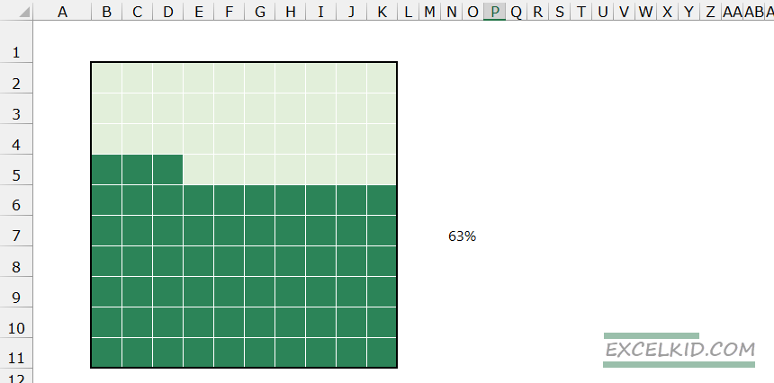
Within this step, you will customize the waffle chart to the net. The positive side is that the waffle chart is open to changes because it is connected to cell number N7. In other words, any changes in cell N7 will lead to a new state of the whole chart. At this point, further attempts will be made to introduce related labels to the KPI value in cell N7.
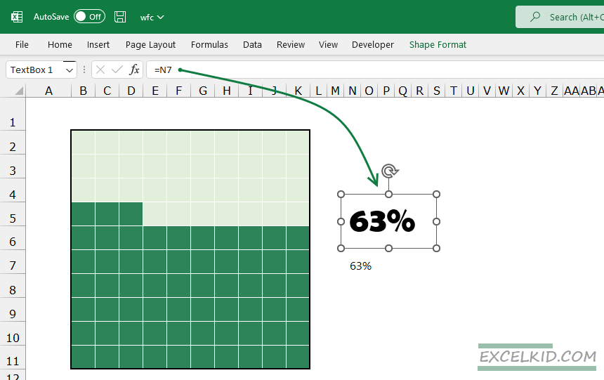
#2 – Create Chart Labels
Go to the Insert tab on the ribbon, then choose Text > Text Box to insert a new Text box. Select the text box, then type the “=N7” in the formula bar. We created a relationship between the text box and the cell that contains the actual value.
Finally, format the text box using custom text fill, outline, and text effects. Finally, move it to the waffle chart area. Although your waffle chart is not ready for the panel, you have finished the chart. As the next step, you should snip the chart and copy it to your panel as an image to easily modify the size and angle of view.
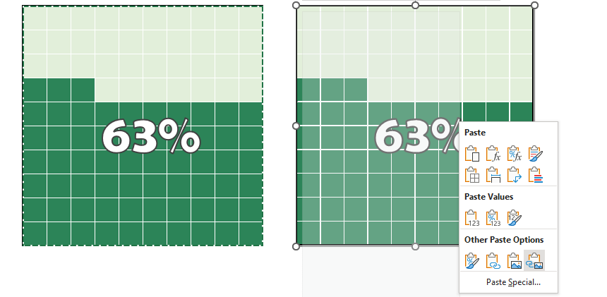
#3 – Use linked pictures
Select the chart range and copy the cells into the clipboard. Go to the Home Tab and use the following commands: Clipboard > Paste > Linked Picture
The chart is almost ready. You can insert it anywhere you wish, in the same or other documents.
The only thing to remember is that it is only the picture of the cells, so if there is any need to modernize the chart, the picture should be snipped and pasted again as it represents only the image of the cells and not the cells themselves.
If you are using a simple drop-down list and you can manage multiple square charts:
If you are in a hurry, download the example workbook.
Waffle Charts: Pros and Cons
Finally, compare the advantages and disadvantages of the waffle chart.
Advantages:
- It is visually clear and detectable. Every square visualizes the attained target per KPI beyond simple data visualization.
- It is easy to read and shows data is noticeable at first glance.
- The difference between pie charts is that a waffle chart prevents the deformation of the displayed information.
Drawbacks:
- The effort to create a Waffle chart in Excel is bigger than creating other columns or diagrams.
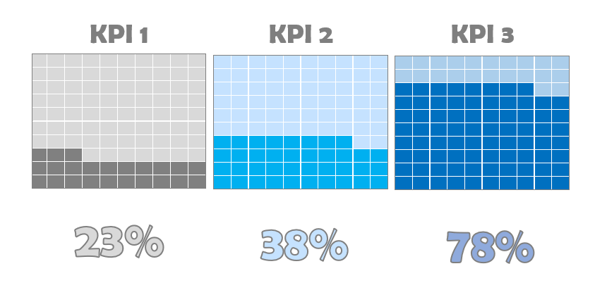
- Understanding if you have more than three target points is not always comfortable. For example, the shown left graph is obvious when it has only three colored ranges, but when it boosts up to 10, it turns unfriendly to get the main idea.