A Cycle Plot (panel chart or small multiples) is a small comparison chart that consolidates the charts using the same scale. Sometimes we are working with custom reports and need a space-saving solution. The cycle plot is a perfect chart to track and analyze data using a small space.
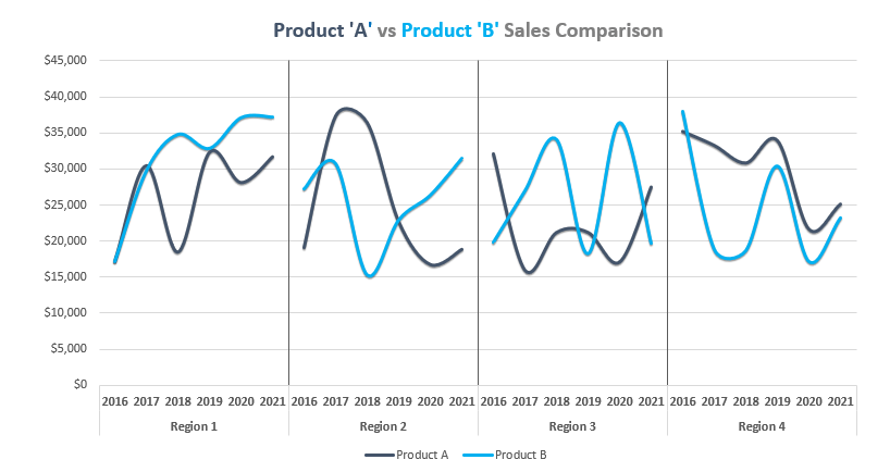
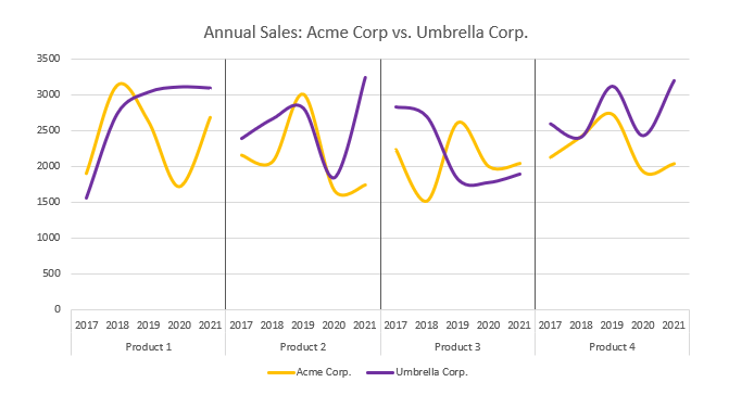
Today’s guide will take a closer look at the Cycle Plot. In the example, you will learn how to compare the sales performance of two companies using five years.
The bad news: Excel does not support the cycle plot. If you want to build this chart in seconds, use our chart add-in. A few clicks are necessary, and you can forget the manual work. Let’s see how to create a Cycle Plot in Excel using our step-by-step tutorial.
How to create a Cycle Plot in Excel
Step 1: Prepare the Data
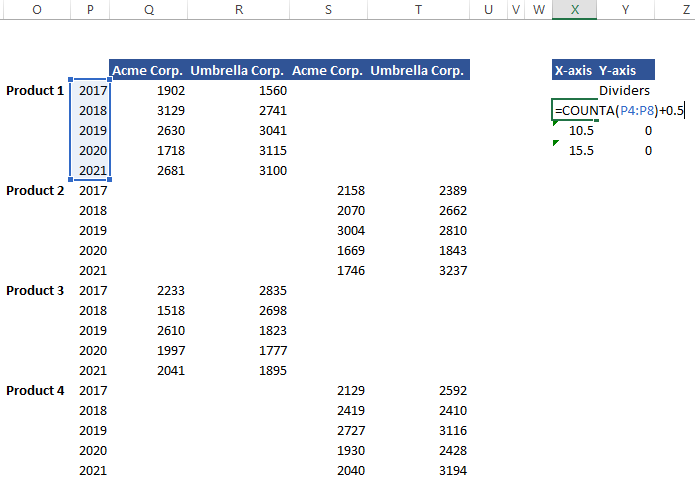
Because we want to show you every step, let’s start with the initial data set. In the example, we will compare the data sets of the two corporations, ACME Corp. and Umbrella Corp, using four different products in five years. To create a cycle plot, you need to prepare and use the structure below:
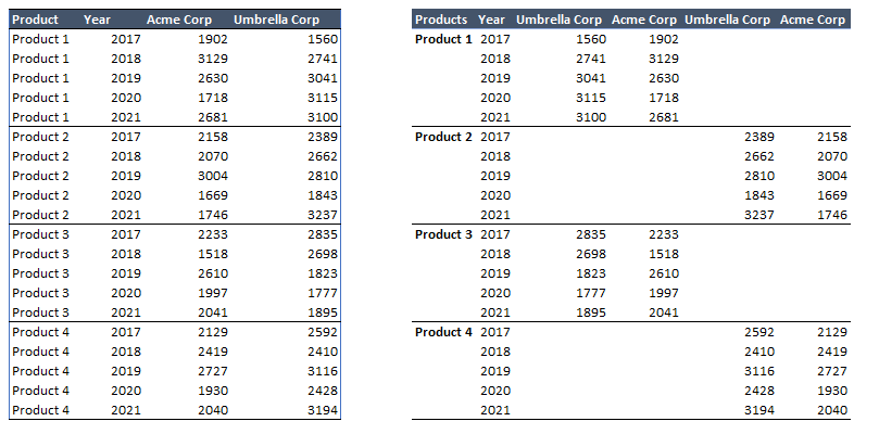
You can manually create the structure on the right side if you have time. However, we recommend using Pivot Tables to extract the data from the table.
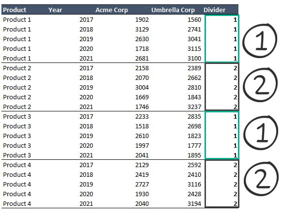
Step 2: Add separators to split line charts
We need to insert a helper column to create a cycle plot in Excel. Insert a new column! Use “1” for the range F2:F7 and F13:F17. Apply “2” for ranges F8:F12 and F18:F22.
This step is important; you’ll see why we need a small extra data.
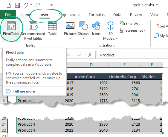
Step 3: Create a new Pivot Table
Select the range, locate the Insert Tab, and use Pivot Table.
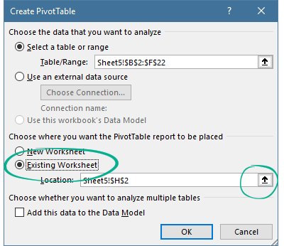
After clicking PivotTable, a new window appears. You can create the table using a new Worksheet. In the example, the right decision is to place the Pivot table in the existing Worksheet.
Select the location and insert the Pivot table.
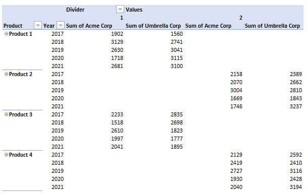
Step 4: Build a proper layout using fields
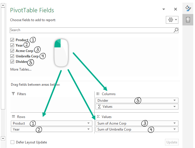
After clicking OK, a blank pivot table will appear. On the right side, you should have to use the PivotTable Fields task pane to build a usable output for our cycle plot.
- Place the Product and Year in Rows.
- Move “Divider” to “Columns area.”
- Add the “Acme Corp.” and “Umbrella Corp.” to the “Values” field.
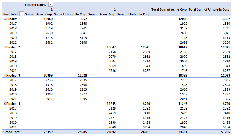
Result:
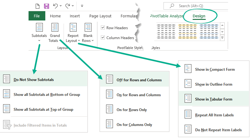
To remove subtotals, Grand Totals, and simplify the pivot table, do the following steps. First, select any cell in the pivot table and locate the Design Tab.
- Click the Subtotals icon and choose the “Do not show Subtotals.”
- From the “Grand Totals” menu, pick the “Off for Rows and Columns.”
- Use the Report Layout menu and select the “Show in Tabular Form.”
Our data set looks like in the picture below:
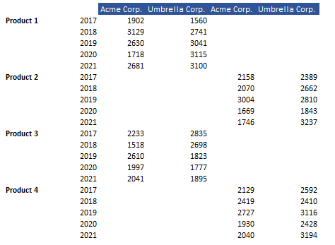
Step 5: Copy data and Create a Header
Select the Pivot Table data and copy all cells into a new location.
Add headers to the new table.
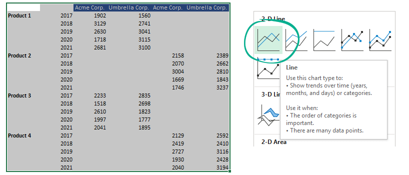
Step 6: Insert line charts
Select the data to create a simple line chart for the cycle plot. After that, go to the Insert tab. Finally, choose a line chart.
Step 7: Format data series
The next step is to simplify the chart. We want to use the same colors for the variables. To do that, select the series using right-click and choose “Outline.” In the example, we use purple for the Umbrella Corp. and Orange for the Acme Corp.
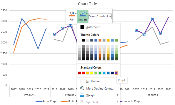
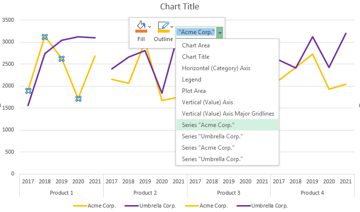
You should not have to reopen this dialog box. We can apply different colors without using the task pane. Instead, use the drop-down list and select the given series. It’s easy to add colors for each corporation.
Step 8: Add a helper table for dividers
Creating dividers for the merged line charts is not an easy transformation. To create a cycle plot, you have to use vertical error bars. In the next chapter, we’ll show you how to create dividers using the right position.
To create dividers, we need to build a small helper table.
- Leave the cell X4 blank, and fill the cells using zeros in column Y.
- Enter the following formula in cell X5. =COUNTA(P4:P8)+0.5
- Apply the =X4 + COUNTA(P9:13) formula in cell C6.
- Copy the formula down
Step 9: Create dummy series for the cycle plot
Let’s see the key steps!
- Select and copy the helper table data
- Select the chart area.
- On the Home tab, click Paste and apply “Paste Special.”
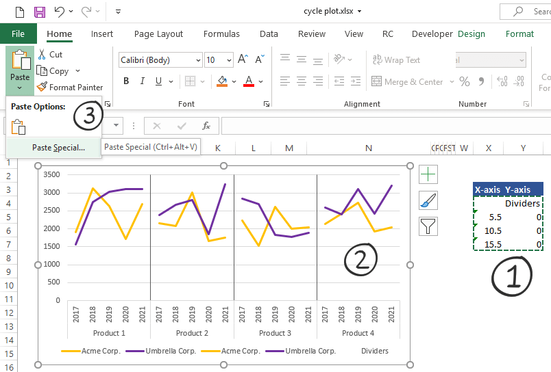
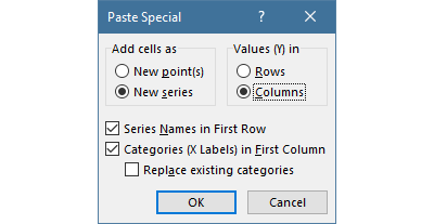
A new popup window will appear. Use the following settings:
- Under the “Add cells as” group, click “New series.”
- Under the “Values (Y) in” group, select “Columns.”
- Enable the “Series Names in First Row” option
- Enable the Categories (X Labels) in First Column” option
- Finally, click “OK.”
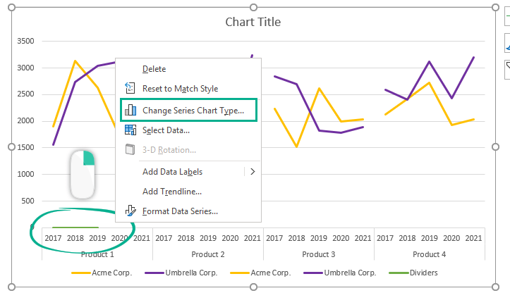
Step 10: Change the inserted Chart Type
In the picture below, you can see the inserted data series. Right-click the line and select the “Change Series Chart Type” option.
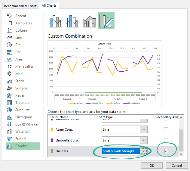
Select the combo chart and choose the Dividers series. Now change the chart type to “Scatter with Straight Lines ” and ensure the secondary axis checkbox is enabled.
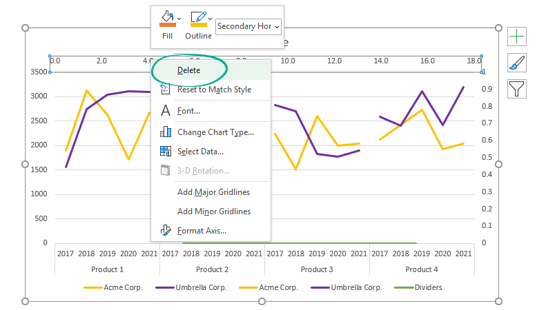
Step 11: Clean up the chart and format axes
We need to remove the unnecessary elements. Select the secondary horizontal axis using right-click. Click Delete.
Now, right-click on the vertical axis and use the “Format Axis.” option.
Use the following setup on the Task pane:
- Select the Axis Options tab
- Enter “0” for the Minimum Bounds
- Add “1” as a value for the Maximum Bounds
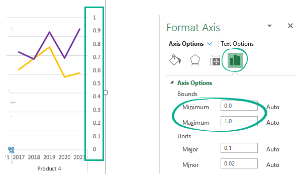
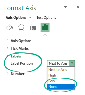
Locate the Labels section and change “Label Position” to “None” to hide the axis scale.
Step 12: Use error bars as dividers
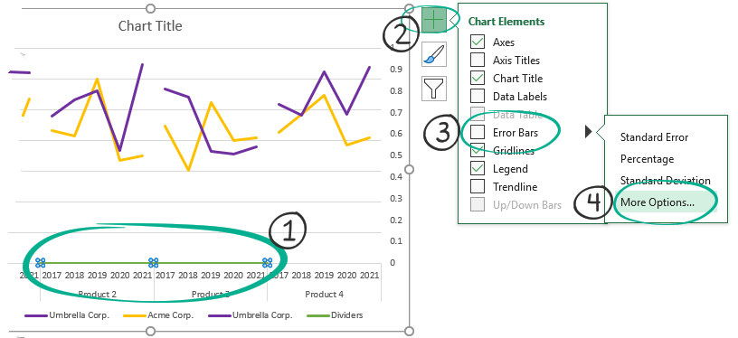
We are almost ready! Now we’ll add error bars for the cycle plot.
- Select Series “Dividers.”
- Click the plus sign to reach the Chart Elements menu.
- Select “Error Bars, then click “More Options.”
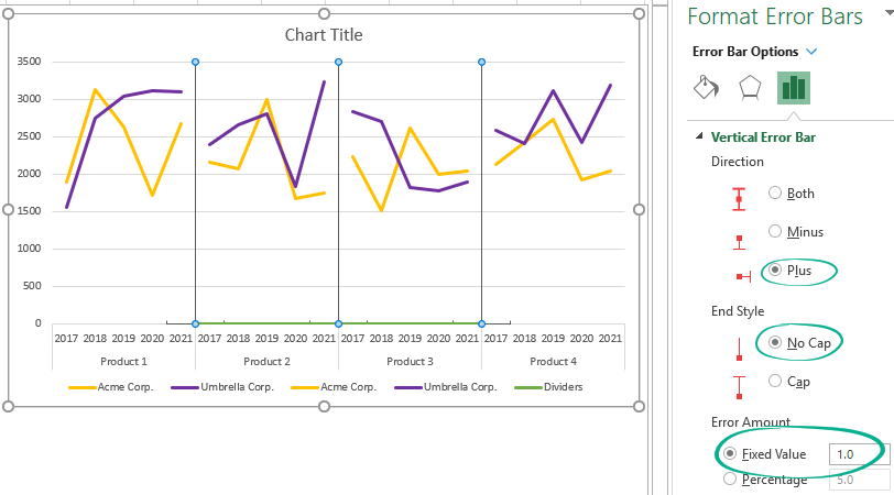
Change the vertical error bar settings in the Format Error Bars task pane to modify the dividers:
- Select “Plus” for direction.
- Apply “No Cap” for End Style
- Add “1” as a “Fixed Value” under Error Amount Group
Step 13: Hide the dummy chart elements
Finally, clean up the chart.
Choose the ‘No line’ option for the series Dividers using the Format Data series Tab.
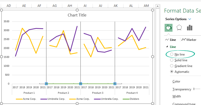
Delete Horizontal error bars!
Additional steps to improve the Cycle plot
- Add a chart title
- Remove duplicated company names from
- Add smoothed lines
Here is the final chart!
Download the example and stay tuned.
Additional resources: