How to create an Income Statement using Sankey Diagram
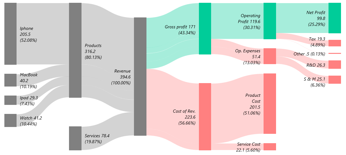
In this tutorial, you will learn how to create an Income Statement using Sankey Diagram in Microsoft Excel.
Excel Chart Templates offer valuable tools for creating engaging and informative data visualizations. These dynamic and interactive charts can enhance data storytelling and provide clear insights for decision-making. In this section, you’ll discover techniques and resources to help you craft visualizations that effectively communicate your data and capture your audience’s attention. You will also learn how to save custom graphs as a template.
In this tutorial, you will learn how to create an Income Statement using Sankey Diagram in Microsoft Excel.

I met with the waffle chart several times while reading newspapers and magazines. Another name for them is a pie or square pie chart. However, a square or waffle chart template is a valuable alternative to other Excel graphs.
A waffle chart in Excel is a grid-based visualization that represents progress toward a target or goal in a simple, intuitive manner. The most significant advantage of using a waffle chart is that it is exciting and forwards the attention to your dashboard.

Polar Plot is not a native chart type in Excel. Learn how to create it to compare two variables using a polar coordinate system.
We will analyze the service level performance using two companies in the example. The plot is a great choice if you want to measure – for example – customer satisfaction score.
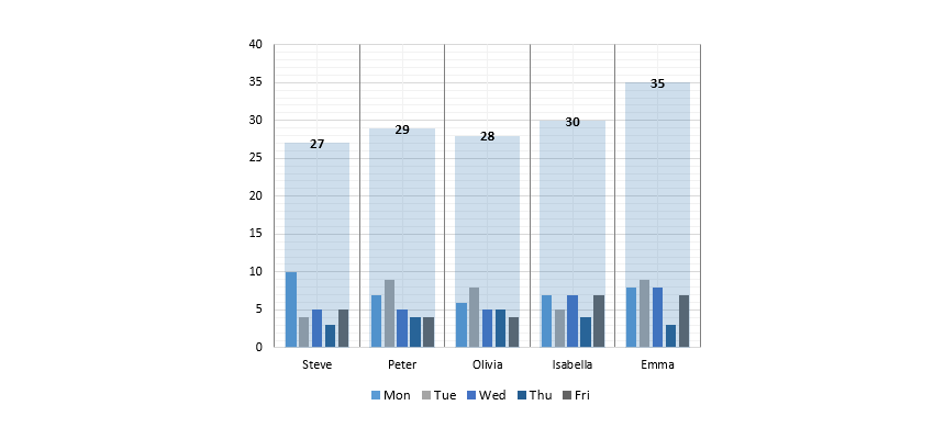
In this tutorial, we will show you how to use a small multiples chart in Excel to create a weekly sales chart. Take a closer look at the small multiples (panel charts). Instead of busy lines or column graphs, you’ll get grouped graphs. To build sales comparisons, make your data table first. After that, summarize your data. Finally, calculate the position of the dividers for the x-axis.
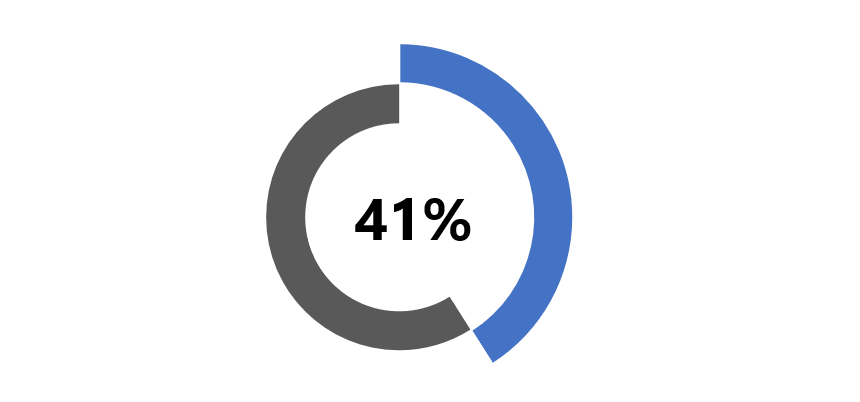
The progress circle chart displays the percentage completion towards a goal. We’ll use special formatting tricks in Excel.
For example, you can combine two doughnut charts and apply custom formatting to create an infographic-style visualization in Microsoft Excel.
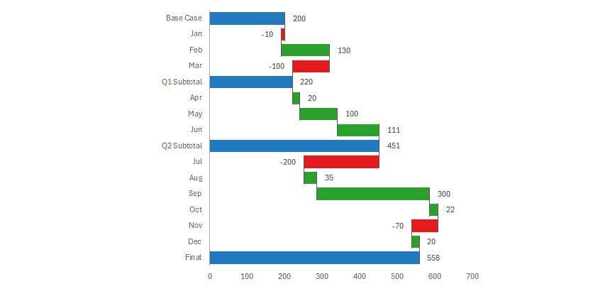
How to create a Waterfall chart in Excel (bridge chart) that shows how a start value is raised and reduced, leading to a final result.
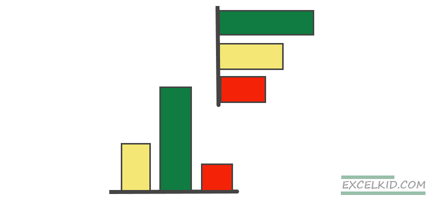
This tutorial will show you how to use conditional formatting for column or bar charts in Excel using multiple data series.
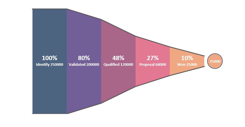
Create a sales funnel chart in Excel to tell a story from the first call to the completed purchase and track the process using a pipeline.
It is based on a combination of an area chart and a scatter plot. Following the sales activity from the first cold call to the purchase is a must-have visualization.

This tutorial will show you how to create a Tornado chart in Excel using two clustered bar chart series and proper axis formatting.

Learn how to create a Gauge Chart in Excel using a combo chart: a doughnut shows the zones, and the pie section indicates the actual value.
The gauges (speedometers) logic is simple: it provides information about a single data point (value). Therefore, using red, yellow, and green colors (that follow RAG reporting – red, amber, green), it’s easy to compare the actual value to a goal (plan value). We have said quite many times why we love this graph.
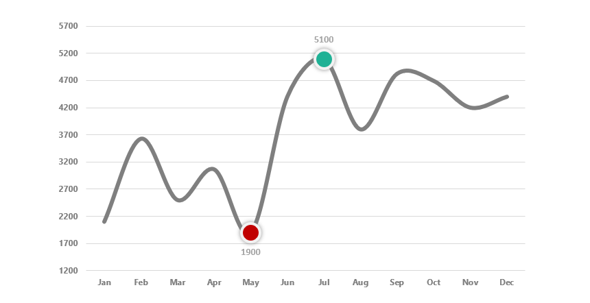
Learn how to highlight data points (high and low points) in an Excel chart using custom formulas and multiple chart series.
The method is straightforward: create one or more additional series, find the high and low points, and finally use the NA function to hide the unnecessary data points. Format the marker to create a stunning visualization in a few steps.

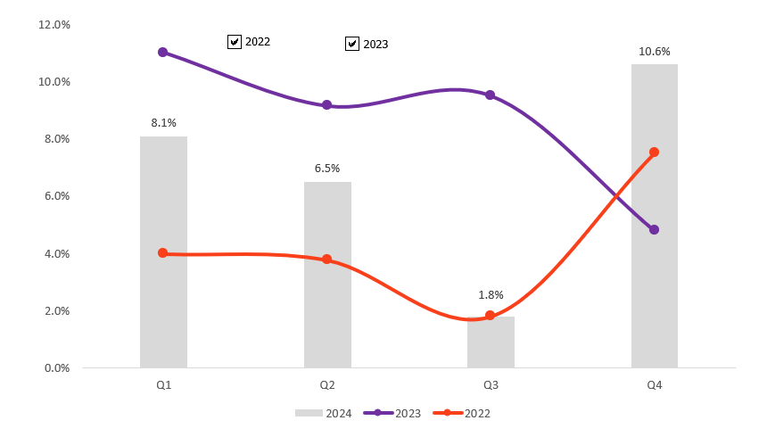
The plan-actual variance chart visually represents the monthly variances between planned and actual values throughout the year.
If you want to create an attention-grabbing visualization, use the variance chart template. The graph clearly shows the differences between the plan and actual values month by month.

Learn how to create a multi-layer doughnut chart in Excel using advanced data visualization for dashboards and reports. The built-in Excel chart enables you to make further customizations.
We will display multiple series and make the graph visually appealing. In the article, you can find step-by-step instructions on how to build the template.
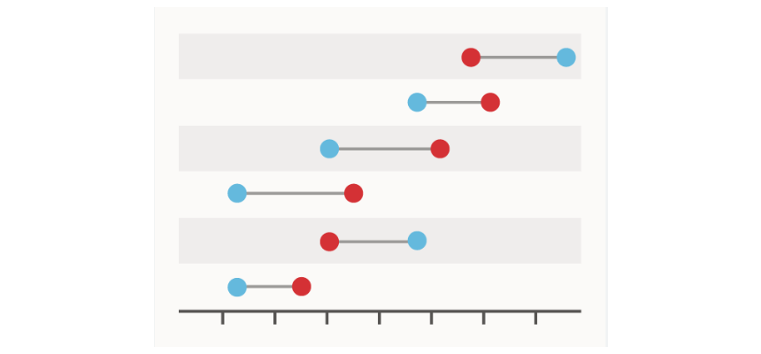
Learn how to create an Excel dumbbell chart (dot plot) to emphasize the change between two points across multiple categories. The Dumbbell plot (or dot plot) is based on two data series.
To create a dot plot chart template, select the data and insert a basic scatter plot. After that, calculate the x-axis (category) positions and the width of the lines. Use standard error bars to connect the dots.
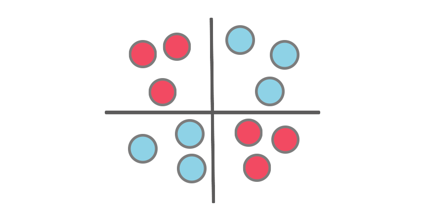
This step-by-step tutorial will show you how to create a Quadrant chart in Excel to support SWOT analysis. Based on your criteria, we use the Quadrant chart to split values into four equal (and distinct) quadrants.
The quadrant chart uses a scatter plot. For example, the chart helps you understand the performance under two parameters.
Learn how to build a forecast chart in Excel! It is a custom combination chart with one column and two line charts.

This tutorial will show you how to create a radial bar chart in Excel. It provides easy comparison options for multiple categories. Use the circular bar template to show the sales visually effectively. Unfortunately, Excel does not support this custom chart template by default, but no worries!
Dynamic charts in Excel help us to improve the quality of data visualization by allowing users to update and interact with data.
Sometimes, we use a dynamic chart design to display the key metrics from a vast amount of data. To improve your graphs, apply Excel Form controls (drop-down list, spin, radio buttons).
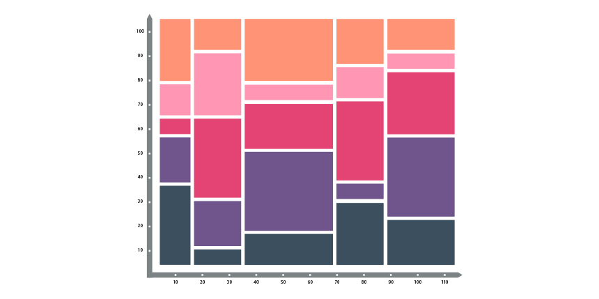
Today’s guide will explain how to create a Marimekko Chart in Excel 2007, 2010, 2013, 2016, 2019, and Microsoft 365 to display market segmentation maps using easy-to-understand visualization.
The Marimekko chart is the most powerful tool for examining the overall market. It is also known as a market map and helps drive discussions about growth opportunities. You can segment an industry or company by customer, region, or product.
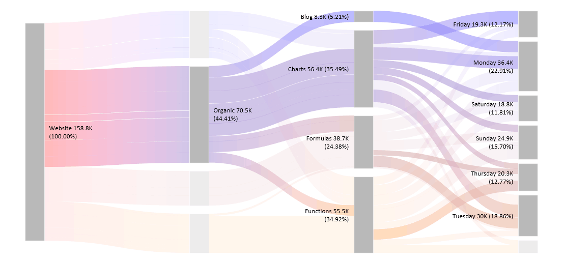
The Sankey diagram is a high-level data visualization tool, not just in Excel. We use it to show and follow the flow of resources. The main advantage of using it is that the flow chart lets you visually show and analyze complex processes quickly. The main graph uses a group of shapes. You can find a detailed description of how to build the template using custom calculations and 100% stacked area charts.
The timeline template uses a custom bubble chart, a great Excel visualization tool if you want to show data over time.
The chart is a member of a scatter chart type. In this case, we replace the data points with different size bubbles. We recommend using it to visualize your project milestones or sales over time.
The Stream Graph in Excel is ideal for displaying high-volume datasets and discovering trends and patterns across various categories over time. You can create various graphs in Excel, like a stream graph.
We use multiple stacked area charts and custom formatting for overlapping. If you are working with numeric data types, a streamgraph is a smart choice to show the evolution of a variable on a flowing shape.
A Cycle Plot (panel chart) is a small comparison chart that consolidates charts using the same scale. Sometimes, we work with custom reports and need a space-saving solution. The cycle plot is a perfect chart for tracking and analyzing data in a small space.
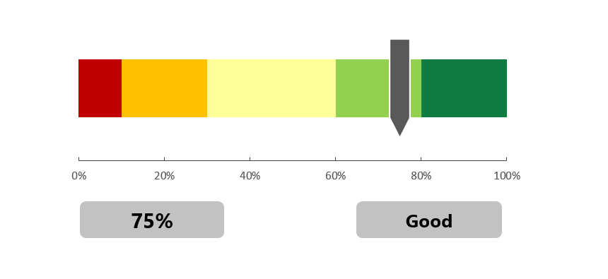
The score meter chart template is a smart chart that helps you to display values on a quality scale.
No one likes to work with useless reports. The Bullet Chart is one of the best usable chart types in Excel and a real alternative to gauges. It transforms data using length and height, position, and color to show actual vs. target using bands.
You can save more space using bullet graphs. Without using and advanced chart design, you can easily tell a story using segmented bar charts. In our detailed guide, you can learn how to track progress easily.
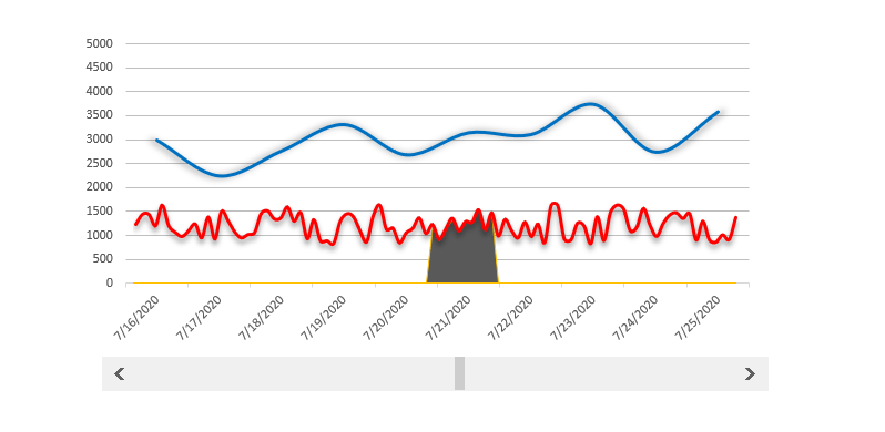
The scrolling period chart template helps you if you want to track a longer period and within it a highlighted period.
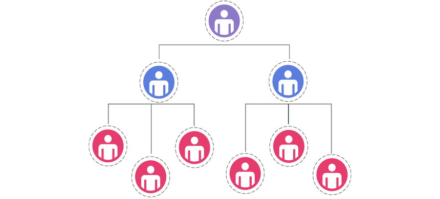
The org chart template is nothing else than a snapshot of the organized corporate structure.

We are using variance charts in everyday work in Excel. Comparing the planned value with the actual value is your goal if you are in sales.