How to create a Dashboard in Excel
Learn how to create a dashboard in Excel, a powerful decision-making tool that combines graphs, charts, and widgets to visualize data.
Use Free Excel dashboard templates if you need a fresh idea to create stunning data visualizations. Check our in-depth article about dashboards! If the task is simple, download our free spreadsheet templates. We recommend our chart add-in if you want to make a stunning report in minutes.
Dashboard Template is a powerful tool for visualizing information. A great-looking report or template can radically improve how you use and get a sense of your information. Furthermore, Templates are great for many tasks, not only to display the achievements of a company. If we have enough data with that, we can take more efficient steps.
What will we learn today? In this category, we will show you the most efficient techniques. We will go forward with you, starting from the ground up! We’ll generally use the best techniques and visualization guidelines. Don’t forget to download the best free dashboard templates!
Learn how to create a dashboard in Excel, a powerful decision-making tool that combines graphs, charts, and widgets to visualize data.
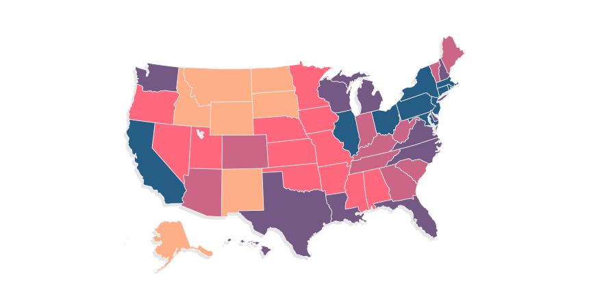
The tutorial provides a detailed guide on creating state map to visualize data.
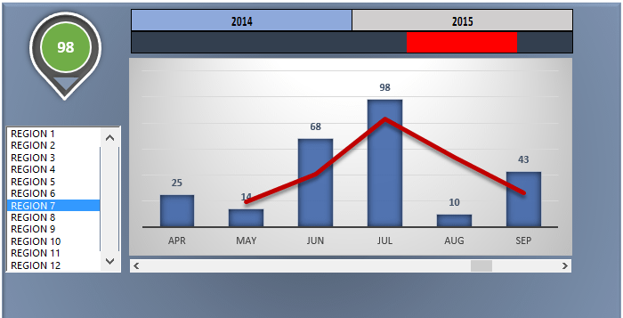
Learn how to track and monitor sales performance over different years, by region, and by sales.
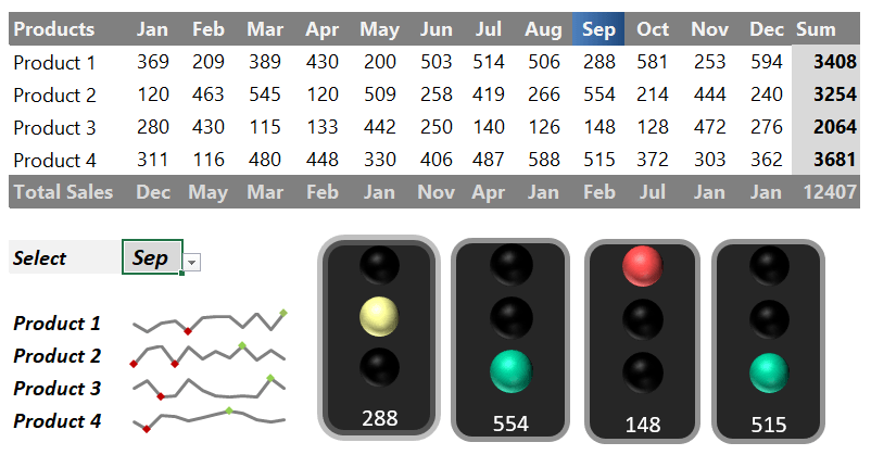
Using an Excel Traffic Light Dashboard Template can track your sales or project activity quickly and supports KPIs using stoplight indicators.
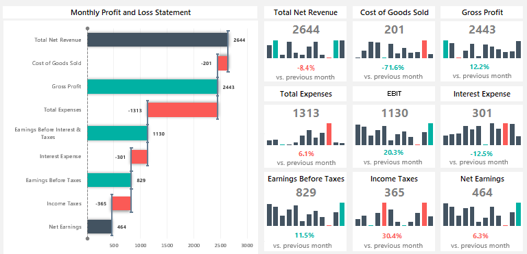
The Profit and Loss Statement Template is a great option for leaving boring reports behind.
The template shows trends using sparklines and apply a rotated waterfall chart to visualize the monthly profit and loss statement.

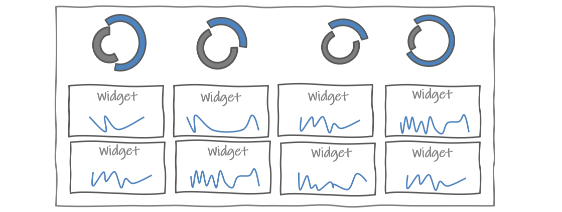
Excel dashboard widgets are valuable for several reasons. They make the dashboard more visually engaging.
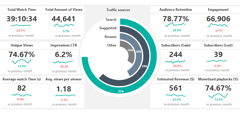
Our report lets you stay on top of social media analytics from all your favorite channels.
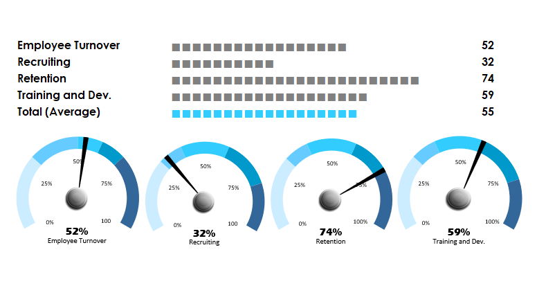
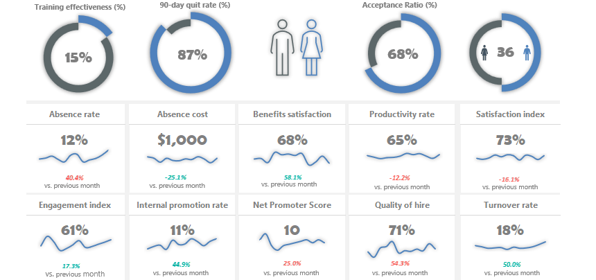
In this article, we will show you how to use various methods to build a human resource dashboard.

This quick guide will explain the best practices when working on a dashboard.
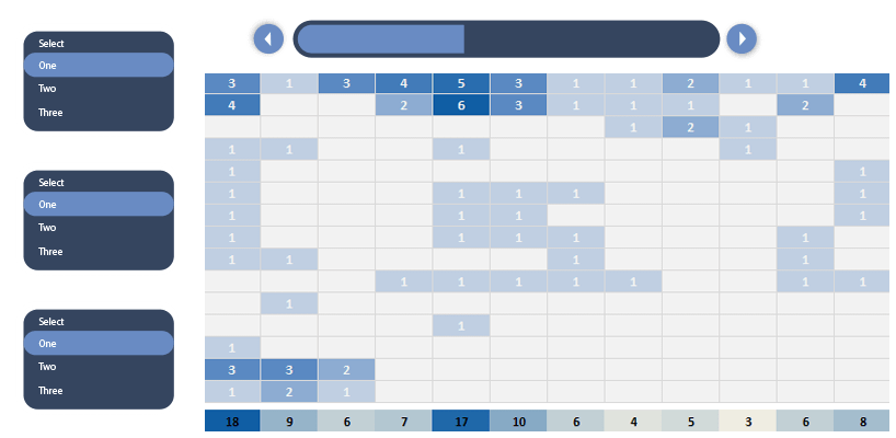
Learn how to build a dashboard using Excel form controls to manage a project.
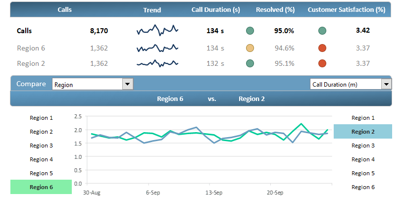
Analyze your call center performance and trends using Customer Service Template!
In this example, we’ll show you how to improve user experience using a dashboard UX template.

The free template providing the owners with insights on how their website actually performs.

Learn how to create a one-page template for tracking the actual status of key metrics.

The customer analytics template is nothing else than a statement of customer habits from a relatively large excel data source.

If you want to create an Excel dashboard using infographics, take a deep into our template!
In this free example we will use sales data to create a scrolling chart using a simple macro.

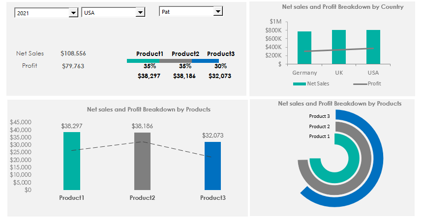
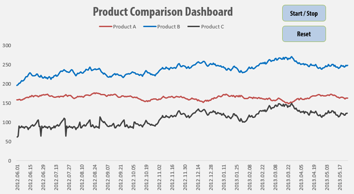
Learn how to create a Sales dashboard in Excel. The goal is to show the main metrics and provide a comparative view of other products.
Rolling 6 Months Dashboard can be a perfect solution if you want to display massive amounts of data from various sources.