A profit and loss statement template shows income versus expenses and compares business performance over a month, a quarter, or a year.
Furthermore, it effectively reviews cash flow and predicts future business performance. Generally, we use a profit and loss dashboard to display incomes and expenses over a month or quarter period. This tutorial will demonstrate how to transform a raw data set into a dashboard.
The template shows performance in two views (monthly and yearly) and provides a detailed analysis of revenues and expenditures.
P&L Template: Categories
A multiple-step P&L statement splits different revenue and expense types and provides detailed analysis. Before we show you how the P&L statement works in Excel, quickly examine the main categories.
Here are some formulas to calculate each stage:
- Total Net Revenue is the sum of net sales in a given period.
- The cost of Goods Sold contains all of the costs and expenses directly linked to the production of goods. This metric is the difference between net revenue and gross profit.
- Gross profit is the company’s income after paying all direct expenses.
- Total Expenses are a great metric for comparing spending patterns over time. They can be broken down into salaries, marketing costs, office supplies, and other expenses. Revenues will be subtracted from this row.
- EBIT is a KPI of profitability and shows the amount of operating income. To calculate EBIT, use the simple formula: Net Income + Interest + Taxes.
- Interest Expense is the cost of borrowing money.
- Income Taxes
- Net Earnings is the bottom line of the profit and loss statement and is equal to a Profit.
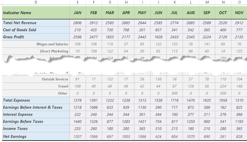
The data set contains data for 12 months and a Total column.
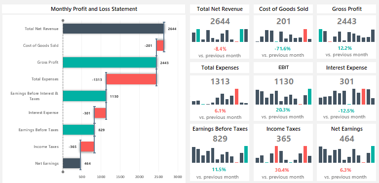
Best chart types for visualizing a Profit and Loss Statement
In the example, we want to compile a report into a visually effective spreadsheet. To build an effective P&L visualization and break down the structure, we recommend using a Sankey Diagram or a rotated waterfall chart.
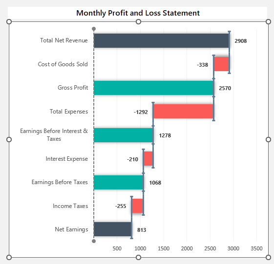
The practice file contains all formulas and charts. To build a rotated waterfall chart, you can use stacked bar charts and Scatter with Straight Lines. We integrated a helper Worksheet if you want to take a closer look at how to build the chart.
Dynamic widgets using Sparklines
Another important part of the dashboard is the sparkline-based card layout. Let us create the first card, in this case, the ‘Total Net Revenue’.
To insert a tiny chart (sparklines), select the E7:P7 range on the ‘Data’ Worksheet. To highlight the minimum and maximum points, select the in-cell chart.
Now, the ‘Sparkline’ Tab will appear on the ribbon. Under the ‘Show’ Group, activate the High Point and Low Point checkboxes.
Finally, choose your preferred color for highs and lows.
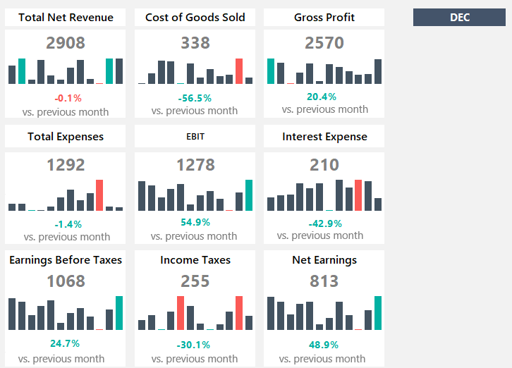
The next part of a card is the actual value. Type an equal sign and link the data from the Data Worksheet to the Dashboard Worksheet.
To calculate the variance between the selected and the previous month, use the formula:
=IFERROR(IF($T$7=$E$6,0,IF($T$7=$F$6,F7/E7-1,IF($T$7=$G$6,G7/F7-1,IF($T$7=$H$6,H7/G7-1,IF($T$7=$I$6,I7/H7-1,IF($T$7=$J$6,J7/I7-1,IF($T$7=$K$6,K7/J7-1,IF($T$7=$L$6,L7/K7-1,IF($T$7=$M$6,M7/L7-1,IF($T$7=$N$6,N7/M7-1,IF($T$7=$O$6,O7/N7-1,IF($T$7=$P$6,P7/O7-1,"")))))))))))),0)Then, copy the formula down to get the value for all cards. Last, you can apply an optional step to make the profit and loss dashboard easy to read: apply conditional formatting!
Additional resources: