Today’s guide explains everything you need to know about the financial dashboard template – or P&L report, as it’s known. First, we’ll show you what it is and why delivering an overview of its liquidity is important.
Our goal is to focus on data visualization, not data entry. We’ve created modern charts to visualize the most important financial metrics and trends.
Before we dive in, if you want to learn more about Excel dashboard templates, you should check out our training video!
Create a Financial Dashboard with Ribbon control
In the example, we use a simple and clean structure. The financial dashboard uses a grid layout and cards to provide the best user experience. We’ve used advanced chart types and a grid layout in Excel for better readability.
You can control the dashboard through the ribbon using icons to create easy navigation. You’ll see the code under the hood if you download the template.
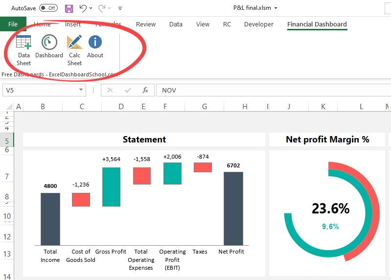
You must focus on the navigation structure when you develop and create complex reports and templates with multiple worksheets.
As usual, we’ll follow the main design rules and use three Worksheets: Data, Calculation, and Dashboard. This layout is the best practice if you are in dashboard design.
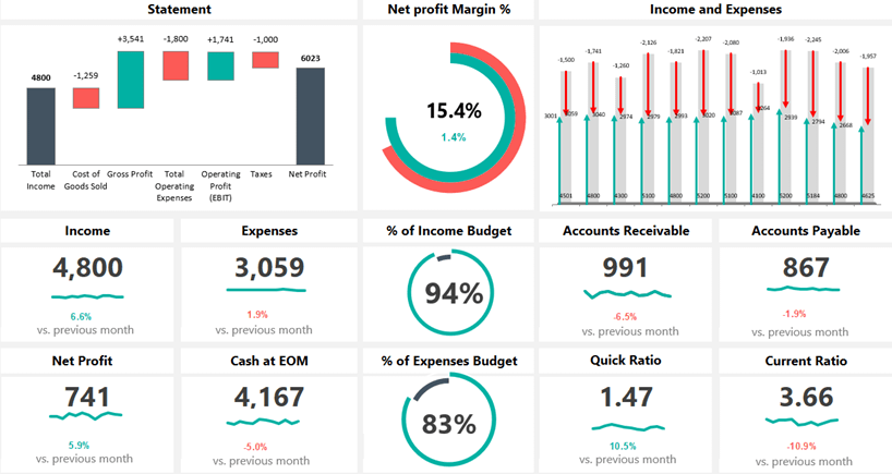
Key Performance Indicators
Here is the list of financial metrics:
- Income
- Net Profit
- Net Profit Margin %
- Expenses
- Cash at EOM
- Quick Ratio ((Current assets – Inventories) / Current liabilities)
- Current Ratio (Current assets / Current liabilities)
- Accounts Receivable
- Accounts Payable
- % of Income Budget
- % of Expenses Budget
- Net Profit versus Target
Financial dashboard logic, in a nutshell
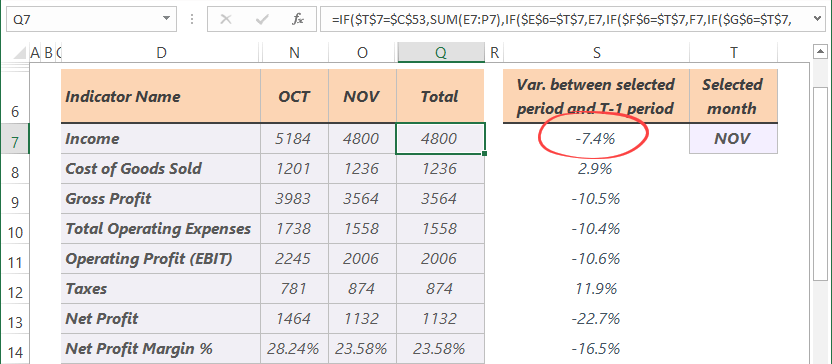
First, you can add your data to the “data” Worksheet.
We’ve created three sections for the KPIs in this financial dashboard example. First, place your monthly results.
As you see, we’ve applied simple calculations. Next, use the nested IF function (combined with the IFERROR function) to identify and show the results of the selected month.
Let us see the calculation sheet. As we know, conditional formatting is key when showing the target vs. actual performance. We’ll use standard color codes for the positive and negative variance.
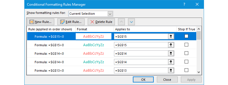
Tip: Be careful with the conditional formatting rules!
Some metrics (for example, Expenses, Accounts Payable, etc.) work “reverse”. For example, if the Expenses increased vs. the last month, you must use a red color because it’s a negative trend.
We build a new template library on Excelkid.com!
If you want to visualize the monthly/yearly performance, we recommend using the chart types below:
Download the template and play with our modern dashboards.