
In this article, we will explain how to use effective dashboard design in Excel using grouped shapes and mockups to create a dashboard layout.
If you are working with templates, the proper design is essential.
Dashboard Design: Layouts and Mockups
What is a dashboard layout?
A dashboard layout prototype demonstrates the final design for the given department or management. It is very important to make the wireframe design before we invest considerable time and money to realize the report when we build a good dashboard UI prototype that helps to reach our goals.
What is a visual mockup?
The mockup that we create is only a visual complement. Nevertheless, of course, we think its creation is important. Why? Creating a layout takes much less time and expense than rebuilding the structure after completion.
What is the purpose of a user interface (UI)?
With its help, we can effectively support the planning phase. We want to underline the importance of this step. Think of it as if you are laying the foundation of a house.
Let’s stop here for a moment!
The planning phase does not substitute an exact specification but complements it. The wireframe will not describe how the completed framework should work! This is the task of the specification phase.
Within the frame of this, we set the user needs.
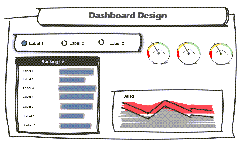
Explanation: Let us review together the effect of the dashboard UI prototyping. Before working with shapes, we should know exactly what result we want. What kind of requirements does the final presentation have to answer? In the figure below, we show an example of a typical layout.
Build a Dashboard Layout using Grouped Shapes
Because our goal is to create a sales spreadsheet, the task of the Business Analyst is to meet and coordinate with the manager of the given organizational unit or company. After this, we can start the actual work! Our service has various tools to make the above-mentioned wireframe or similar designs.
Now that we have explained the role of the mockups in the design, it is time to talk about the realization. We should know about the mockups they’ve grouped vector objects, namely grouped shapes. We can create all kinds of dashboard UI components! The limit is set only by your imagination. This chapter will show you how to make complex shape-based layouts for diverse usage.
Don’t forget! It is a lot easier to modify a mockup than an already finished spreadsheet! The utterly brave can use paper and pencil, but we prefer Office (Word, PowerPoint, or Excel).
How to Design a Custom Dashboard UI in Excel?
Here’s a little surprise for you! We make available a downloadable pack free of charge for those whose daily task includes dashboard design.
We have divided the pack into two sections:
Chart Mockups
You can also download the most known chart types and the newest generation charts. In the picture below, we only show a fragment of the type of charts we have made the mockups of. We have built every type of chart that Excel supports, and it would take a long time to list all of them, so we have highlighted the most important ones.
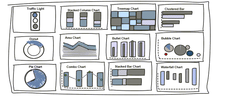
Our mockup collection also contains advanced chart types: gauge, treemap, traffic lights, and sales funnel.
Form Control Mockups, Tables, and Headers
Form controls provide interactivity to the spreadsheets. We thought we could make form control mockups with the help of shapes. With this, we can greatly support the dashboard layout design. Tables, headers, and buttons are indispensable additions to layouts. In the figure below, you can see some useful shapes. This section contains those controls by which a static dashboard becomes dynamic.
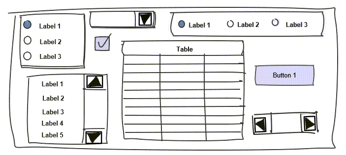
- The Label is a text field where we can put descriptions and short instructions for the user to see how things work quickly.
- With the help of the Group Box square, we can switch very easily between groups, names, and lists.
- The button’s name is talkative: if the user intervenes, namely pushes the button, a short task or even a VBA macro will start.
- Use the check box if you want to apply multiple selections so practically, we can give complex conditions.
Effective Dashboard Design using Grid layouts
Check this typical grid layout below! A common practice is that an organization or organizational unit uses consistent schemes. This means the information flow between departments is provided using already-defined structures or schemes.
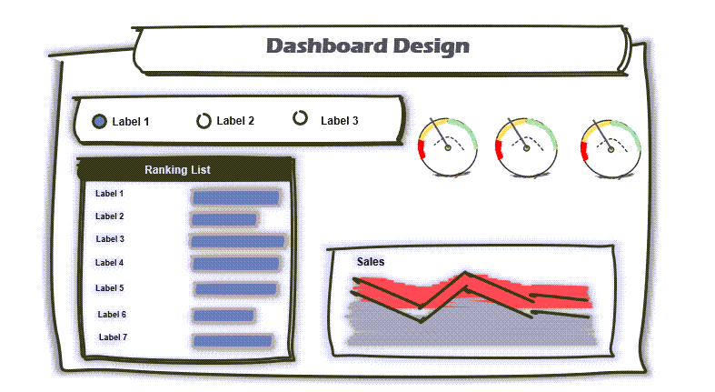
Besides the professional looks, the company’s co-workers can interpret the information.
Apply Corporate color schemes and typography
After the department has decided on the grid dashboard layout they will use, the color scheme and font type can be assigned to the report. Make a template that contains the following style, color codes, and font types.
Key benefits of implementing flat color schemes:
- It draws the eye to details
- Information on the main sheet is more easily readable
- Simplified the menu structure
- Flat color schemes and typography are attention-grabbing
Conclusion: Create a proper Dashboard Design and save your time!
Briefly summarize the introduced knowledge about UI prototyping and dashboard layout design. On the one hand, making a reusable mockup considerably decreases the time consumption of development.
Additional resources: