Ultimate Dashboard Tools is a powerful chart add-in for Excel. Improve your dashboard in seconds using visual storytelling.
UDT chart add-in has reached a significant milestone! Join 150,000 professionals worldwide and make smarter decisions faster. We deeply thank our valued customers for their steadfast support and trust in our product. The chart tool supports advanced visualizations like the Sankey Diagram. It is good to know that zero programming skills are required.
Take a closer look at how the chart add-in works!
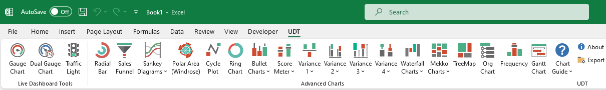
Features
- Gauge and Dual Gauge Charts
- Sankey Diagram
- Radial Bar Chart
- Windrose Diagram (Polar Area Chart)
- Mekko Chart
- Sales Pipeline (Sales Funnel)
- Bullet Graphs, Waterfall Charts
- Org Chart Creator
- Score Meter Chart
- TreeMap Chart
- Traffic Light widgets
- Variance Charts (8 types)
Compatibility
Windows version: Excel 2013, Excel 2016, Excel 2019, Excel 2021, and Microsoft365 (Office365)
Mac version: Excel 2016, Excel 2019, Excel 2021, and Microsoft365 (Office365)
Download the documentation (which contains chart examples) for more information about the chart tool. Take a closer look at the functions! The zip file contains the user guide and Excel chart examples.


If you have further questions, check the FAQ!
Pricing
We provide various payment gateways through Stripe and PayPal.
We offer HUGE volume discounts on purchases of 2 licenses or more. You can install the add-on of up to 5 Workstations. If you are an Excel instructor or a team leader, you can provide group training cost-effectively to maximize shared learning.
Ultimate Dashboard Tools – Excel Add-in – Chart Examples
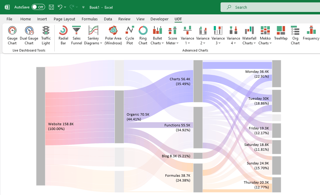
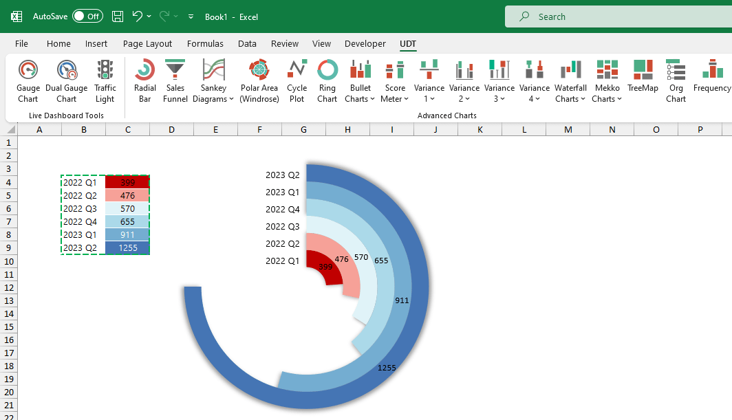
Sankey Diagram
Sankey Diagram is a brand new visualization in UDT; it shows relationships between different data points. With its help, you can create flow diagrams and various breakdowns in seconds. Visualize your customer journey or analyze your website traffic using the Sankey diagram.
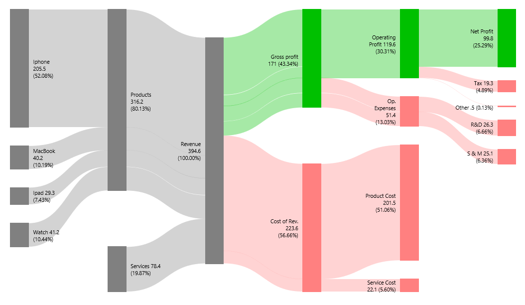
Sankey Diagram for Income Statements
A new feature debuts in v11. After several months of intensive coding, our dream has finally come true, and now you can easily convert an Income Statement into a Sankey Diagram.
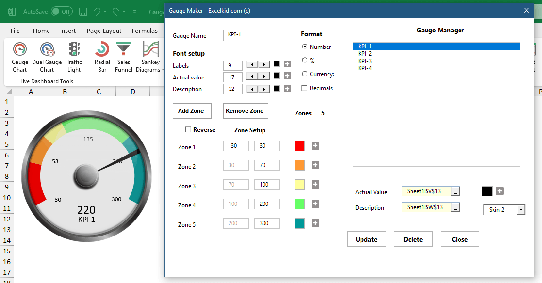
Gauge Chart Builder
Creating Gauge charts in Excel is easy if you use automated solutions. Connect the actual value to the gauge in a single click, add multiple zones, and customize your zone colors. The latest version of UDT enables 12 zones for gauges.
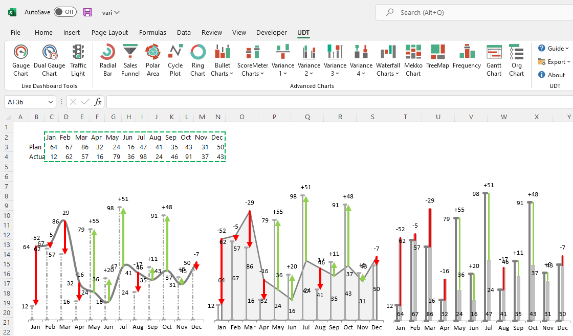
Variance Charts
Look at this powerful section; you can create various variance charts with a single click! You only need to highlight the plan and actual data rows. Good to know that the dynamic chart principle is also in effect. If we change the value of one cell, then the chart will change in real-time.
Radial Bar Chart
A radial bar chart (circular bar chart) is an eye-catching visualization. We’ll fully support Excel’s latest data visualization trends in future releases! The primary function is comparison. First, select the data and click the Radial Bar Chart icon.
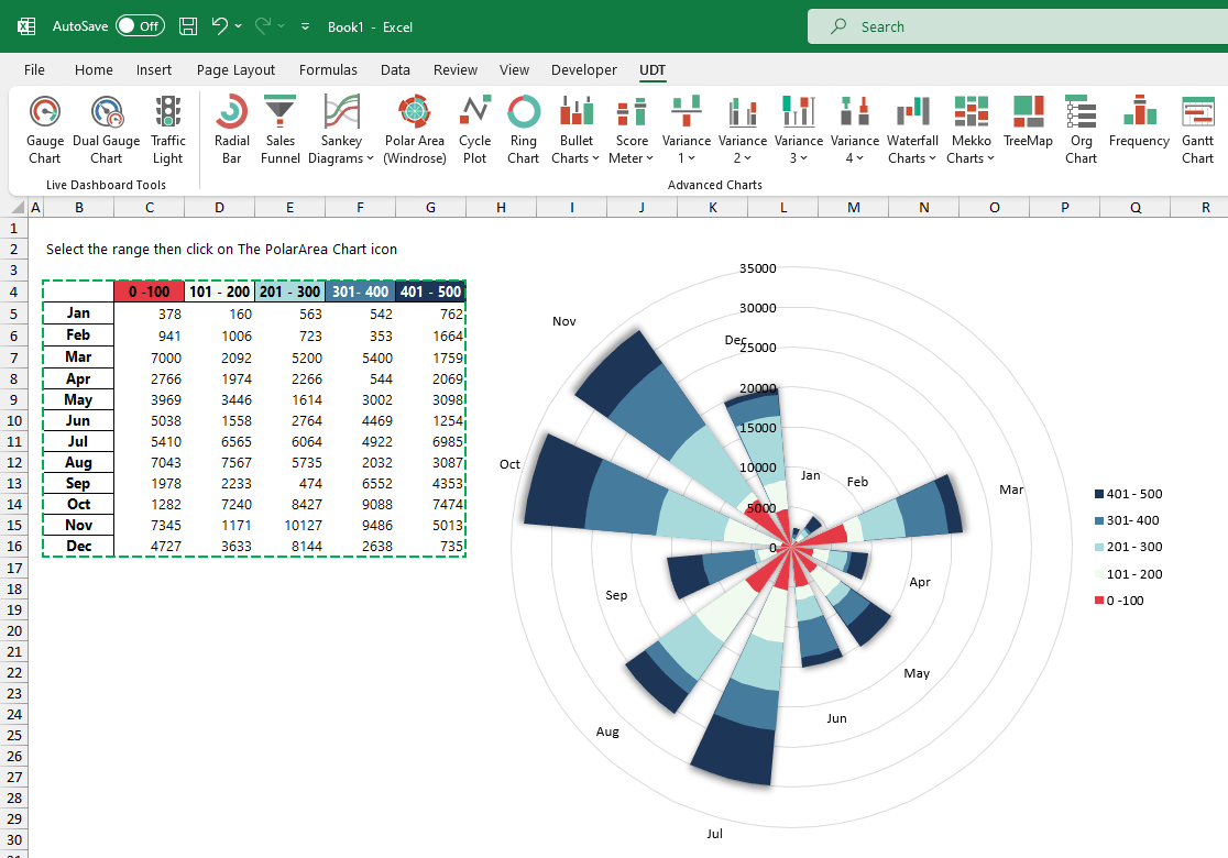
Polar Area Chart
Use the polar area (Windrose chart) to visualize the sales distribution easily. The polar area chart presents data in a circular format; the length of each slice around the circle indicates what you want to measure. In the example below, we display the sales distribution for 12 months. Looks great!
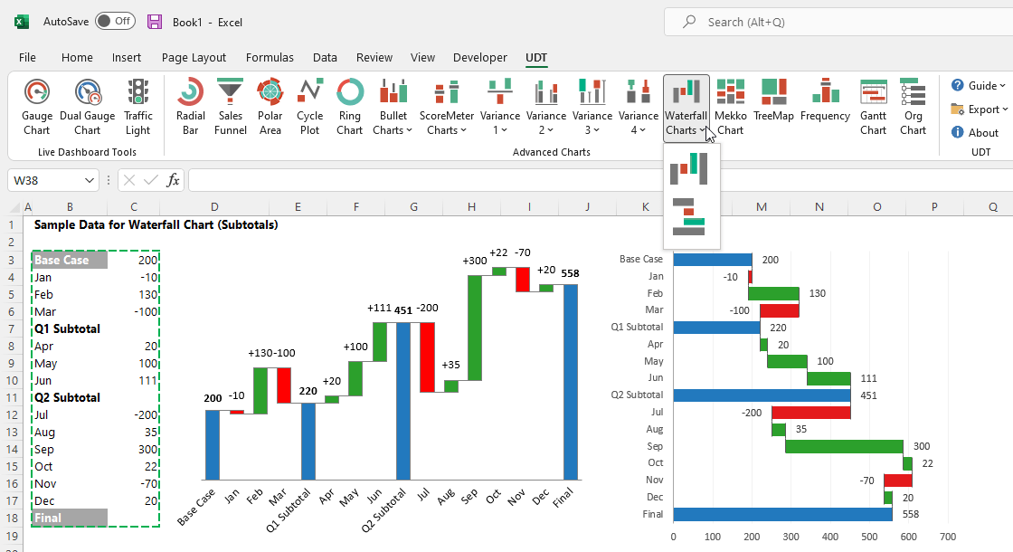
Waterfall Charts
A waterfall chart is great if you want to show the positive and negative contributions to the net value. By default, Excel supports horizontal Waterfall charts only. The function provides horizontal and vertical chart types and enables you to use subtotals.
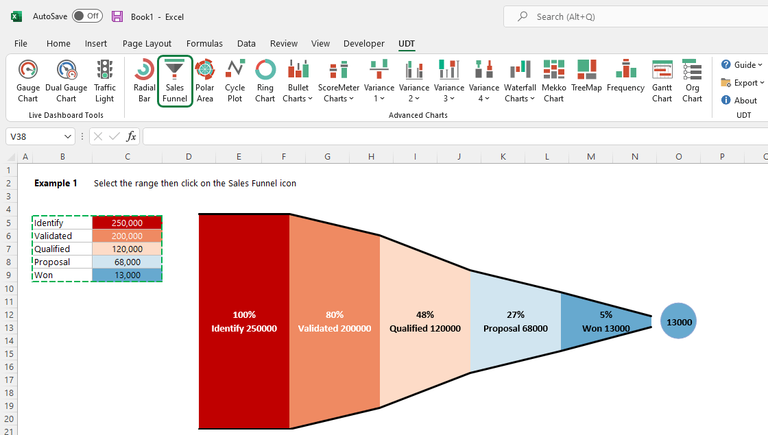
Sales Funnel
If you are in Marketing, this tool is yours. At the top of the sales funnel chart, there are a large number of potential customers. However, at the end of the funnel, only a small fraction of these customers purchase your service or product.
The chart helps you to break the purchasing process down. Select all stages you want to visualize and click on the funnel icon. Automate repetitive tasks with our funnel graph so your sales team can spend less time on data entry!
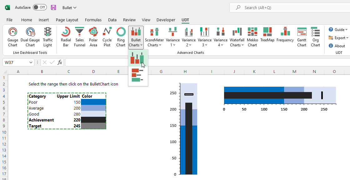
Bullet Graph
Bullet charts are a variation of a bar chart developed by Stephen Few to display multiple measures and create easy-to-read visualizations. In addition, the bullet graph is a space saver, and you can use it vertically or horizontally.
Sharing Dashboards
The add-in creates portable dashboards. Share your work with colleagues or with your boss! First, install the add-in, then create and modify advanced charts. You can view the dashboard without trouble if the add-in is not installed.
Our Partners