
This guide will show how to create a Sankey Diagram in Excel. Use the UDT chart add-in to create stunning data visualization in seconds.
By offering insights into energy, material, or information transfers, these diagrams are important to enhancing efficiency, understanding system dynamics, and making informed decisions.
Table of contents:
What is a Sankey Diagram?
The Sankey Diagram converts information into accessible, visual insights, highlighting areas that might require attention or intervention. These visualizations are more engaging and understandable compared to traditional numerical data or boring reports. In addition, you can recognize patterns in a few seconds.
How to Create a Sankey Diagram in Excel
Excel does not have a native for Sankey diagrams. Creating a Sankey Diagram in Excel is a complex task without using 3rd party add-ins like Ultimate Dashboard Tools. The add-in provides a user-friendly interface to create these diagrams without getting into the coding.
Here are the steps to create a Sankey Diagram in Excel:
- Install UDT chart utility for Excel.
- Select data, then click the Sankey icon.
- Choose your color theme
- Click OK.
- The Sankey diagram is ready.
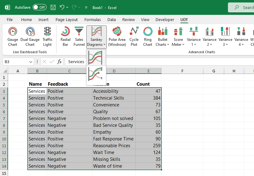
Here is a sample data set:
After clicking the icon, you can choose various color styles.
The result:
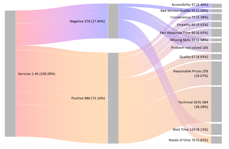
Looks great.
Okay, the question is: is it possible to create the diagram without an add-in?
In short, the answer is no. Even if you are an Excel ninja, Excel has some limitations. Developing complex visualizations in Excel requires high-level programming skills in VBA or .NET.
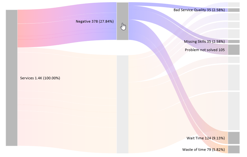
Dynamic Sankey Chart
When you are creating a chart, it is great if the result is dynamic. Click on any stage to closely examine how the data flows between two or more categories.
Conclusion
So, whether you’re trying to save energy at home, run a giant company, or figure out traffic patterns, Sankey diagrams are important. The main point is that they help turn “What is happening?” into “Oh, I see now!”
We hope you enjoyed this small introduction. Learn more about chart templates!