Improve Dashboard UX! We’ll show you how to create contextual help using VBA and then how to improve the user experience. Build elegant screen tips step-by-step.
First, we will explain how to add useful contextual help to our spreadsheet. Then, we will discuss how to boost user experience using an interactive help system.
You will find the answers to this question after reading the following tutorial. You are looking for a solution for another business issue that can interest many Excel users or managers. Take a look at our dashboard templates!
Differences between UX and UI
The UI is a series of screen mockups, charts, and visual elements. These controls enable a user to interact with the spreadsheet components. Dashboard design is a crucial part of the UI. Typical user experience design elements are improving usability or enhancing customer satisfaction. The end-user’s interaction with the spreadsheet or software is the key element of the user experience.
Create Contextual Help for Better Dashboard UX
Just a few words before we start. Let’s start with that unfortunate case when you work on a project for days, maybe weeks. You believe in rescuing the world, and in the end, something is wrong.
It’s nice and good; you might calmly relax, but there is such a significant volume of data on it that the outside user (your boss, in most cases!) will not find his way around it. You can all agree that this is a very problematic situation.
Contextual help can dramatically improve the user experience of an interactive dashboard template. How can you help with this? As a solution, you will use a little programming. Don’t get discouraged by this! You will need only minimal knowledge.
We are using Microsoft 365 to create contextual help. The double-click-based writing into the shapes works fine.
How to improve your Dashboard?
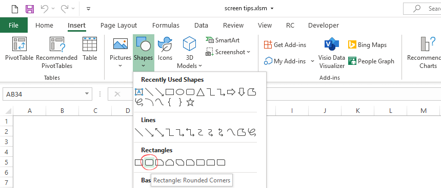
#1. Insert a Shape
Go to the Insert tab on the ribbon and select the ‘Shapes’ menu. From the list of the shapes, select and insert a rounded rectangle.
#2. Format the shape
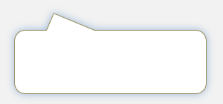
Sometimes, the inserted object has issues, and the shape contains a background or border. For example, we need a white background and grey text. To change the style, select the object.
Use the Shape Fill and Shape Outline options to improve the readability. Finally, apply a shadow! After the changes, our box looks like in the picture below:
#3. Add Explanation to screen tips
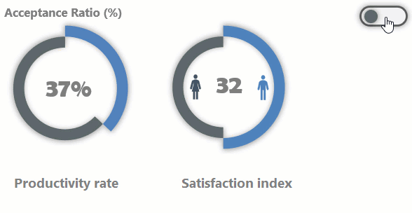
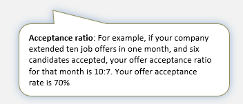
Now, enter the right definition of acceptance ratio: “For example, if your company provides ten job offers in one month and six candidates accepted, the offer acceptance ratio for that month is 10:7. Your offer acceptance rate is 70%.”
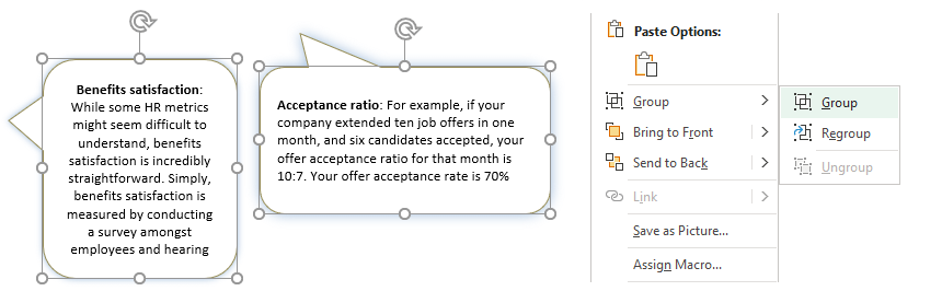
#4. Group Shapes into one object
Because I want to use two infoboxes, repeat the steps mentioned earlier. If we have two formatted shapes with proper text, follow the steps below:
- To create a group, press and hold the Control key and select all rectangles.
- Right-click and select the Group option from the context menu.
- Click on the Group command to merge the boxes into one object.
You can see the action in the picture below:
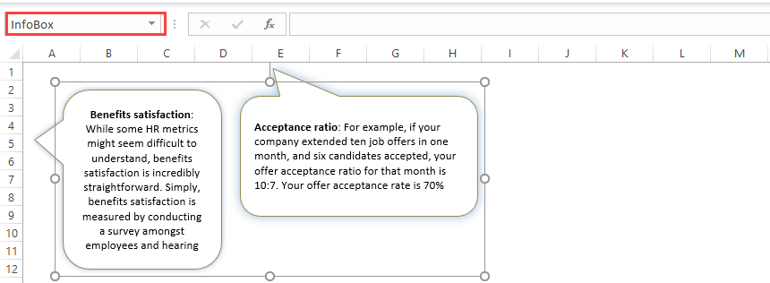
#5. Name the Group
Our screen tip is almost ready. Only a few steps remain: to add a name for the merged objects. To do that, select the group. Locate the Name Box field. The Name Box appears in the top-left corner of Excel. Try to use a simple but proper name. We’ll use it in our VBA code.
In the example, we’ll add the name ‘InfoBox’ for the group.
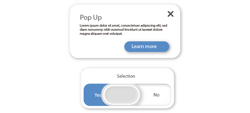
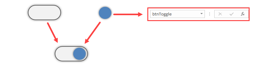
#6. Insert a switch button for the screen tips
Insert an icon for the switch button. You can use Microsoft Excel’s built-in icon library. Go to the Insert tab and insert an icon.
We’ll create an animated switch button to improve the report’s usability. Insert two shapes! The next step is to add a name for the blue toggle button. In this case, ‘btnToggle’
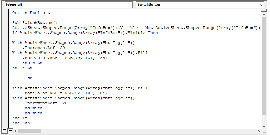
#7. Write a VBA code
We want to animate the button! Create a small VBA engine to move the button. This trigger will show or hide the screen tips and change a button’s color from grey to blue. If the marker is blue, the screen tips are active. Elsewhere, the button is grey, and the contextual help remains hidden.
Press Alt + F11 to reach the VBA editor. Create a new standard module and add the code below.
How do the Screen Tips work?
To animate the button, we will assign the code to the shape. To do that, right-click on the object! Choose ‘Assign Macro’ from the context menu.
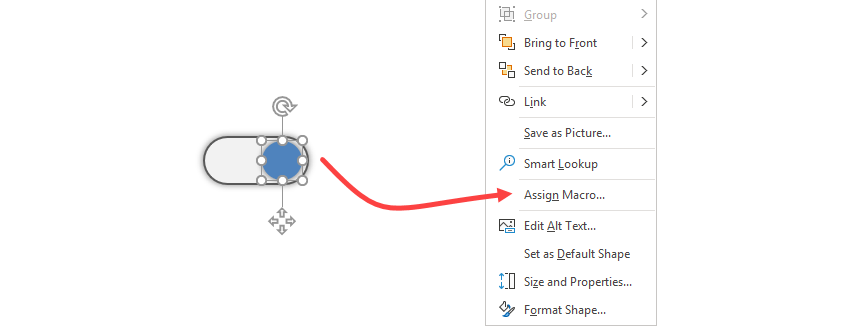
Select the ‘Assign Macro’ option. A new window appears. Select the ‘SwitchButton’ macro and assign it to the button by clicking OK.
Conclusion
Contextual help in Excel is a simple but effective way to improve dashboard UX.
Additional resources:
- SEO Analytics Dashboard
- Create a ribbon navigation menu
- How to change shape color based on a cell value