
SEO Analytics Dashboard in Excel! The owner of each website feels that it is important to get an overview of the site using KPIs.
Discover more dashboard templates!
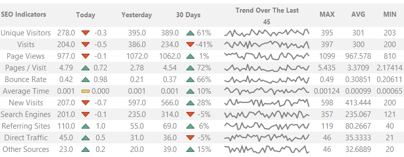
Measuring Website Performance
Unique Visitors are those visitors that visit the site at least once on a given day. If there is more than one search from the same IP address in the statistics, we must consider it unique.
The following important indicator is the Bounce rate. With the help of this, you can analyze how many percent of the visitors leave the website after looking at only one page.
The Bounce rate is the key performance indicator; everything is all right if the values are between 30-50%. When making a homepage, it is worth paying attention to urge visitors to stay on the site for more browsing.
We can be satisfied if the indicator is the lowest possible. For example, the Average Time usually shows how much time each visitor spends reading articles. Here, the higher indicator is better.
The New visits, of course, show the number of new visitors. In the bottom four rows of the chart, we can see those factors that indicate the source of the real traffic. Following the usual practices are Google or Bing search engines, referring sites, direct traffic, and other sources.
SEO Analytics – Under the Hood
Using our template, you can give a snapshot of current performance and direct your goals for future improvement. Here are our main SEO indicators:
Let’s see the most exciting part; we will say a few words about the operation of Excel dashboards.
The first column shows the current daily information and the change in % (this can be positive or negative according to the color of the arrows).
The second column shows yesterday’s status; the third shows statistics from 30 days earlier. We have set the markers using conditional formatting and built-in shapes.
You can use icons or the well-tried red-yellow-green traffic lights.
Check the Trends using Sparklines!
Trends serve two kinds of purposes. First, we make assumptions from past data and, on the other hand, make predictions or forecasts.
In previous articles, we wrote about the use of sparklines. We had good use of it, making the dashboard now.
As you can see in the picture, we have used the occurrences of the past 45 days. It looks good.
One more important thing about trends: we designed the dashboard to adjust the number of days in the trend cell freely.
If you change the current default parameter, you can automatically see the period you chose, so we save you from the trouble of drawing the chart.
Download SEO Analytics Dashboard
We hope that with the help of the template, you can track the indicators you own more simply.
Our conception is still the same; we make everything on the site downloadable for free.
Additional resources: