In this tutorial we’ll show you how to use excel sparklines. In Excel 2010 and Excel 2013 we can use a new chart type named sparklines.
Sparkline are mini charts located in single cells, each representing a series of data in our range. It help bring meaning and context to numbers being reported and, compared with a classic chart, are meant to be embedded into what they are reporting.
This chart type in Excel enable you to see trends using small space on your dashboard template.
Select the cells we want your chart to be in. In the example we will create and use three cells.
Select the range from Cell K5 to Cell K7.
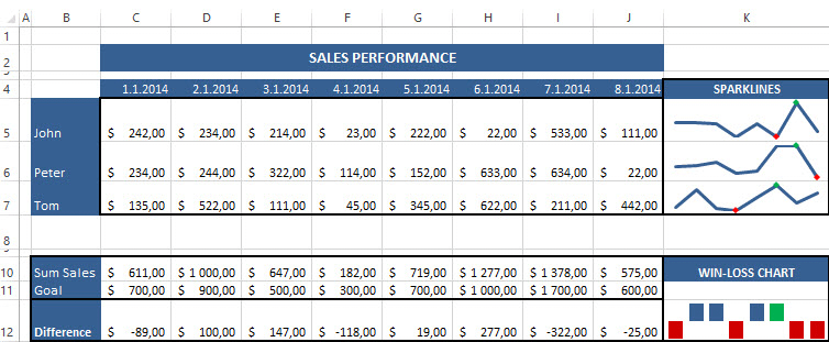
Next Click the Insert ribbon and select a sparkline type and chose the Line style.
Select the cells that contain the data we want charting using sparklines. Once we have done that, click OK.
Using the Design tab on the ribbon, we can completely customize our mini charts to match whatever visual style we need.
In the sparkline colour section we can choose the line style. In the marker colour section we can choose the colours of the marker the higher and lower value.
Set the green colour marker for the highest value and set the red colour for the lowest value.
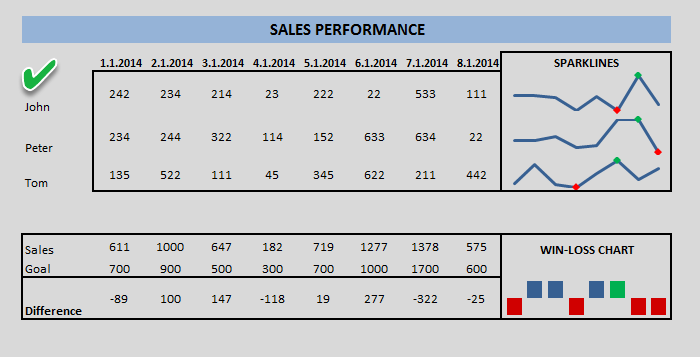
Excel Sparklines – Win-Loss chart
Here is a next question, what is Win-Loss sparklines and how to create win-loss chart?
Here is another Excel sparklines and chart types, is called Win-Loss mini chart. This sparkline displays an upward working on marker for plus values and a downward facing value for negative values.
This type of chart enables you to zoom on general trends. You can find many uses, such as sales performance direction. It can be used to monitor and analyse a summarized sales results and the differences.
Win-Loss chart can be used to track if something happened in a specified time period.
In this example, Win-Loss sparkline cell is showing 8 months of sales data and comparing it with the Goal for each month. We will create a chart for displaying the difference for each month.
Click the Insert tab on the ribbon and select a sparkline type then choose the Win-Loss sparkline style.
Select the cells that contain the data we want graphed by win-loss sparklines then click OK.
The Win-Loss sparkline chart displays profit versus loss or positive versus negative values. Thanks for visit our website! You can download this free excel template.
Additional resources:
Download Free Excel Chart Templates