In this guide, you will learn how to create an HR Analytics dashboard in Excel through useful examples and download free resources.
It’s time for us to show you how to build a custom HR template.
If you are an HR leader, your goal is to monitor the company’s human resources. We will examine six departments.
These are the following: Accounting, Administration, Finance, Human resources, Customer service, IT, Marketing, R&D, and Sales.
Don’t forget to use the one-page dashboard rule and show the main metrics on a single Worksheet.
HR Analytics Dashboard – Metrics and Visualization
In connection with the HR project, we will display the following key performance indicators: Total Salary, Total Bonus, Total Overtime, Total Sick Days, and average related to these indicators.
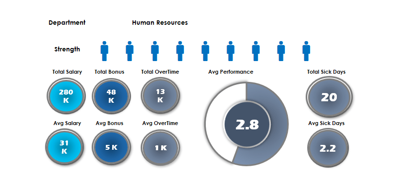
In addition, we will evaluate the average performance on a scale from 1 to 5. First, select the department you want to analyze with a drop-down list. You can find the departments on the ‘Data’ Worksheet.
In general, we place the data source of the HR analytics dashboard in the ‘Data’ Worksheet. So it is easy to separate the data from the final dashboard. If you need to change the source, modify the ‘Data’ Worksheet.
Use the VLOOKUP and SUMIF functions to create a live connection between Worksheets.
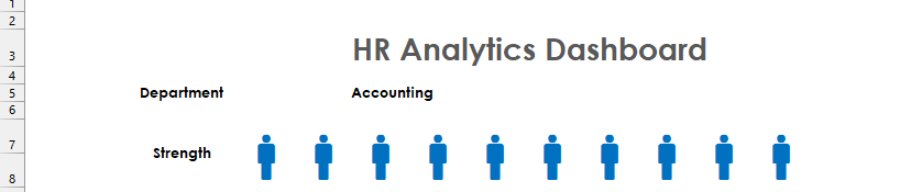
After choosing a department, use the well-tried REPT formula and the Webdings font and display the department’s size.
The number of displayed figures determines the number of co-workers in the given department. If you are making a different nature of the dashboard, then you can use other special characters of the Webdings fonts. For example, you can choose from the symbols below.
The people graph determines the number of co-workers in the given department. If you are making a different nature of the dashboard, then you can insert other special characters of the Webdings fonts. For example, choose one from the symbols below.
We highlight the symbol that we want to use.
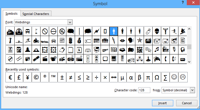
You can insert the symbols with the following method:
The symbol button on the Insert tab launches the Symbol screen, which includes two tabs. The Symbols tab has lots of features. For example, you can pick a Font and a set of unique characters.
Subsets provide groups of related symbols.
For example, use the Subset menu to switch to people symbols. When you locate the character you like to use, click Insert. Finally, double-click to embed a symbol to complete the HR analytics dashboard.
HR Analytics Dashboard – Using Shapes
The Excel shape is a vector object we can use to make our dashboard presentation more spectacular. There is no ‘magic’ here; we have placed 1-1 different colored (blue and white) circles on top of each other, and they also partly cover each other.
With the help of a simple text box, we can assign arbitrary values to every vector object.
Excel lent us a hand in many problems, and it didn’t let us down today, either. If you want to look at this template, you can download it here.
Create a Dynamic HR template using linked pictures
In the second part of the tutorial, we will build a dashboard that uses special methods. Like before, our principal is to create a simple dashboard that is great for a quick analysis.
Our primary goal is to understand the basic rules of dashboards fully. So we’ll use the drop-down list again!
Components of HR Dashboard
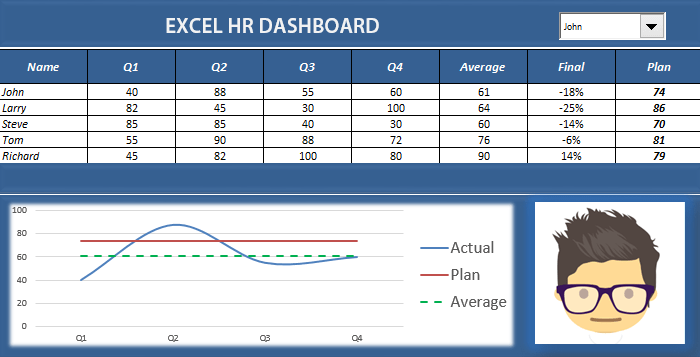
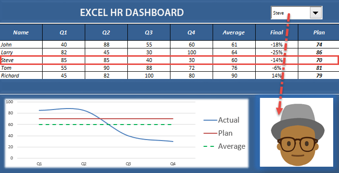
Let’s see the dashboard components: In the first column are the names; we can find the quarterly data in the next four. Finally, the sixth column contains the average performance, and the seventh is the qualifications.
You may convert or replace the qualification base settings as you wish (you can find these in the Final column). Finally, the Plan column shows the planned values.
Let’s see how the chart works! We will always show the chosen co-worker’s achievements in a plan versus the actual breakdown on the chart.
The blue line shows the quarter achievements, and the green shows the average achievements. Finally, the red line represents the expected (planned) values. Thus, we can see that, in this case, the chosen co-worker has accomplished under expectation.
Using a profile picture in the HR Dashboard
How do you use a profile picture to improve the design? It is possible in Excel. We have the opportunity and only need a little creativity.
If you want to look at the linked picture method, check the calc Worksheet. It is a simple but effective method.
In general, we can also say that creating an Excel dashboard is enough to use a 1-1 small new idea, which brightens up the result. So, keep that in mind.
Additional resources: