The customer service dashboard will show how to track and display activities using an easily readable dashboard. Customer service takes care of the customer’s needs by delivering professional service.
Previously we have touched on this subject, and today we will show how to create a customer service dashboard using interactive drop-down lists, conditional formatting, and sparklines. Our secondary goal is to process a large amount of data efficiently.
Before we take a deep dive, it’s worth creating an initial layout. Check the draft below, and using this, we can build up the dashboard quickly. If we need to build a dashboard, always draw a little preview sketch or use widgets. If we leave this step out, we quickly get lost in the sea of data.
Let’s see the initial conditions.
In the example, the call center will provide six different products. These are Sosa Teletech, Globocorp, Cryptomantics, Kilosys, Stormy Design, and Orange Corp. We have given these funny names for the marketed products.
In reality, these, of course, don’t exist. PrimeFlux, High Falcon, DriftPulse, Bitter Thunder, Hollow Cobra, and FrostWard. The calls will be in 6 regions for simplicity. These will be Regions 1-6.
Using Excel Tables
First, we’ll create an Excel table containing the dashboard data. See the column header area. Let’s see the initial data set:
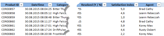
From left to right can be seen the ID number and time of the call, name of the product, name of the region, the name of the client (company), duration of the call, and a YES / NO flag that determines the success of the call, customer satisfaction index and name of the employee.
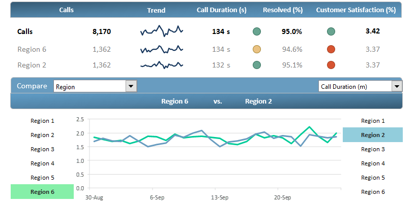
Customer Service Dashboard – KPIs
We can analyze the following information on the dashboard header from left to right.
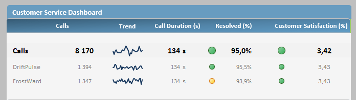
The first three rows on the top of the customer service dashboard have a double function. The first row’s data summarizes the main indicators during the examined period. The values of the second and third rows are dynamic.
Their value depends on which two indicators are highlighted in the given category (product, agent, etc.). We can see the performance of two agents, two products, or two regions.
We can compare these indicators with the average values in the first row. In the analysis, we will process information accumulated in almost one month. The 8170 calls are in the second column, representing all the calls.
The trend is that a mini chart uses sparklines to display the whole time interval. Call duration(s) is a perfect index for examining the length of the calls. The resolved calls (%) definition is simple and contains the successful calls.
Customer satisfaction (%) is a perfect KPI in this field. With its help, we can measure customer satisfaction on a scale from 1 to 5.
KPI Configuration
The KPIs can be configured freely using conditional formatting rules. Here we have used deliberately strict settings. For example, the indicator must be over 95 % for an accepted call.
In this case, the green circle shows that everything is OK. The general dashboard rules are valid here also: yellow is medium, and red represents an unacceptable value.
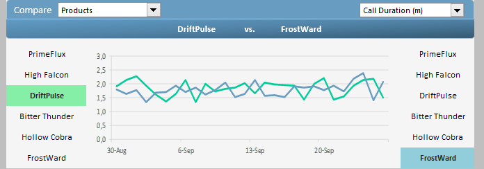
And finally, let’s see the second part of the customer service dashboard that does the comparing analysis.
In the first part of the article, we have said that we can do, for example, comparisons product by product. In the figure below, you can see an example of this.
The subject of the analysis is the ‘Driftpulse’ and ‘PrimeFlux’ products. With conditional formatting (and with some VBA programming), we have accomplished that the currently highlighted products separate from each other using the right colors.
We set the colors of the line charts to this.
What do we see in the picture?
We can select two products using the drop-down list. Then, it is easy to analyze the selected KPI (in this case, durations of calls) in a given period. As we can see, we displayed the achievements in the daily breakdown, and it is evident that the longest call was 2,5 minutes in the case of the ‘PrimeFlux’ product.
We can choose (Products, Regions, Agents, or Client Categories). You can also use the right side menu (Call Duration, Calls, Resolved Calls), so we can do 12 kinds of quick analysis only in seconds.
Final thoughts
We hope you find this guide very useful. And we don’t have to stress that you can reconstruct the dashboard to your liking by modifying data and categories. If you want to dive deeply into conditional formatting, read our definitive guide.
It has everything that a good report needs: data visualization, key performance indicators, charts, and drop-down lists. Of course, we recommend checking our gauge visualizations too!
We await your feedback on our Facebook page!
And finally, the most important thing: the Customer KPI Dashboard can be downloaded from here!