Excel sales tracking templates provide helpful information about sales performance to improve your business and move down your sales funnel.
What are sales tracking and activities?
When we talk about sales, we can approach the task from many different directions. The main business goal is tracking all the activities and procedures influencing sales. The analysis reviews sales activities during a specific time frame to recognize trends and compare actual performance with targeted performance.
We can create simple forecasts using sales-forecast charts. However, we instead use more dynamic sales tracking templates that demonstrate the development of KPIs. Use our comprehensive guide of sales-related Excel templates, and you can give an overview of sales activities to refine your sales process. It’s important to set practical and achievable business goals. You can use and easily manipulate these templates and transform them into actionable reports.
We want to create an Excel sales tracker to repay our’ dues.’ Many different Excel reports and gauge templates have been introduced recently, although classic templates can never be enough.
In building the sales template, our concept was to show the sales data of seven products within 30 years. In our case, the template can examine the period between 1985 and 2015. We display values in USD and percentages also. The following section discusses the most important thing: design and how it works. The question remains: is it possible to push a massive amount of data into only one dashboard? Our answer is yes, although there are extreme cases when we need to use tricks. First, we’ll show you a sales tracker that everyone understands.
Using a scrollbar
Using a scrollbar in Excel, we can step year by year, as you can see on the left-hand side of the picture. At one time, we can dynamically display the data of 8 years in one window, and in the middle of the window, we can see related current data to these years.
When choosing one product, the sales tracker automatically highlights the cells corresponding to the selected product. So, our eyes can’t wander but can concentrate immediately on the critical information.
With the radio buttons, we can easily choose the displayed data format (USD or %) simply and easily. With this solution, we have already saved space instead of two boards. So we need only use one. You can implement key performance indicators, too. The chart is unique, for we have highlighted the five largest values automatically with green color and the five lowest values with red. With this method, we can send information to the leaders even faster.
Sales Tracking Templates: Visualize sales and profit
This section will show you step-by-step how to create an advanced sales tracker. We have spent a lot of time planning; fortunately, the previously introduced shape kit has helped us contain predetermined interface elements.
We used this when we created the template below.
Let’s get into the middle of it! We divided the screen into four parts and marked them with numbers to quickly understand the connections and sales activity. In the first section, there are three drop-down lists. The general role of the drop-down lists is that they make data grouping, organization, and filtering considerably easy.
There are two things in focus: sales and profit.
In section 1, you can find the central element of the Excel sales tracking template, the menu system that coordinates the data filtering: you chose the sales year, country, and salespeople here.
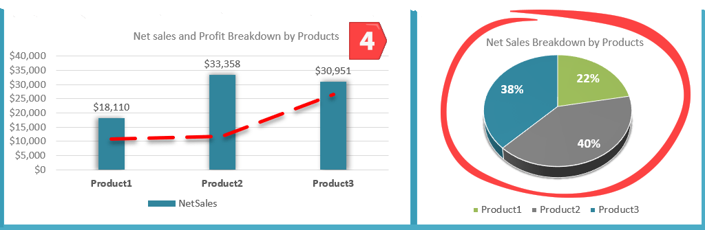
Any change in the current values of the drop-down list will change all the charts. That’s why our sales report is dynamic. Let’s see what explains chart number 1 on the top left and its numbers! In our example, we have chosen sales year 2016, products sold in the USA by salesman Jacob. In this case, the profit was 82,419 USD, with a profit of 49,257 USD. The chart here continues to display further details.
Look at the product-level resolution! The chart details the accomplishment of the responsible sales representative concerning each product. Looking at the picture, we can conclude that to the sum of sales, the products contributed as follows: Product 1 22%, Product 2 40%, and finally Product 3 38%.
Under the percentage, we have marked the sales in USD also.
Summary: on this screen, we can see the sales rep’s sales.
Let us see the second part of the sales tracking template on the bottom left. Again, the net sales value is the same as the previously introduced chart. In this case, the main difference is that we also portrayed the profit with the net sales value. The former is displayed on a column chart; the latter is on a line chart combined on one joint screen.
Net Sales and Profit Breakdown by Country
This combined chart represents the accomplishment by sales reps and profit in product level resolution. Examine the usage of the combined chart closely because it can be a great benefit for us when we visualize different kinds of sales information using a sales funnel chart.
The third part summarizes the data using a combined chart. But, again, the difference can be found in the content of the displayed information. We can find information regarding the given year’s Sales / Profit. It is important to note that these numbers contain the achievements of all sales reps of all the countries in the given year, compared by country.
Product Level Resolution
The fourth part of our sales tracking template chart is a percentage partition, the same as the product level breakdown analysis portrayed in point 1 with a pie chart we used here.
You should know that this kind of chart uses sensible in a maximum of 3 or 4 categories; it becomes confusing if you have more than these. So we recommend you keep this in mind.
Formulas and Functions
We have discussed many things and the details of the sales tracker template, but we haven’t discussed the formulas that help us summarize data. As usual, we have placed the calculations on a sheet called ‘calculation,’ now, let’s review these shortly.
The first of the Excel formulas is SUMIFS. The essential of the formula is that it sums up values based on several conditions.
For example, in Product 1, we have calculated the Net Sales value as follows.
The formula sums based on the values of currently portrayed cells in the drop-down list. So, the base chart looks for dates regarding 2014 in the ‘Dates’ column, then looks for the USA in the ‘Country’ column, and then for the third condition, looks for ‘Jacob’ in the ‘Name’ column.
If these three conditions are met together (as we have mentioned, SUMIFS can be used for several conditions), then it sums up the values from the ‘Net Sales’ column. This might seem difficult initially, but the picture shows the formula.
The calculations for Product 2 and Product 3 are similar. We also use the SUMIFS formula to calculate profit with only that tiny difference based on the criteria. Then, we sum up the values in the ‘Profit / Loss column.
Tracking Sales Activity using Gauge Charts
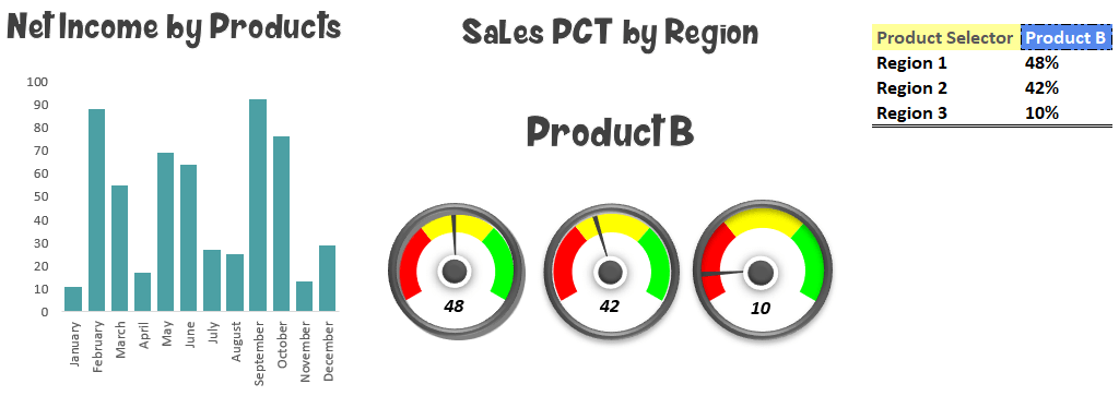
Using sales activity templates, we will create a beautiful sales presentation. Today’s tutorial will show you how to create a complex presentation. The main objects are visualizing four products, three regions, yearly, and detailed data on one screen!
The left-side section contains a column chart. This displays the chosen product’s yearly sales evolution. Finally, on the right side, the regions’ breakdown uses three gauges.
What kind of tools should we use? First, advanced Excel formulas like MATCH, INDEX, and VLOOKUP. Next, we calculate partial results on an additional worksheet. Finally, we display the results on the sales activity template.
Recommended structure for effective analysis
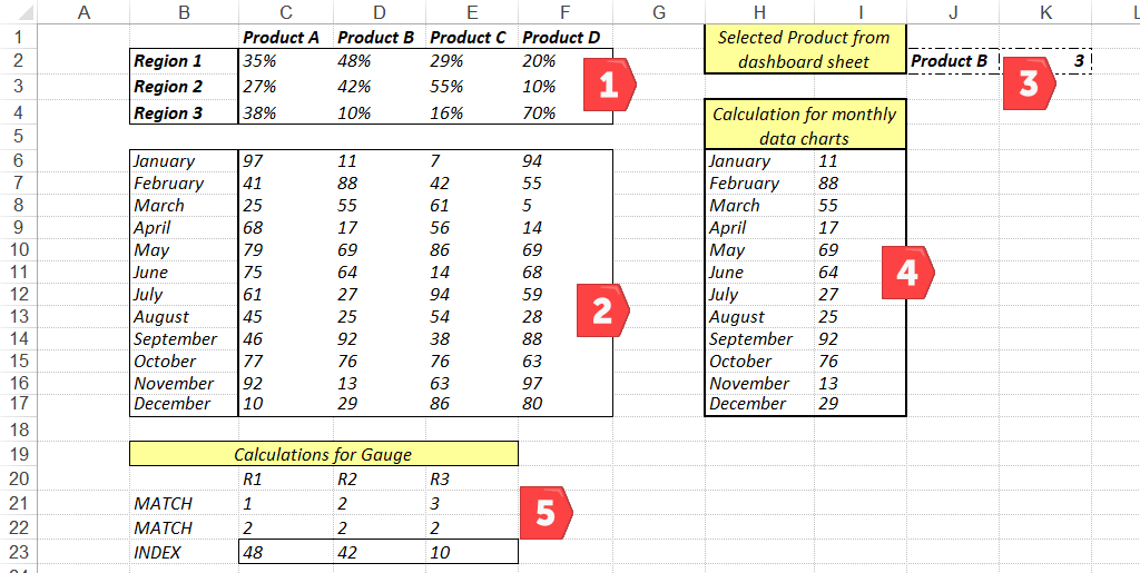
Let’s see the initial data set! The data worksheet contains the initial data set and all the calculations. On the gauge worksheet stored is the basic information of the speedometers (minimum, maximum, and actual values). On the main worksheet, there are the operational elements and the charts. Finally, let’s see the tables on the data worksheet in detail!
The matrix contains the four products and the three regions in the first range. In the second table, we didn’t use a breakdown by region. Here, the emphasis is on the sale values by month. In the third table, the name of the chosen product appears on the dashboard worksheet. With this value, we’ll make further calculations. The fourth table contains the yearly sales of the chosen product in the monthly breakdown. Finally, in the fifth table, we calculate the actual values of the gauges that also depend on the selected product.
Prepare Chart for Sales Activity Template
After this introduction, let’s see all the steps of the calculations! For the region breakdown, we’ve used percentage values. It is the simplest way to unfold the numbers of yearly sales. But first, let’s see the example of the Product A / Region I combination. In the table, the 35% value means the share of the year’s sales was 35%. You can quickly interpret the other elements of the matrix based on this logic. We display the values of the second table on a column chart! These are fixed values. We don’t have to make any calculations.
And now the trick comes!
In the fourth table (calculation for monthly data charts), we have to display the yearly data for the chosen product. In the picture, you can see that this is now Product “B.” The value of the K2 cell is 3. With the help of the VLOOKUP formula, we’ve calculated the values belonging to this product.
The fifth table is interesting! Excel offers two solutions for lookup-type searches. The first one is the old but widely used VLOOKUP. The other is the combination of the INDEX and MATCH formulas.
Advanced users prefer to use the latter solution. First, with the help of the MATCH formula, we calculate the relative position of the chosen product. Then, the INDEX will give the precise position of the searched value.
Finally, we link the gauge charts and the gotten values. The interactive sales template will become truly spectacular with the gauge charts! After downloading, check the calculations! We have built the formulas so beginner users can understand all the steps.
Creating a Cumulative Sales Dashboard
When creating executive sales tracking templates, we endeavored to be no trouble for beginners to understand its operation. We are hopeful that after reading this tutorial, you will handle it quickly, whether you use it for work or study. Let’s take a closer look at the figure below.
We have designed a simple list that allows us to choose between the months, and we highlighted the drop-down list in green. In column “B,” there are the names of the locations where we will make the comparison. Then, we have the given city’s income data for the month in the horizontal direction.
Because column “P” will summarize the data, that’s why if you pick the month of July, it will account for the period from January to July. Accordingly, if you are choosing December, in that case, you will have the whole year’s income data available.
Does this sound simple and easy? Let’s look behind the curtains now, and we will show you what kind of gear we have used to create cumulative sales reports.
The OFFSET and MATCH formulas will help your work again. The combination of the two formulas will give the result we want. Therefore, we will use these formulas. Subsequently, they are handy in Excel to improve our template.
We place the sales dashboard under the main chart, and it is visible that it changes dynamically upon choosing a month from the list. Of course, you can shape this the way you want (colors, patterns, shades, etc., using’ Shape Fill,” Shape Outline,’ or a shape effects tool.)
Sales Distribution Chart Template – Population Pyramid
This lesson will show you how to create a great-looking sales distribution chart in Excel to establish the distribution of customers by age and product type.
Bad news. Excel doesn’t have this chart style in the chart’s ribbon. However, we’ll create your sales distribution chart using a pyramid chart.
Another option is to use the pyramid chart to show a community’s age structure. However, in our opinion, a simple bar chart is a fragile solution to show you the distribution of products over group buckets.
The population pyramid charts effectively analyze male and female populations of various ages.
Sales Campaign Analysis using Maps
How to create Excel maps to track sales performance? From now on, it’s simple; you need only 2 minutes to finish the procedure.
Over the past few days, we’ve worked hard in the Excel UK and US Dashboard prototyping phase. In various business sectors, mapping plays a valuable role in sales tracking, product analysis, market analysis, risk management, or decision-making in top administration.
Thank you for being with us today! You can download the sales tracker template collection using this link.