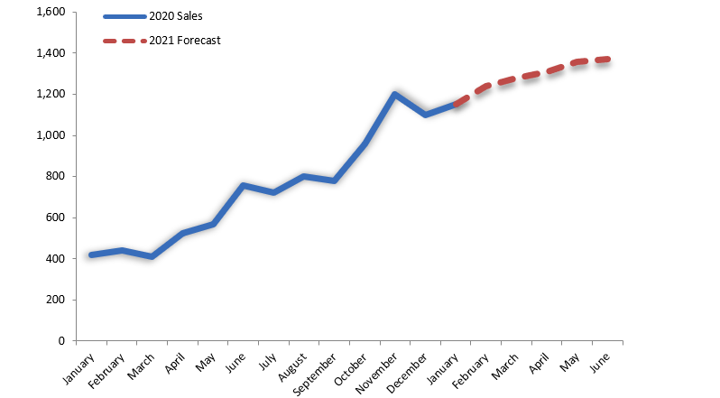
The sales Forecast Chart will show you the best solution because it’s a common problem to show both actual data and forecast as a single trending component.
Here is a good question: How to create a sales forecast chart in Excel? This example shows a simple line chart with monthly data for two years.
We will chart months on the X-axis and sales on the Y-axis.
This table represents actual and forecasted sales. We need to show the first part of the line (actual data series) with a solid color (blue) while the rest of the line (forecast) with a dotted red line. This is because we are talking about only one line for sales performance.
How to create a sales forecast chart
How can we do this? First, I don’t want to do a sales forecast chart with manual work.
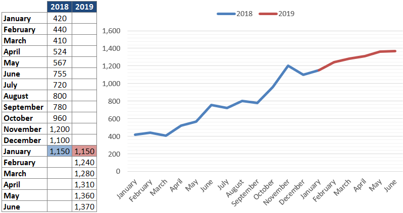
We will create a chart with two series. First, put down all the dates in column B, the actual data in column C, and the forecast in column D from that date down with the blanks above.
Chart this data, then format the two series how we want them to appear (one solid line, one dashed line). Then, when we can insert new months, delete a forecast value, and add actual value.
Actual and forecasts are in separate columns, so you get two different data series when charted. We can create a line chart and apply special formatting to the forecast data series.
Sales areas operate in a fast-moving, high-pressure atmosphere that needs them to stay up to second on the current opportunities and difficulties.
Sales tracking templates present a lot of tactics. It can help sales experts stay on top of their company. So you can show your business team using visual models or sales forecast charts of your business success.
The sales forecast chart keeps up automatically! Use our free chart to reach your business goals! Watch this video on YouTube or download the free template!
Additional resources: