Rolling 6 Months Dashboard template with a clear and flexible design can be a perfect solution if you want to display massive amounts of data from various sources.
This tutorial will show you something different from creating a highly interactive dashboard template that shows the rolling six months.
Check out the following guide from excel tricks:
- List box to select the Region (on the left side of the dashboard)
- Form Control (scroll bar) to manage the displayed data (under the chart)
- Conditional Formatting to highlight the selected 6 months of 24
- OFFSET function to manage the selected data
Apply dynamic filters
Go to the Developer tab on the Ribbon in the Controls group, then click Properties.
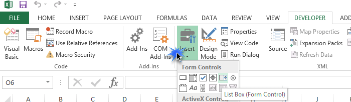
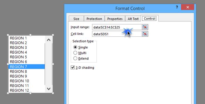
To define the control properties, follow these instructions: In the Input range box, enter a cell reference to a range containing the values displayed in the list box.
In the Cell link box, enter a cell reference that contains the list box selection. The linked cell returns the selected item number in the list box. For example, the first item in the range returns 1. The second item in the range returns a value of 2, and so on.
Check the’ Data’ Sheet!
Typical examples of items in these lists are sales rep names, region names, and product items. We’ll use the comparison function for regions. We’ll use it on the left side of the dashboard.
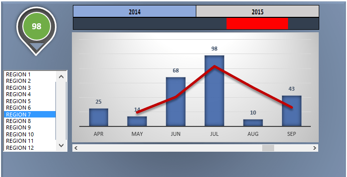
How to visualize the selected month’s data on a dynamic chart?
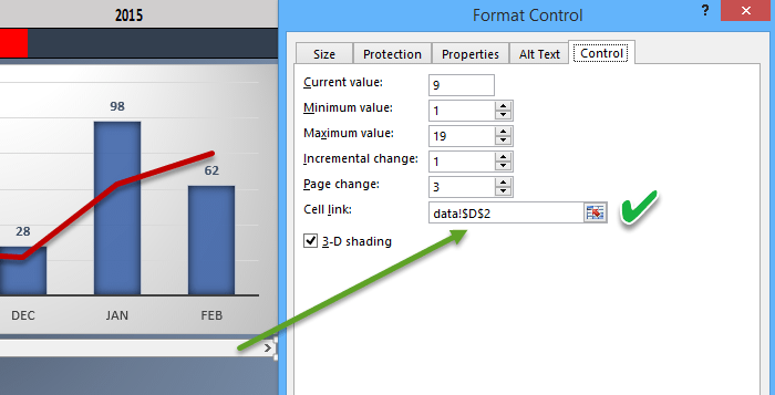
Put a slider (scroll bar) only to show the selected six months. Excel provides the time series slider to you, where you can choose any month range and explore all the month’s data as needed.
By simultaneously moving the slider to the right and left, the list’s contents continually change and contain only the chosen six months.
This is how we make our dashboard dynamic.
Download the rolling six months dashboard and create your template in 5 minutes
Additional resources: