The scrolling period chart is a special solution if we want to examine a longer phase and an emphasized period. There are two instances of portraying the results of a period.
The first one is when we create a detailed statement. This variant is especially for analysts; every detail is displayed on the chart or the dashboard.
In the second case, we created a form control-based dashboard and only displayed the highlighted events.
The manager’s overview of the report wouldn’t get lost in the details. A manager needs only the final data because they will make strategic decisions based on these.
What will happen when we want to display the details and summarize data simultaneously? This can be solved with the help of the scrolling period chart!
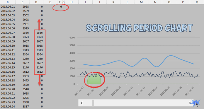
Let’s see the base data! In this case, we have built the starting Excel table especially simple. This goal is, so we don’t get lost in the sea of numbers. Let’s examine the following figure closely!
The data source for the scrolling period chart is a column containing dates and two columns containing values. With the dates, we have no problem; we will move the chart to the base of these. But, of course, we are talking about fixed values. This is also true for the values of the second column.
In the third column, we use formulas to display one part of the data row of the whole database on the chart. (We will talk about this at the end of the article.)
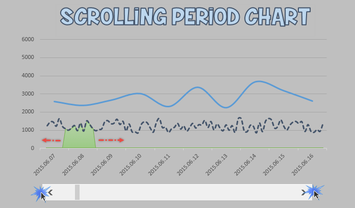
You can find a scroll bar at the bottom. It plays a vital role in the handling of the dates. We’ll explain in short terms why we need it! This form control is responsible for the movement of the scrolling period chart. It is a built-in Excel controller that you can reach with the help of the Developer Tab.
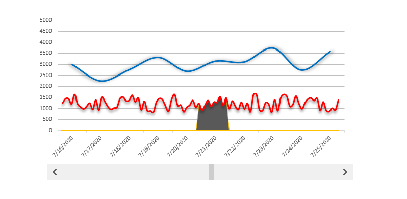
On the horizontal axis we have set the dates and values on the vertical axis.
Scrolling Period Chart – Graphs
The function of the three charts is as follows. The first one (seen on the very top) is a line chart (marked by blue) that shows a part of the whole period. In this Excel example, we have chosen a 10-day interval.
The second is a line chart represented by a dashed line (marked by dark blue color) that portrays the values of the whole period.
We have drawn here the values of the second column in simpler terms.
The third part of the scrolling period chart is an area chart (we have highlighted this with a red circle), and its function is this: The area located under the dashed line, just like on the first chart, only portrays a fragment of a period.
What is great about it is that it portrays this compared to the whole period.
Scrolling Period Chart – In Motion
How will the scrolling period chart move?
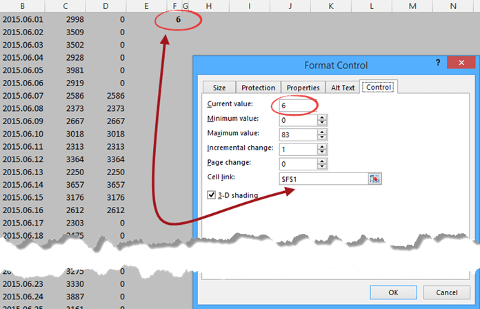
We are not going to overcomplicate this. Here is a little help! Right-click the scroll bar, then the Format Control menu.
In the appearing Format Control window, we can set that by moving the scroll bar to how big of a time interval we shall portray.
The value of the current setting is 6. This value continually increases or decreases by the right or left movement of the scroll bar.
The minimal value doesn’t need extra explanation; the maximum value is 83, which is exactly how many rows our data table contains. So, for this example, we have portrayed an 83-day interval.
The value of the Incremental Charged field is 1, so the scroll bar steps this many days when moved to the right or the left. The Cell Link field points to the F1 cell.
And this is what the Excel formula looks like that is responsible for the 10-day interval portrayal.
=IF(AND(ROW(B1)-1>=$F$1;ROW(B1)-$F$1<11);C1;0)
When we click on the arrow on the right side of the scroll bar, then the value of the F1 cell will increase by 1. However, it is true inversely: by clicking on the left side arrow, the value of the F1 cell will decrease by 1.
The formula checks this cell’s value and chooses the ten-day interval to be shown.
Let’s see some examples: if the value of the F1 cell is 6, then values between the 7th and 16th days will appear. On the other hand, if the value of the F1 cell is 0, then we will see the values for the first ten days.
Have fun! We recommend you download the material for this article and, with its help, analyze the formulas and the operation of the chart!
Read more about chart templates!
Additional resources: