Using an Excel Traffic Light Dashboard Template can track your sales or project activity quickly and supports KPIs using stoplight indicators.
Setting up your business targets is a primary element of deciding on the most suitable business. Then, using these indicators, you can measure business or employee performance. The Traffic Light Dashboard can display a large amount of data using a small space.
If you want to learn more about this topic, we recommend our definitive guide on Excel dashboards.
How to build a traffic light template
#1. Create a wireframe
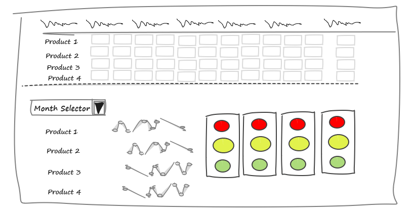
Before diving into implementing the dashboard, it is worth creating a quick sketch. The plan should contain the dashboard wireframe, the applied metrics, charts, and form controls.
In the picture below, we created a wireframe with a drop-down list, sparklines, and stoplights.
Once your plan is ready, it is time to start the next phase and prepare the data.
#2. Prepare Data
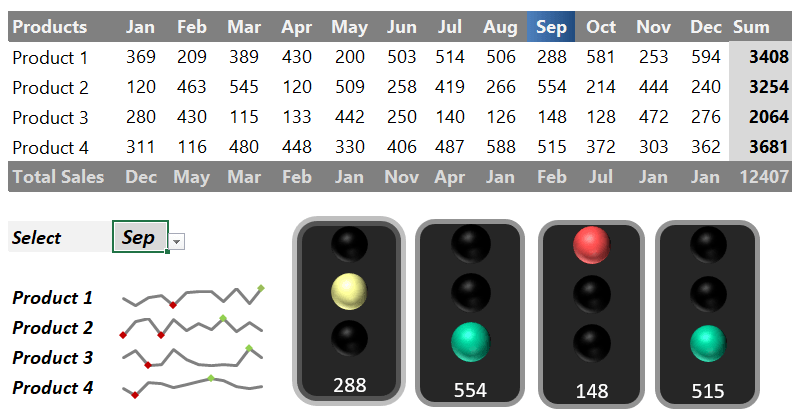
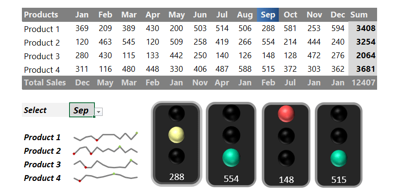
First, we split the dashboard into three sections. In the first part are the months’ names with four chosen products. After that, we link the data to every month and every product. Of course, you can modify these as you like.
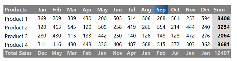
The Total Sales column contains the sales of the four products in the monthly breakdown. We display the yearly result for all products; you can find this in column SUM.
#3. Insert a drop-down list
You can check the drop-down list; it contains the months. For example, if you select August, the dashboard summarizes the sales data from January to September. Likewise, if you choose April, Excel will sum up the sales from January to April.
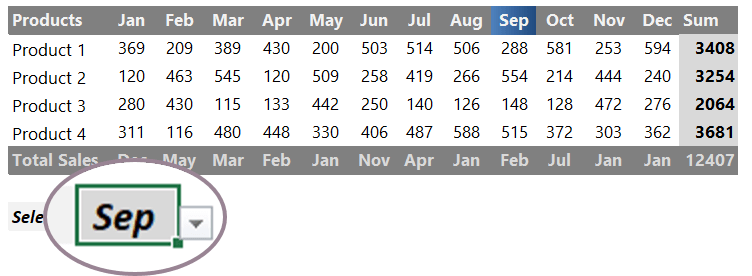
We use INDEX and MATCH functions to summarize the values between January and the selected month.
#4. Create stoplights using conditional formatting
Using conditional formatting, you can create in-cell traffic lights based on rules. First, display the traffic lights section on the dashboard’s right side.
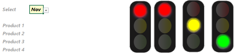
Then, change the default KPI settings on the calculation worksheet. After that, the signals work similarly to traffic signals.
#5. Insert sparklines
The bottom-left area of the template contains the sparklines (mini charts) and the drop-down section. In this case, we use sparklines to display trends in values. Using these mini charts can help us to save space. Although we first encountered them several years ago, how they can contextualize the numbers is fascinating.
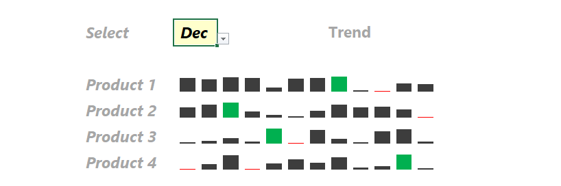
Because we are often not interested in the number itself but want to see how it compares to the previous period, these tiny graphs are perfect for the job. Therefore, we highly recommend their use in analyzing yearly data and displaying trends.
#6. Create a Traffic Light using an add-in
No more traffic jams if you use our Excel chart add-in! You can use this free widget to measure project risk, too.
If you need more dashboard power, look closer at our chart creator utility. We introduce a free solution! With its help, you can create stunning dynamic traffic light widgets.
About KPI Widgets
The yellow sign warns us that – although we are not too far from the plan – the examined process, in our case, the marketing, needs increased attention. When we see this on the dashboard, the green light needs no explanation, and everything is in the best order. But, of course, we like this the best!
KPI traffic signals are the red, yellow, and green symbols or icons we see in Excel traffic light templates or gauge chart templates. These dashboards can help us understand the focus type and give our key performance dimensions.
Download the practice file.
Additional resources: