Free Dashboard Widgets for Excel is a new widget kit package to improve the visual quality of your dashboard templates.
Good to know that all widgets are ready to use, and you can download the bundle for free. You can use these tools for various purposes. For example, track sales, show progress using a circle chart, and compare plan vs. actuals using gauge charts.
Another important feature is simplicity. For example, using widgets, you don’t need to check several data lines if you tell a story. Instead, build your dashboard or report to make the right decision.
Free Dashboard Widgets – Thermometer
If you want to build a thermometer widget in Excel, you need only two values. One cell needs to show the actual value. The second cell contains the plan value. You can easily calculate the variance in a percentage format using these values. We made the widget shape using a free vector editor. Some free editors manage vectors, for example, Inkscape for Windows or DrawIt for Mac.

OK, what’s next? Just define a column graph. After that, use a clustered column chart type. Select the vertical axis and right-click to get the ‘Format Axis’ window. Under the ‘Format Axis’ panel, in the Scale tab, set the minimum value to 0 and the maximum value to 1. Removing all the unnecessary elements from the chart (title, border, lines) is important.
Now fit the chart to a vector shape!
That’s all! To check how the widget works, download the sample Excel workbook.
Progress Circle Widget
The dial widget is a simple but smart chart. Calculating the actual and plan values in a percentage format can be very efficient.
We’ll use three cells. The first cell contains the plan value (185), the second cell contains the actual value (125), and the value of the third cell will be calculated based on the plan / actual values.
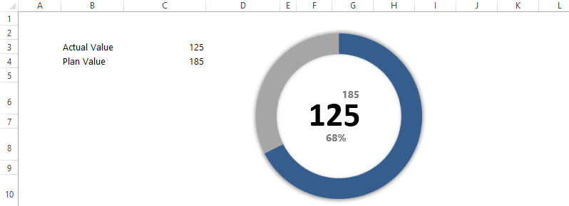
The doughnut chart helps us to visualize the gap. If you need more support, be sure to contact us. You can download the mini dial chart using this link.
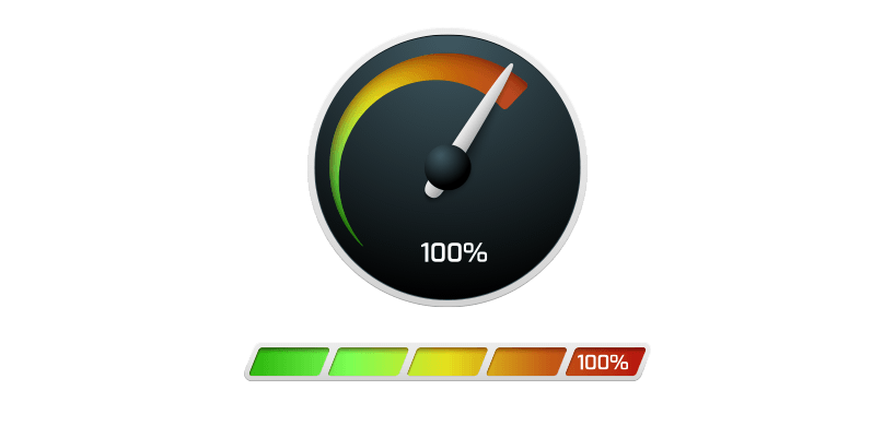
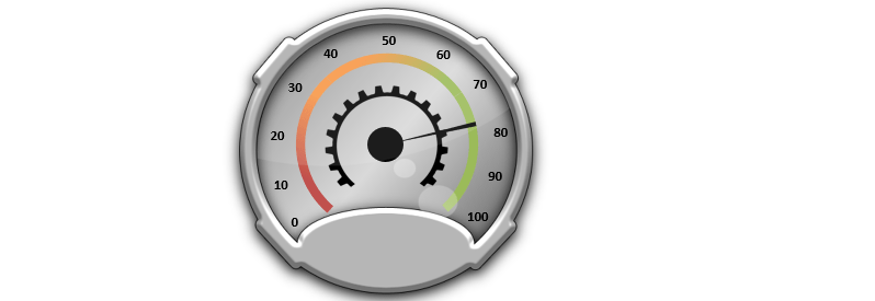
Score Meter Chart
The score meter chart is an improved version of a Thermometer chart. We divided the interval between 0% and 100% into five equal parts and marked them with different colors. Every interval determines a quality indicator from ‘bad’ to ‘excellent.
Take a closer look at the picture. This chart doesn’t need too many explanations. A blue arrow marker shows the actual value. Use this link to start the Excel training!
Excel Dashboard Widgets
This chapter will be about Excel Gauge Widgets. We had many gauge charts and other useful tools in our articles in the past years.
Now it’s time to provide a 4-in-1 Excel widget collection.
Quarter style speedometer
This speedometer style isn’t too common but very useful. Just imagine that annoying situation that you have planned and created the dashboard. Ultimately, we noticed we had run out of space, and only the point is missing.
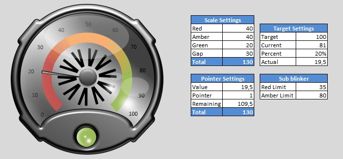
The Scale settings part is the same in all the here-introduced free dashboard widgets, and you can set the standard KPI color chart in the Red-Amber-Green lines.
After downloading the template, we recommend modifying the values this way. Then, you will learn the fastest the knowledge needed to operate it.
Circle style speedometer
Here is the classic speedometer, which can not be absent from any dashboard, so we don’t discuss it lengthily.
Although one change resolves the previous restrictions (that was sometimes annoying), you can set the scale between 0 and 100, but you can set it for arbitrary values. The widget will show the new values.
We have used this format on many dashboards and were always successful. But, of course, there are always doubts about its use. We have read articles that didn’t have a reasonable opinion about it. We think it is mainly from a lack of creativity and persistence.
Semi Semi-circle style Dashboard Widget

The following speedometer shows the values in %. So far, this wasn’t typical but can only define many key performance indicators (KPI) in %.
Some examples: First call resolution, Customer Satisfaction, Percentage of Calls Abandoned, Operational Efficiency, and many more. A speedometer is a great choice for creating perfect dashboards.
CreateBlinker-style speedometer dashboard widget
Finally, let’s see something special! The speedometer in the picture has an extra feature. On the bottom of the gauge is a blinker whose color scale or color value is free to change.
We said we would end this series in the first part of this article. This is not permanent; if we find something new, we will immediately publish that.
There is an unforgettable part of every article: the download section. Thank you for visiting our Excel blog! Stay tuned.
The 4-in-1 dashboard widget is available on this link. We hope you improve your Excel skills using our tutorials and free dashboard widgets!
Free Dashboard Toolkit
This article will share how to use our lightweight free dashboard widgets to create fast and straightforward presentations using a free toolkit.
Our idea of a perfect dashboard is to stop spending too much time at work.
What do you think about it? If you are thinking of making a business dashboard template use our free resources. Try this widget pack to set up your business goals!
Traffic Light widgets
We will show you how to set up traffic lights in Excel to display the actual value. We don’t need conditional formatting to highlight the project or KPI status.
Follow these simple steps to put value in a cell to visualize your data.
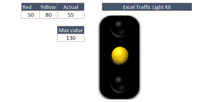
Click the left cell (Red) and insert the maximum value for the red light. Click the next cell (Yellow) and insert the maximum value for yellow light. The light will be yellow if the value is between 50 and 80. Under 50, the light will be red.
Try to enter a number between 80 and 130; the light will be green. It can be useful for you to create a well-designed kpi dashboard or balanced scorecard template.
Speedometer chart collection
This Excel dashboard template will show you how each speedometer type works. But first, you can configure the yellow section. The yellow indicates that the KPI Gauge has a value between 45 and 100.
The largest value in the range is 150. Between 100 and 150, we indicate the maximum area of key performance indicators using green. Enter a value into the input cell, and the needle will show you the performance.
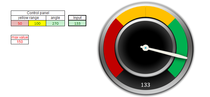
The picture below shows you how to change the scale up to 270. The method for setting up the gauge is the same as the first. Again, the speedometer highlights information about the process or target by which the range is selected.
We love interactive Excel dashboards and free dashboard widgets! Follow us on social networks and use our free Excel templates!
Download the traffic lights template and the speedometer template!