
This comprehensive tutorial will show you how to create an Excel call center performance template.
We love dashboards, so our main goal is to demonstrate how to build a call center template from the ground up. We will build a one-page call center template for tracking the actual status of KPIs and design a user-friendly contextual help for better UX using a VBA macro. Before we start, we’ll introduce the most used indicators in our example. Using these metrics, we can track and trace the overall service performance.
- Time to answer: this performance dimension is usually expressed in seconds. This is the time from when a call is started until a customer service agent responds.
- Abandon rate of incoming calls: we measure this key performance indicator as a % of the number of callers cut off before they touch an agent who answers their call.
- FCR: Use this formula to calculate First Call Resolution = [issue solved by first call] / [total issues]
How to create a call center performance template?
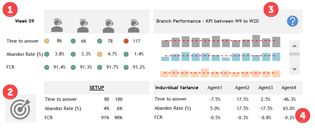
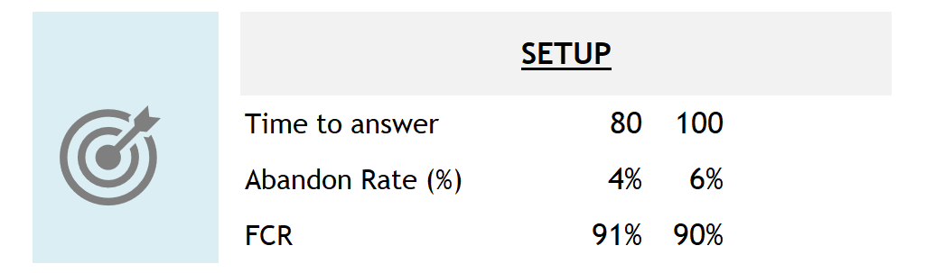
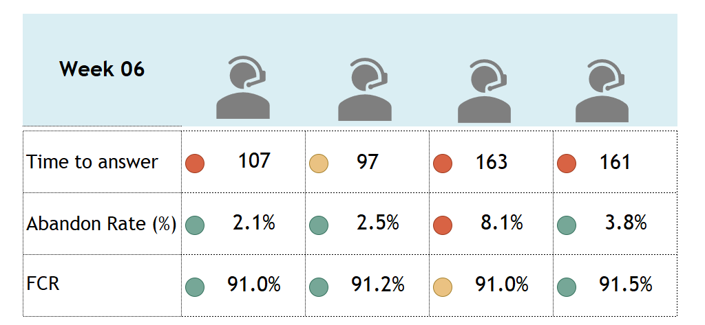
We’ll put the weekly results by agents (Time to answer, Abandon rate, FCR) into the top left area. The bottom-left section contains the KPI setup.
Part 3 will show the selected period (branch average) from the actual week to the actual week + 3 months. Finally, the individual variance will be displayed in the bottom-right section.
Detailed instructions to create a call center template:
#1. Prepare Data
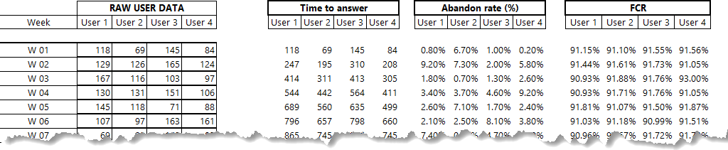
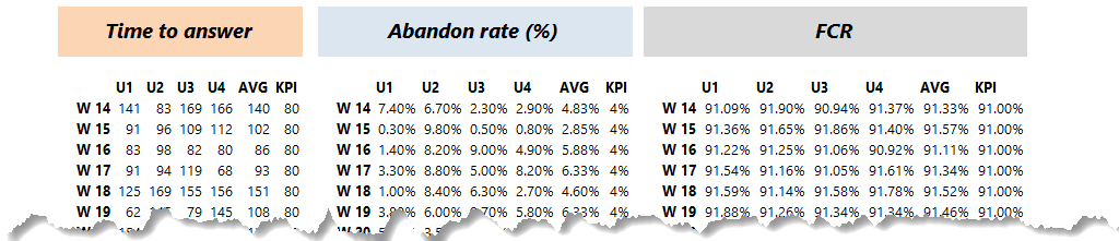
1. We divided this model into three separate worksheets for the template, the main sheet, the input section, and the calculation area. It is one of the easiest ways to build a clear and structured model.
Implementing the unprocessed data and the calculated value is straightforward: The main worksheet with all the figures is linked directly to the data table.
2#. Set timeframe
2. In this example, we’ll use a weekly basis. Let us see the data worksheet. With a fixed duration, the calculated KPI is based on a single duration. You must specify the start and end dates – for example, from 1 January 2017. to 31 January.
If you specify only a start date, the performance indicator will be calculated from the selected date to the current date. If you specify only the end date, we will calculate the KPI using the method mentioned earlier to the specified end date.
#3. Apply VLOOKUP or XLOOKUP
On the calculation sheet, we’re going to use the VLOOKUP formula to find values from the data sheet by values based on the selected week.
#4. Set up KPIs
Check the bottom-left corner! Let us see the metrics. You are creating targets that help you determine progress toward your goals. Each cell is linked separately to the calculation sheet.
#5. Link values from the calculation sheet
Okay, let us see how we build the top right section of the template! This part is a weekly performance scorecard. We get the values from the linked worksheet ‘calc’.
We can visually determine when something breaks a business rule using conditional formatting and icon sets. Next, we’ll use shapes to highlight the variances.
#6. Use conditional formatting
Apply conditional formatting for the selected cells.
Execute the following steps:
- Select the given range. (In this case, the time to answer row)
- Jump to the Home tab, and in the Styles group, choose Conditional Formatting.
- Click Icon Sets, Shapes, Traffic lights
- Enter the values using formulas and click OK
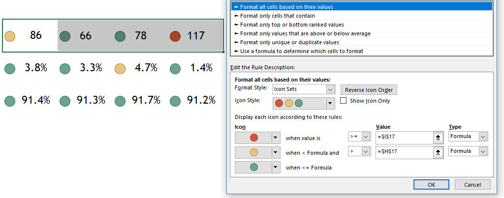
Repeat the last step and apply conditional formatting for the abandon rate and FCR.
#7. Use Office icons
A brand new and useful feature available in Office 2016 is Icons. To insert a new icon to improve the template’s visual quality, find Excel Icons in the Insert tab of the ribbon in the Illustrations group. This feature is available in subscription versions of Office 365.
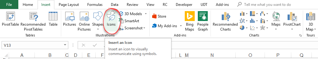
Choose your favorite picture and put it on the sheet. A gallery of icons is available, and they’re grouped into categories to make them easily searchable.
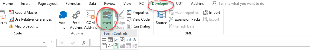
#8. Insert form controls
We’ll use the spin button form control to display the results weekly. Go to the Developer tab and click Insert. Then, click the spin button form the control icon.
#9. Configure a spin button
Right-click on the Spin Button. The format control pop-up box will appear. Next, click on the ‘Format Control’ tab.
This will open a Format Control dialogue box. Go to the ‘Control’ tab, and make the following changes to create a dynamic list: Minimum Value: 1, Maximum Value: 48, Incremental Change: 1, Page Change: 10
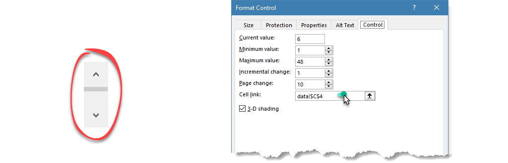
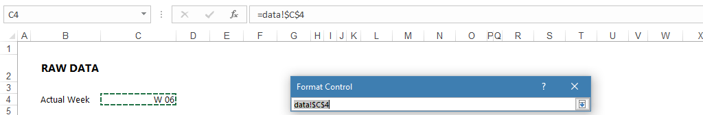
On the Cell link box, link the cell that contains the actual week’s value. In this example, select cell $C$4 on the data sheet. Now validate it using the arrow button.
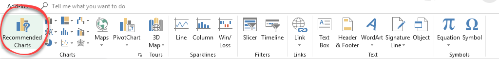
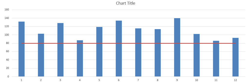
#10. Insert charts
Let’s see the chart section! We’ll track the weekly performance using easily readable charts. Select the $G$5:$G$16 range to create charts on the calculation sheet. Go to the Insert tab on the ribbon and select the Recommended Chart section.
What are recommended charts in Excel? Select the source range in your worksheet and click this button to get a customized set of diagrams that Excel thinks best fits your data. Go to the All Charts menu and select the combo chart. Choose the chart type axis for your data series. For example, choose the clustered column type for the “Series1” and the Line chart type for the “Series2”.
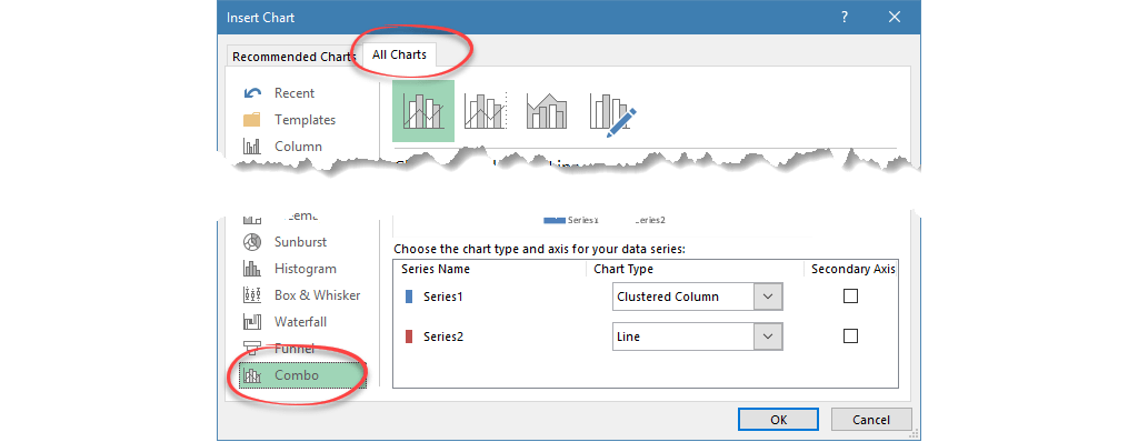
Click OK to insert a combination chart.
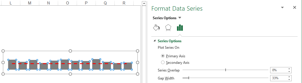
#11. Customize the chart
Copy the chart to the main worksheet area and clean it up! You should remove the unnecessary elements: Right-click on the chart and select Format Chart Area. Use this method on the Plot Area too.
First, format the bar chart! Right-click on the bar chart and choose the Format Data Series option. On the “Series option,” use 33% for gap width and 0% for Series Overlap. Choose the right color too.
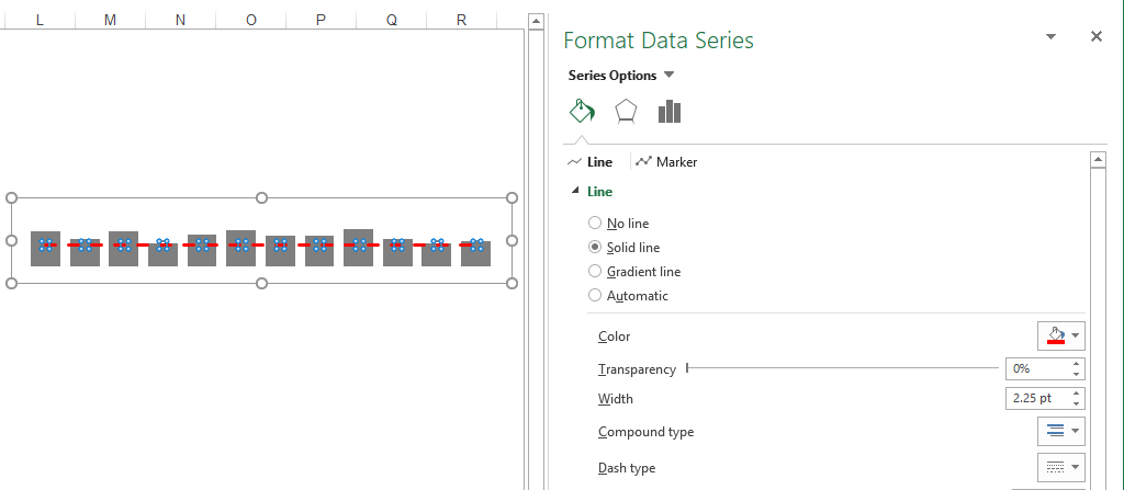
In the following step, format the line chart! Right-click on the line chart and choose the Format Data Series option. On the “Series option,” use a solid line and red color. Finally, set the compound type to dash. Finally, the average line is done.
Repeat Step 13 to Step 17 to create the combo charts for abandon rate and FCR.
Here are the formatted charts below:

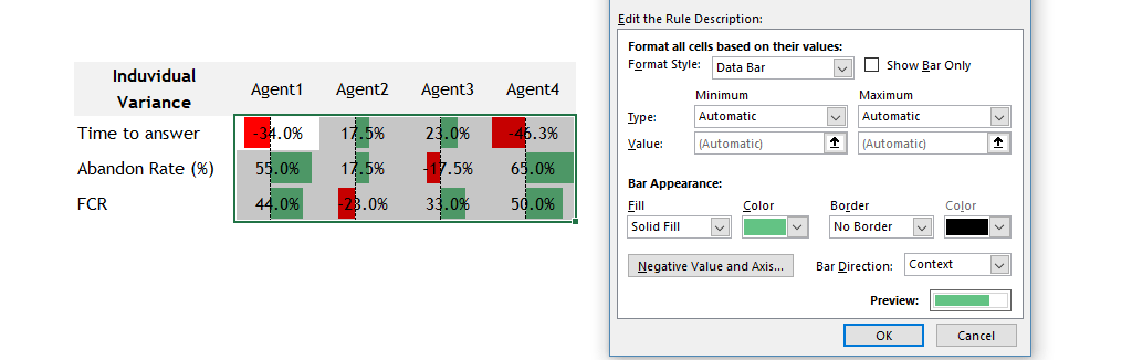
Optional steps to visualize agents’ variance (+/-) on the selected (actual) week. Go to the bottom right corner.
Click the arrow next to Conditional Formatting on the Home tab, then click Data Bar. Select a formatting style. In this example, we’ll use light red fill for negative variance and light green fill for positive variance. After applying a quick style, select cells or range, click Conditional Formatting on the ribbon, and then click Manage Rules to update the selected rules manually.
Download the free call center template if you are in a hurry!