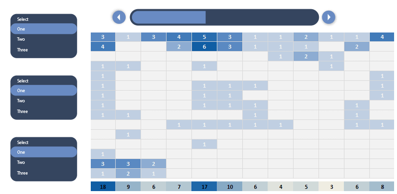
In this example, we will show you how to use form controls if you are creating a project dashboard. Check how the radio button and the slider work!
In the picture below, we have listed all the important information. On the data worksheet, you’ll find the well-known base table: name, activity, responsible person, start, and end date.
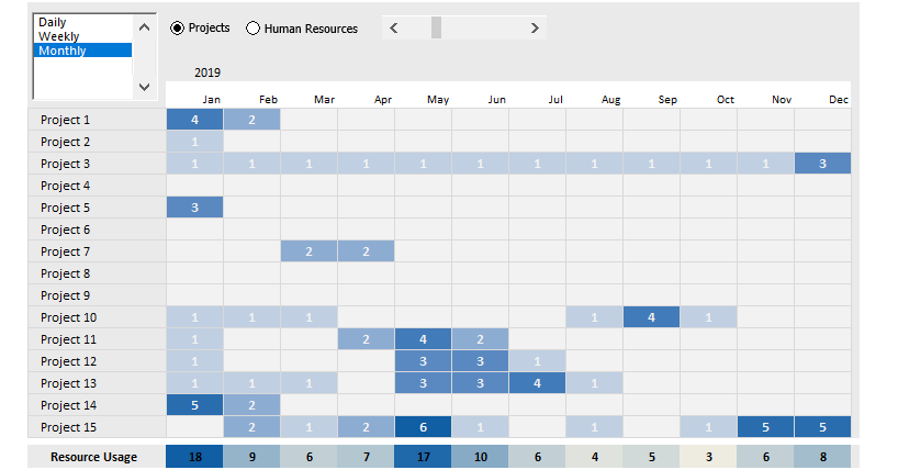
We’ll be able to handle the data of 15 business procedures and 15 participating persons.
Only one question remains: how will we jam this large amount of data on only one page with the help of the template?
Fortunately, Excel provides us with multiple options for this!
Tracking Activities
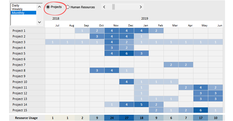
We can keep changing between the ‘Project’ and Human resources with the help of a switch, and now we’ll explain the main difference between them. For example, in the picture below, the project view is active.
Summarize multiple tasks for the selected project in a given period; you’ll see the peaks that can affect the whole business process.
We must know about the HR view that arises from its name and focuses on human resources.
As you can see, we have switched views, so now, in the list on the left-hand side appears, the names of the persons who execute the tasks.
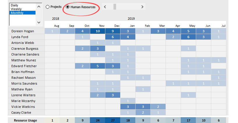
Why can this be interesting and, at the same time, also important?
We can establish the encumbrance of resources at once to reorganize specific tasks completely. For example, if 1-1 resources work too many subtasks simultaneously and the project manager judges that as a risk, we can revise or modify that.
Use Excel Form Controls to show activities
We have not yet discussed the Form Controls that make the presentation interactive.
The first one is the Period Picker, which enables the switching between the daily, weekly, and monthly views. If we want to analyze the details, choose the daily breakdown. On the other hand, we should use the monthly view if we need a review / cumulative screen.
A slider enables us to handle even months or years of activity.
By clicking on the arrow on the slider’s right side, we can display future information, and by clicking on the arrow on its left side, there will be passed information shown.
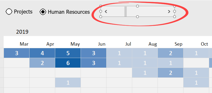
The heat map is a data visualization tool that displays business connections with the help of colors. We showed a lower charging rate with light colors in our current example. We used darker shades in periods when the charging rate was large.
Sometimes too many tasks run simultaneously, or one participant works on too many different simultaneously. This way is understandable why the project activity map is so important.
We have used the IF(), INDIRECT(), and OFFSET() functions to create the template. Everyone knows the first one, which is a comparably simple logical formula. The other two require deeper Excel knowledge. We have it in our plans to introduce their use in a separate article.
We hope you have liked elaborately studying the project activity map’s connections. There’s nothing else to do but share the Excel resource planner template related to today’s presentation.
Additional resources: