
Customer analytics enhances the customer experience. This tutorial will show you how to manage the key performance indicators using interactive Excel dashboards.
Our free template is a statement of customer habits from a relatively large data source.
Today’s article is an experiment on our part, and its goal is to show a completely different dashboard from the already-seen analyses.
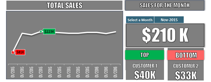
Monthly Performance Analytics
The customer analytics template consists of two parts. The first one reviews sales achievements in a monthly breakdown of one year. We didn’t have any particular problem here; we only had to find the minimum and maximum values of the examined period (which, in this case, is one year) and mark them on the line chart.
The sales section on the right-hand side of the template is even more interesting. With the help of a drop-down chart, this section enabled the monthly breakdown.
Three indicators display the data of the chosen month from the list. The first is the monthly sale; the value shows this in the big rectangle. It’s not difficult to define this; we have gathered the products sold in the given month with the help of a pivot table.
Then, as a supplement, we displayed the largest and smallest income-bringing customer results in the given month. By using these indicators, we can make important conclusions.
Customer Analytics – Data Source
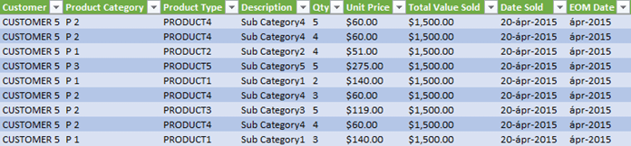
The picture below shows a part of that Excel worksheet that provides the data source.
You can fill this up with arbitrary data. We built the Excel template so a completely personal template can be created from it. As usual, this template also can be downloaded and used for free.
For those who are not in a hurry, we would like to write down in a few sentences what Excel formulas helped us to define the values of the customer analytics dashboard.
The EOMONTH() Function
In the “End of Month” column, we classified the date of the sale (“Date Sold”) with the help of the EOMONTH() function.
With this, we can tell any element of the list consists of several thousand components and what month it belongs to. (1 line equals one sale). After this, the monthly breakdown can be easily made. Using the RANK() function, we can decide from the 12 months summed up data what month brings the most and the least income.
Where the value of the function is 12, which indicates the least income, we can easily determine the minimum and maximum values of the line chart. Take a look at the “calc” worksheet. We recommend you check our customer analysis, even if the functions look familiar (INDEX, SUMIF, COUNTIF, MIN, MAX).
Effective Data Visualization using Excel
If you want to care about data visualization and Excel dashboard creation, keep the following rules in mind.
One of the most important rules of Excel data visualization is that few are always more! We believe today’s customer analytics template well supports this statement.
It is not worth jamming the screen with 5-10 gauge charts and values; always use key performance indicators. Always think there is no need to pile up the data but show the trend and process behind the numbers. Most of the time, to achieve this enough, use a few well-chosen indicators.
Another standpoint is the well-chosen design. For example, a different font can better the overall image. The font used in making the customer analytics template is included for download. So your dashboard can have the same appearance.
There is nothing else left to do but present the link to access the sample workbook. Download the practice file by clicking here.
Additional resources: