A bullet Chart is one of the best usable chart types in Excel, and it helps create a KPI dashboard on a single screen. A bullet chart is an answer to this. Besides the gauge, this is one of the best data visualization tools.
Currently, the gauge chart is the market leader dashboard tool. Can this simple little tool compete with it?
As discussed in our previous articles, the one-page dashboard rule makes designers’ lives a little harder because they must portray all the important indicators on one page. Fortunately, the chart type introduced today is a great choice if we need to create a spectacular representation, and it takes up little space on your dashboard.
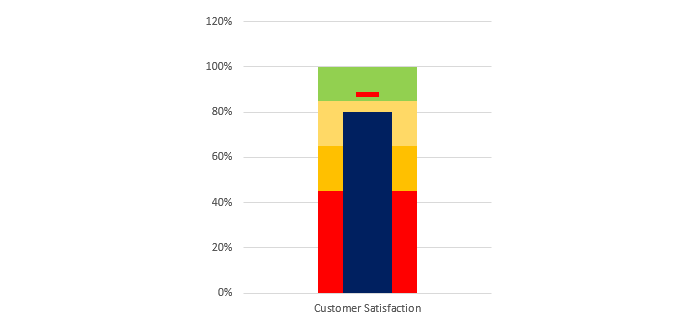
Let us look at this already-done bullet chart! In this article, we will create the graph in the picture above. This single bar chart is power-packed with a very small but effective analysis. So please take a look at its most important elements. At first glance, it is a simple bar chart.
The Key Elements of Bullet Chart
We will examine the elements that play an important role in creating a plan / actual type of report.
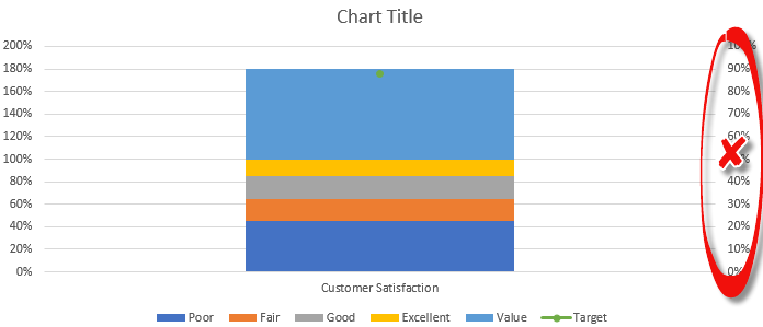
Qualitative Parts: These sectors help us identify the performance levels. For example, the picture shows a poor performance level between 0% and 45% (marked by red color).
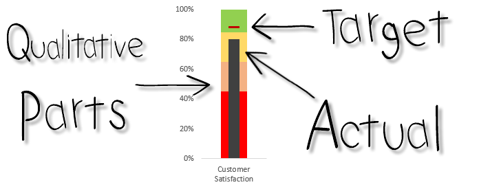
The performance is fair, between 45% and 65%. Between 65% and 85% are good, and from 85% to 100% is excellent.
But what if the performance indicator is not between 0% and 100% that we have to display? Can the bullet chart still be used? At first, we would think not.
Target Performance: This represents the required performance level we want to achieve. In this example, we marked the level of performance needed with a red, at least 88%.
Actual Performance: After the plans, let’s talk about the facts! For most everywhere, the most important indicator is the variance.
The actual performance shows the performance we have achieved in the examined period. This value is indicated now by a thin black bar chart.
Looking at the figure, we can easily interpret the given result. For example, we were expecting a performance above 88%. And according to the chart, the actual performance is only 80%.
So now we know how the bullet chart operates. But first, let’s see the detailed Excel tutorial!
Differences between Graphs and Charts
How to create a bullet chart in Excel?
Let’s start the work! Here are the steps to create bullet charts in Excel.
#1. Arrange Data
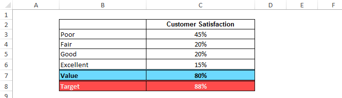
Arrange the following data on a blank worksheet. The header of the second column will be customer satisfaction, a trendy key performance indicator.
The first four rows will show the appropriate performance levels (poor, fair, good, excellent). The fifth row contains the actual value, and the sixth is the planned value.
It is very important that the sum of the first four rows be 100%. This is not mentioned in many tutorials, but we do!
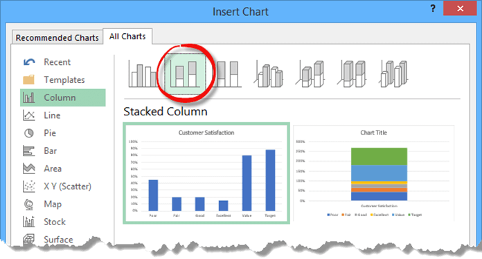
#2. Select Data
Select the entire data set (B2; C8). From the ribbon, choose Insert, Charts, 2D Column, and Stacked Column.
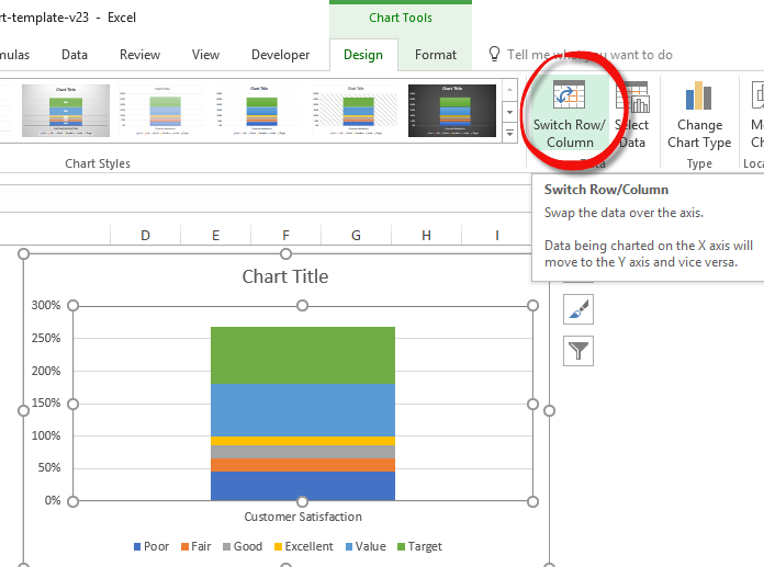
#3. Switch Row / Column
The result we got is not exactly the one we wanted! The bar charts representing the given values are displayed separately. How can we merge them? Fortunately, nothing is impossible in Excel!
Highlight the chart, and follow the following steps: Design Tab > Data > Switch Row/Column.
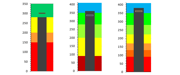
This merging will display all of our data points on one bar chart, allowing us to see that we have used the proper method easily. We used six different stripes, making the final chart easy to create. Four are responsible for the performance levels, the fifth is the plan’s value, and the sixth is the actual performance value.
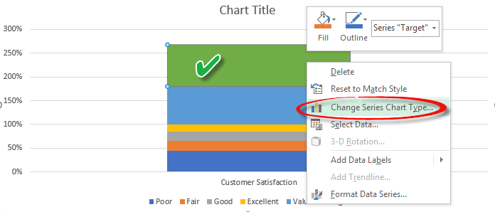
#4. Highlight the target value bar
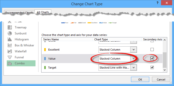
Highlight the target value bar. This is the upper section of the bar chart, as you can see in the picture below. Right-click and select the “Change Series Chart Type” option.
Explanation: What will happen now? We have only highlighted one part of the chart containing six elements. We only change the type of this one.
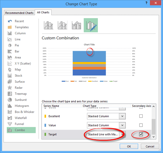
#5. Change Chart Type
The dialog box that appears is the “Change Chart Type.” To change the Target Value chart type, you must do the following: First, use the “Stacked Line with Markers” type. After this, mark the secondary axis checkbox. If we followed all the steps correctly, we would see a dot in the target value.
#6. Delete secondary axis
We will only need one axis, so we need to delete the other one. Highlight the secondary axis, as seen in the picture below, and delete it.
#7. Apply stacked column chart
Select the actual value bar. We will also change its type. Select the secondary axis checkbox in the ‘Change Chart Type’ dialog box. Here, we leave the chart type unchanged. The Stacked Column Chart will remain.
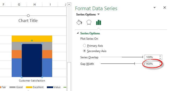
#8. Format Data Series
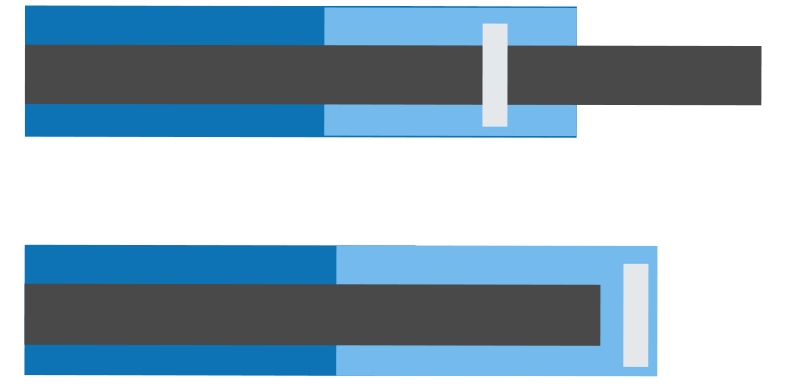
Let’s see the most exciting part! Select the Value bar, right-click, select Format Data Series, or press Ctrl + 1. Change the Gap Width to 400% in the Format Data Series pane. You can, of course, set any value you like. This will set the width of the stacked column chart.
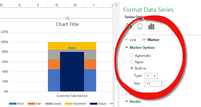
Earlier, we set the point to mark the target value. To make this point a real marker, we will follow a few easy steps. First, select the Target Value marker dot, right-click, and select the “Format Data Series” option.
In the Format Data Series dialog box, select the following: Fill & Line > Marker > Marker Options > Built-In.
Select the dash and set the size of the marker to 17.
#9. Customize the Bullet Graph
We still have two small changes to make to the marker. Change the Marker fill to red and remove the border.
Additional resources:
Download the free chart template!