The advanced score meter chart in Excel is a useful graph that helps you display each key performance indicator in a small space.
We can see several solutions – like gauge chart – but these all looked alike except for a few. Therefore, we keep ourselves to the previously written principles, meaning that you will only see unique dashboard templates on the blog.
We will introduce the making of an advanced score meter chart, but we will not settle only for this; we will go further, and the article will contain some unique and original solutions. Even the array formulas will be at our help!
Let’s say a few words about the widget!
Score Meter Chart – How to use Slicers
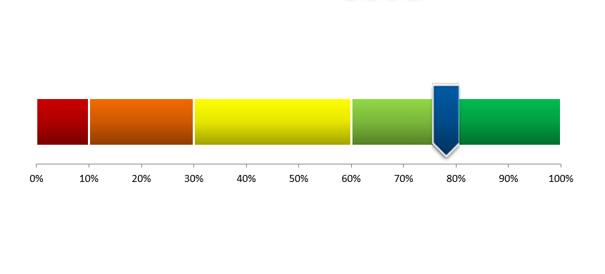
The effectuation of the interval division makes the score meter chart unique. But, of course, we all know the classic scale with degrees ranging from a week to excellent.
We will dynamically use these and can handle values between 0% and 100% as a default.
Our advanced score meter chart will have the unique characteristic that we will set each element of the color chart by giving arbitrary values. As usual, red is the smallest / weakest value, and dark green is the best / highest value.
The division does not need to be even; we can differ from the average division rule of 0%-20%, 21%-40%,…81%-100%. Why is this so useful for us? Using the opportunities given by free configuration, KPIs will be available for display that differs from the customary.
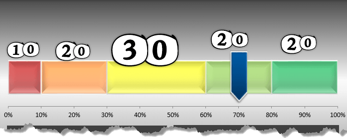
We have defined the percentages in the ‘Slicers’ column. But we have to bring your attention to one crucial issue! When changing values (anyone out of the five), pay attention so that the value doesn’t exceed 100% because we can only display this on the chart.
In our example, we increased the middle interval (yellow color) to 30%, so we had to reduce the gap containing the weakest value to 10%. Of course, reducing this is not mandatory; the bottom line is that their sum must be 100%.
The score meter only displays correctly in this case! Therefore, we have applied a control field in the ‘Slicers’ column; everything is all right if its value is 100%. It’s good to know that the score meter chart looks spectacular as a part of a complex dashboard!
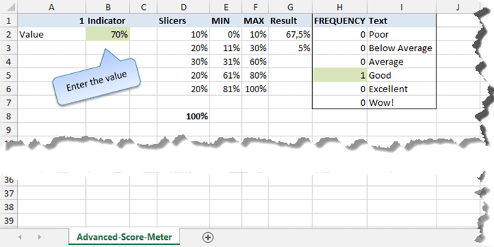
We have created the ‘MIN’ and ‘MAX’ columns that we have made intervals using the rules of running total. The current ‘Slicers’ settings are 0-10%, 11%-30%, 31%-60%, 61%-80%, and 81%-100%.
Using Arrays – The Frequency Formula
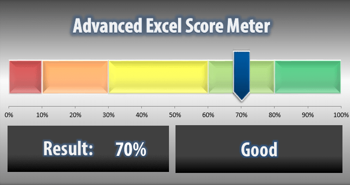
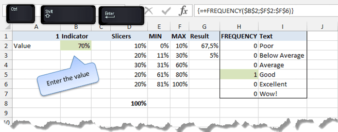
If you are using array formulas, you need advanced knowledge, and we will talk about them in detail, for they are important in this solution. Set the actual value to 70%.
The array formula will decide what value will correspond to this percentage in the FREQUENCY column.
In our case, between 61% and 80%, the number 1 indicator can be seen there.
How do we get this result? First, highlight the cells as we do in the picture. After this, click on the formula bar and write in the formula. Do not press enter!
But instead, use the <Ctrl> + <Shift> + <Enter> combination! Then, the results will be automatically entered into all cells. You will notice that the formula appears with curly brackets around it.
Assigning TEXT to values
There’s only one thing left: display the text assigned to the percentage values on the advanced score meter chart. We want to ensure that the category text appears in a text box. So, we have to bring out the good old VLOOKUP formula.
The first parameter of the formula will be the ‘1’ indicator (located in the FREQUENCY column); the second parameter, in turn, will look for text assigned to the given interval in the ‘TEXT’ column. And we are all done!
Thank you for staying with us today. You can download the chart mentioned above using this link. Then, play with our advanced score meter chart!