
The variance analysis report is an often used Excel template in everyday work.
In our article today, we would like to introduce with a few words the procedure that can help us achieve spectacular results quickly when we have to create a plan-actual comparison.
Our Excel tip series expands with another presentation.
In the future, we’d like to pay more attention to the small but handy apps.
Based on our feedback, these are at least as needed as dashboard templates or complex analyses.
The plan-actual issue plays an essential role in the life of companies because careful planning alone is never enough.
The plan’s realization has to be continuously followed so we can immediately take appropriate action in case of a remarkable difference (that can also be positive or negative).
Fortunately, Excel is always at hand!
The Solution
The Excel template will make the analysis quicker with the help of a straightforward but effective solution.
Now let’s talk about the technical background of the variance analysis report!
Everyone knows that economic analysis is an accepted method of comparison, and without it, the evaluation of economic activity is unimaginable. The plan-actual comparison seems very simple and doesn’t need complicated calculations. Generally, we mean a difference or ratio by it.
Dynamic comparison means data comparison for a period or point of time, so it observes and measures economic occurrence changes in a period. The comparison shows data in a timeframe or simultaneously.
This is the case in comparing one or more types of product or service data. Another example can be the characteristics of the organizational departments within the company.
Variance Analysis Report
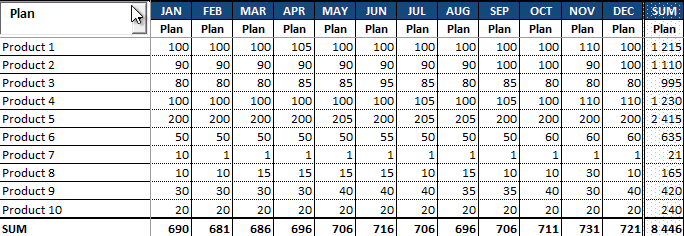
Excel can create the variance analysis report. The usage of the drop-down box is unavoidable; it is an inseparable part of the modern report.
You can choose three components from the list. By selecting the plan, we only see the plan’s data in a monthly breakdown.
Here we don’t pay any attention to the differences between them, or to be exact, we don’t display them at the moment. However, we can fill the table with current values/data if we choose the Actual option.
The purpose of the Variance option is to portray the plan, the actual, and the positive or negative differences between them.
Variance Analysis using conditional formatting
Conditional formatting is an often-used Excel solution for highlighting the differences. For example, as you can see in the picture, we portrayed the differences with red and green colors if you chose the Variance switch.
We have created these with the use of the dynamic method. Therefore, minimal programming skill is needed to develop the currently introduced template.
If you want to know the code, press ALT + F11 together, and the VBA Editor’s window will appear. You can find the code here that enabled us to display interactive data.
This is all about creating the variance analysis report and its characters. You can learn all the above quickly if you download the free Excel template.
Thank you for staying with us today! If you have any ideas, tips, or suggestions that you would like to see in the blog, please don’t hesitate to write to us!
Variance analysis in a single click? It is possible! Check our professional Excel add-in!
See you again next week! You can find the template here.
Resources: