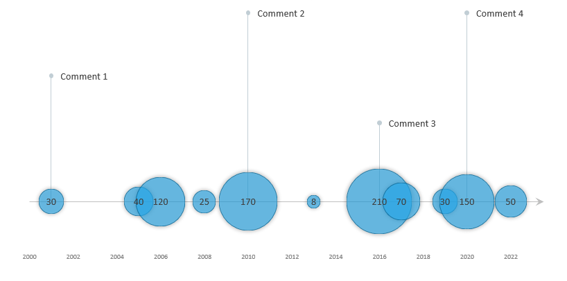
The bubble timeline chart is a variation of the scatter plot, and we replace all the data points with different size bubbles.
The timeline and bubble chart combination is a proportional chart variation, allowing you to display data over time. The bubble size corresponds to the actual value, for example, a marker share or sales performance.
Create Bubble Timeline Chart in Excel
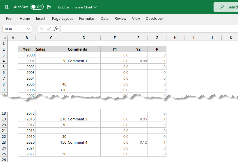
Step 1: Format source data
Add “coordinates” to the table with the initial data. Place bubbles on the zero axis; we require using a helper column, Y1. Column Y2 contains the positions for the comments. In column P, we use a simple IF function to mark these data points where we want to display comments.
Step 2: Insert a bubble chart
Select the data table to build the bubble timeline chart. Next, click on the ribbon, and locate the Insert Tab. Next, choose the Bubble chart type from the menu. Finally, click OK to insert a new chart.
Right-click on the chart, keep the ‘Sales’ series and remove all unnecessary series by using the ‘Remove’ button.
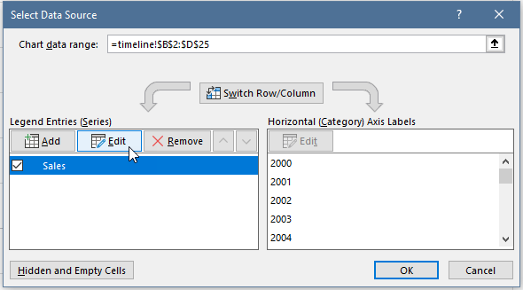
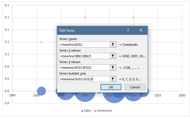
Click ‘Edit‘ to select data.
In the ‘Select Data Source‘, specify the columns; X = “year”, Y = Y1, and the “Sales” column contains the sales values for displaying bubbles.
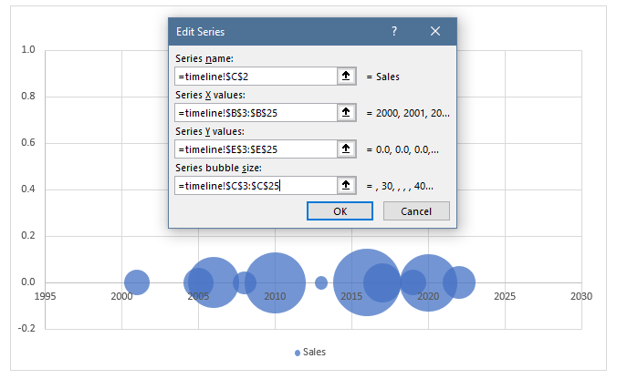
- Series Name: Sales
- X-values: $B$3 : $B$25
- Y-values: $E$3 : $E$25
- Series Bubble Size: $C$3 : $C$25
Click OK to close the window.
Step 3: Create data points for comments
To create the starting points for comments above the sales series, do the following: Right-click on the chart, then choose the ‘Select Data’ option. Next, click on the ‘Add‘ to insert a new series.
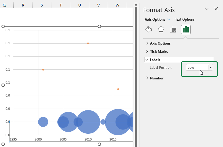
Step 4: Move the X-axis below the Bubble Timeline Chart
It’s time to move the X-axis labels below the chart because they intersect with bubbles and are hard to read. First, select the X-axis labels and change the positions. Next, click on the Axis format tab and choose Axis options. Set the label position to “Low”.
Step 5: Clean up the chart
It is important to remove all unwanted parts from the chart. These are vertical axis, horizontal and vertical gridlines, and chart area borders.
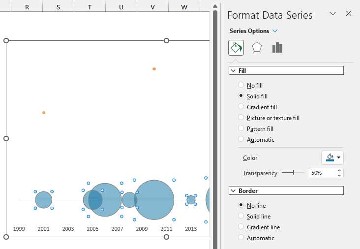
Step 6: Customize the Bubble Timeline Chart
To make the different data points easy-to-readable, set the bubbles semi-transparent. Select the Sales series the use the ‘Format Data Series’ task pane. Select ‘Solid Fill’, pick your preferred color, and set the ‘Transparency’ to 50%.
If necessary, adjust the Bubble Scale and X-Axis.
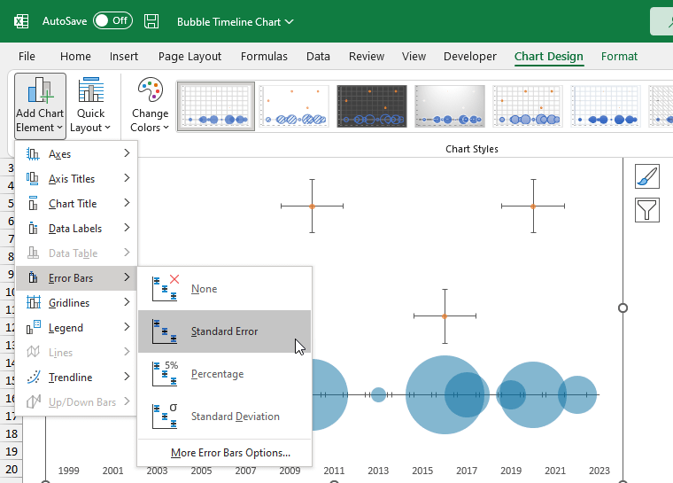
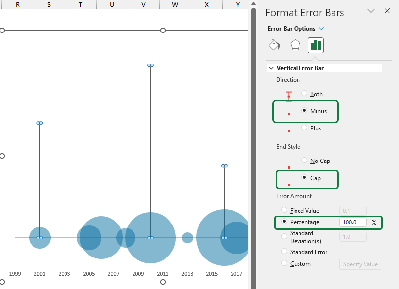
Step 7: Create vertical error bars
Using vertical error bars, you can create connectors between the comments and series data points. First, select the chart and click on the ‘Chart Design’ Tab. Next, click the ‘Add Chart Element’ drop-down list and choose ‘Error Bars’.
First, delete the horizontal part of the error bars. Use the following setup:
- Direction: Minus
- End Style: Cap
- Error Amount: 100%
Step 8: Labels
Finally, Set up labels for bubbles and comments for the bubble timeline chart. Select the ‘Sales’ series and click “Add Labels” to add a label. Now we have to format labels.
Select the labels, and the ‘Format Data Labels’ menu will appear. Under the ‘Label contains‘ group, ensure the ‘Bubble Size‘ and ‘Show Leader Lines‘ are checked. Under the ‘Label Position‘ group, select ‘Center‘.
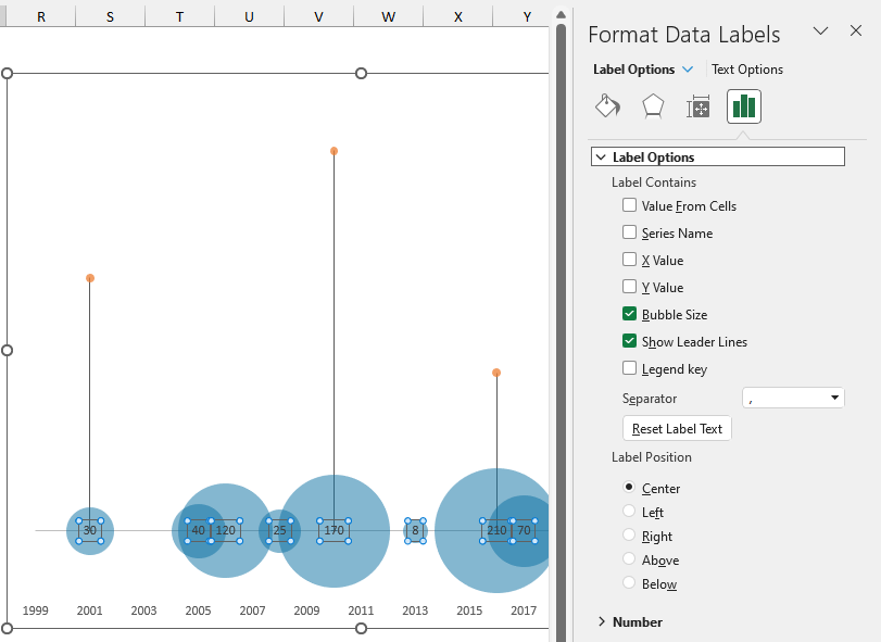
The last step is to add labels for the comments. Select the data points, then click add labels. Format the comment labels. Under the ‘Label Options‘, select ‘Value From Cells’ and browse the range that contains comments.
Additional resources: