
Learn how to create a dynamic chart using the hyperlink rollover effect with the mouse hover method in Excel.
Using the hyperlink rollover method, we will get an interactive chart that visualizes a four-year sales period with a space-saving solution. But first, we will build menus for your report. So, if we talk about the available space, it is time to show you a few advanced tricks in Excel.
The biggest challenge is to show a relatively large amount of information in a given (sometimes small) space. Moreover, we must show all key information on a single page and keep the result simple and easy to understand. The rollover hyperlink method enables us to build Excel’s lightweight navigation menu structure.
Steps to Create a Rollover Effect in Excel
#1. Set up the table that contains the data
The first step is to prepare the data set. In the example, the table contains monthly sales over four years.
After that, five columns will be created for the monthly and yearly data. Finally, we must insert another column and store the chart data here. Using this range, Excel will change the main chart source based on the user’s choice to refresh the chart.
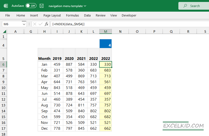
Formula to get the matching value based on cell M5:
=INDEX(data,,$M$4)
#2. Create a Named Range for the actual selection
Named ranges play an essential role in Excel. With its help, you can simplify formulas and add descriptive names for ranges. In the example, the cell that contains variables is M5. To create a named range, highlight the cell to which you want to add a name. Next, choose the Formulas tab, then select the Name Manager option.
Note: If you want to speed up this procedure, use Ctrl + F3 keyboard shortcut.
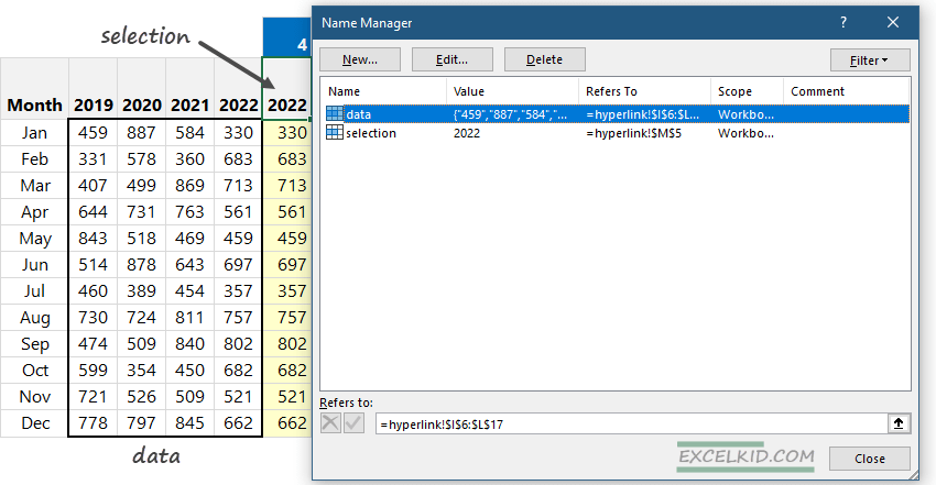
Click OK! Now, we have a unique name for cell M5. In the example, we add a name for cell M5, “Selection”. It is easy to check how the named range works. Highlight cell M5, and look at the Name Box. Everything seems right; from now on, we can refer to the M5 cell as “Selection.”
For the sake of simplicity, create another named range, “data”, that refers to I6:L17. Now, you can close the Name Manager window.
#3. Build a line chart using the dynamic range
To create a line chart, we need to select the source data. The source is the dynamic range, so the “Selection” column will be a dynamic range! Excel will calculate the chart’s data using the rollover hyperlink method.
Select the Insert tab, and insert a simple line chart.
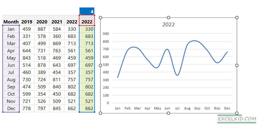
Note: You can use other chart types. You have to decide which format is most fit for the given report! If we think it’s best, change the default chart’s color and the gap between the columns.
#4. Design the navigation area
To understand how the rollover hyperlink effect works, make a wireframe! We have often mentioned that if we leave the planning phase, we’ll do double work later. Therefore, creating a sketch can take only a few minutes; it’s worth spending time on it!
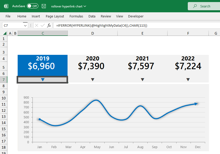
The chart area consists of three parts that are well separable from each other. First, the sales results are presented in the top row in the summary section. Again, there’s no magic here; with the help of the hyperlink, we can connect the values with the selected period.
Here is the wireframe of the interactive chart:
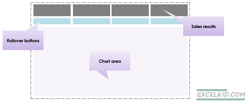
The second area is the mouse rollover area, which is much more interesting. If the mouse moves over the given cell (in the B4 and E4 range), the chart will dynamically change to correspond to the selected period. Again, we can implement the rollover effect using a relatively small space. So it is easy to display various charts on a single page.
#5. Implement the Hyperlink Rollover effect
We will use the HYPERLINK function. Let’s get to know it shortly. This function will define what will happen If the user clicks this link. Here’s an example:
=HYPERLINK(FunctionName(),”Click here”)
Note: It is good to know that hovering the mouse is essential in the example, not clicking. When we move the mouse over the given range, Excel will activate and execute the “HighlightMyData” function we write.
The rollover hyperlink effect is already in action! First, we’ll write a short UDF (user-defined function). Please don’t be shy; it is only three lines.
Public Function HighlightMyData(seriesName As range)
Range("selection") = seriesName.Value
End FunctionExplanation: Let’s see what this shortcode will do! The function only shows the chart based on the value of the “Selection” range. The “Selection” variable can take on the following values: 2019, 2020, 2021, and 2022.
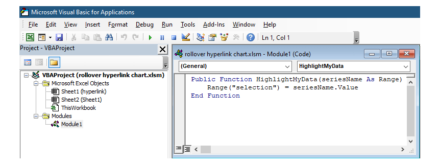
Insert this code using the VBA editor. If you can’t see the Developer Tab on the ribbon, use the ALT+F11 shortcut to open the proper window immediately.
#6. Combine the HYPERLINK and IFERROR functions
Nothing is left to do but write the four HYPERLINK formulas supporting dynamic charts. The formula below may seem complicated, but we will explain how it works!
=IFERROR(HYPERLINK(HighLightMyData(C3)),CHAR(113))
Highlight range C4:F4 and change the default font type to Windings 3. The CHAR(113) formula will display the unique character we need. In our case, an arrow points downward. The role of the IFERROR() formula is error handling.
Apply the formula as shown in the picture below:
Conclusion
You can create dynamic charts in many various ways. However, we often forget that conditional formatting is a Swiss knife if you analyze data. We have millions of other tools and techniques to make the presentation interactive.
Using the HYPERLINK() formula combined with the rollover technique enables us to achieve stunning results. In addition, implementing the rollover hyperlink method can decrease the number of charts and provide a clean look. As a result, we can use the dashboard area once and allow users to focus only on the selected period.