
The scrolling list using the OFFSET formula is a useful tool for creating dynamic lists.
Excel dashboards are very popular, and we have made many tutorials. You can read all about them here! The OFFSET formula is unique. We can use it when we only want to display parts of a large data table.
From the list containing all states of the US, we will only portray five states. With the help of a slider (we’ll talk about it later in detail), we’ll create a scrolling list. Why is this good? How to build impressive dashboard templates?
Working with ten, a hundred, or a million values is irrelevant. There is only one thing we must pay extreme attention to; the dashboard can only be strictly displayed on one page.
So we have to place the separate elements to fit them on one worksheet. In this short article, many of new information awaits you! Let’s start!
How to create a scrolling list to improve the visual quality?
With the help of the following dashboard tutorial, we will learn how to make a great-looking dashboard using the OFFSET formula.
Today’s lesson will be about creating interactive dashboards.
Let’s see an example of how users can be mentioned in some instances.
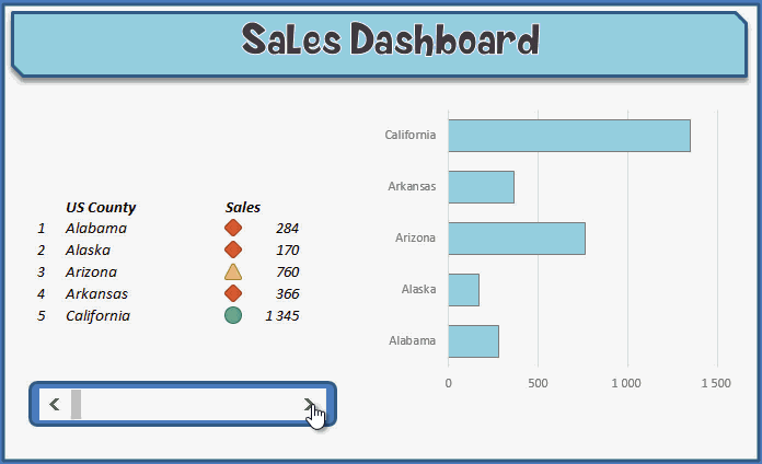
We have put the base data in three columns: in the first one, the number of the states, in the second one, the name of the states; and in the third one, the income data belonging to these states.
We will apply the formula to find raw data on the Data worksheet.
Use the OFFSET formula
The OFFSET formula gives us the first and last values of the list.
- A red diamond will mark the state not reaching the expected achievement.
- A yellow triangle will appear by those states near the expected achievement (+/- 5%, you can adjust this freely).
- The green circle means everything is in the right order; the achievement exceeds the indicators we designed.
We like the latter the best.
Scrolling list tutorial – The Slider
Under the achievement summary table, there is a slider.
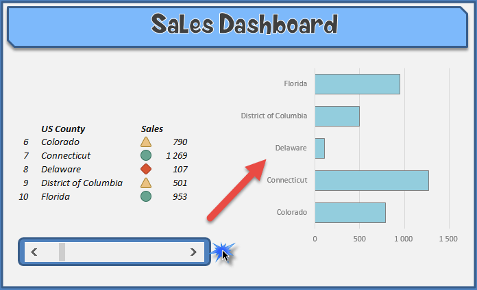
By simultaneously moving the slider to the right and left, the list contents continually change and contain only five chosen purports. So now, we have a dynamic chart!
The slider has a wide-ranging use; its primary task is to control the listed data.
This is a space-saving solution; we don’t have to list all the states’ data. Thus, the dashboard can be used and arranged, which is essential for senior managers.
It is worth considering the latter; senior managers do not usually have time to look at a chart for days. Our task is to show the results briefly and possibly spectacularly.
The dynamically changing graph is on the right side of the picture. There is no devilry in this. We only tied the chart to the data of the acutely shown states.
Conclusion: Create a dynamic presentation!
If you liked the demonstration, do not hesitate to fascinate your boss with a similar presentation! Trust that success will not keep you waiting; we are sure of that.
We suggest you practice, think, and shape the sales template according to your needs.
We are reading more and more Excel blogs where we get through an endless Excel dashboard tutorial, but in the end, there is no helpful material.
Why would anybody make a scrolling dashboard tutorial without a downloadable worksheet?
Writing an Excel blog is exciting, but this can never be a self-serving activity. Most importantly, beginner users should become professional Excel gurus in the shortest possible time. If you are in a hurry, use our professional chart add-in!
We have chosen this way; you can download the free Excel worksheet from here!