This tutorial will show you how to use conditional formatting for column or bar charts in Excel using multiple data series.
Conditional formatting is a must-have feature in Excel if you want to highlight cells or ranges based on one or more criteria, or you can play with it if you are working with shapes. What about charts?
How to use conditional formatting for Charts?
Follow these steps to add conditional formatting with a column or bar chart.
- Define intervals and create groups using the IF function.
- Insert a Bar or Column Chart.
- Format chart series (Gap width and Overlap).
- Apply different colors for each group.
#1. Define intervals using the IF function
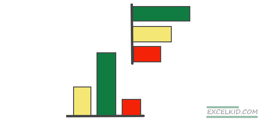
In the example, we want to use conditional formatting rules for a bar chart and apply three colors. To do that, set up the rules using upper and lower limits.
- Series 1: Sales are less than $2000
- Series 2: Sales are between $2000 and $7500
- Series 3. Sales are greater than $7500
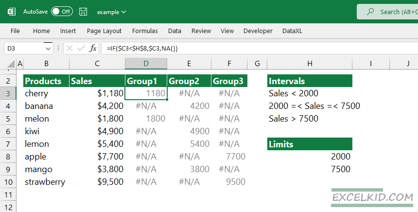
The next step is to create three data series based on the given intervals for the chart. For example, to get the data points for the first chart series, we use the following formula:
=IF($C3<$H$8,$C3,NA())
The formula compares the C3 value with the lower limit; in other words, if C3<2000, the formula will return the value in C3. Otherwise, apply the NA() formula to get the #N/A output.
The second formula returns numeric values with Sales between 2000 and 7500.
=IF(AND($C3>=$H$8,$C3<=$H$9),$C3,NA())
Because we have two conditions, combine the IF and AND functions. In this case, if the sales are greater than 2000 and less than 7500, the formula will return C3; otherwise, the result is #N/A.
Lastly, we will get the data points where the sales are greater than 7500.
=IF($C3>$H$9,C3,NA())
The third series will appear if the Sales exceed the upper limit.
#2. Create a Bar or Column Chart
Select the data and insert a new chart to create a bar chart (or column chart). You can select non-contiguous ranges by pressing and holding the Ctrl key. For example, select the B2:B10 range, then press the Ctrl key. Next, select the D2:F10 range, and finally, release the key.
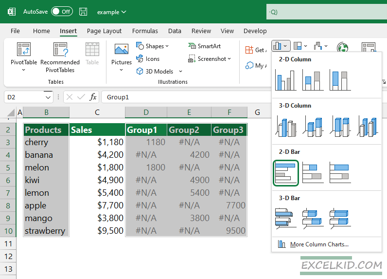
Locate the Charts Group on the ribbon to insert a new chart and select a bar chart.
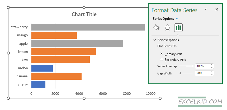
#3. Format chart series (Gap width and Overlap)
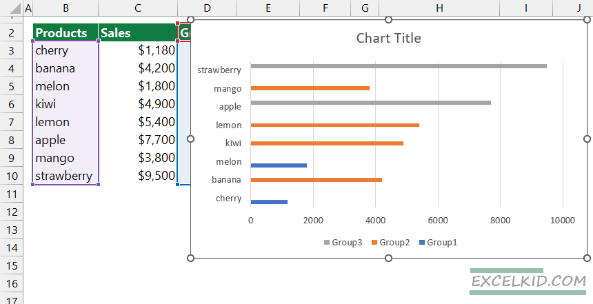
The new charts look noisy at first glance. We have random gaps between bars. Please select one of the bars, right-click on it to align the three series properly, and select Format Data Series. A new sidebar will appear on the right side of the main window.
Improve the conditional formatting chart!, Set the Gap Width variable to 20% and the Series Overlap property to 100%. Then, if you broaden the bars, we will see a chart with one visible series instead of three. Excel always hides two data series since we use the #N/A values for the unnecessary data points.
After the formatting steps, the chart looks like the below:
#4. Apply different colors for each group
Conditionally formatted charts use the same logic as regular cell or range formatting. The next step is to select the colors for each group and assign them to the visible data series.
In the example, we visualize data using the standard RAG-reporting colors (red, amber, and green).
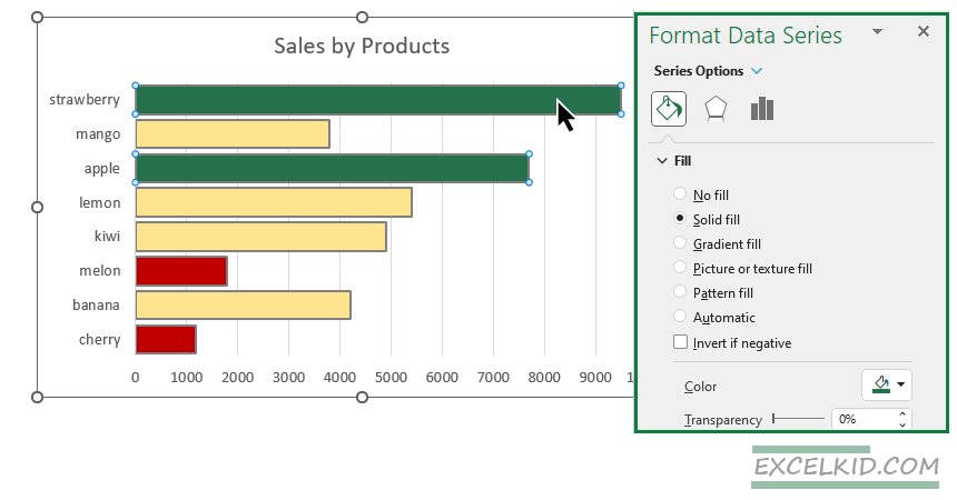
To replace the standard Office theme, select the bar. Then, under the Fill section, click Solid Fill and pick your preferred color. Repeat this step twice for the other two series. Finally, add a chart title, clean the chart, and remove unnecessary gridlines and borders.
Final Words
When you apply conditional formatting to a line or a bar chart, the performance categories can be clearly shown. It is good to know that if you change the values in the data table, Excel will update the colors automatically.