Excel TreeMap chart engine is our latest Excel tool. Let’s see a real novelty that you can’t see every day! After many years of waiting, the Treemap chart or square chart still didn’t get into the current version of Excel. Finally, our newest application is ready, and with its help, you can build dashboard templates in Excel.
Without programming skills, you can create spectacular heatmaps; otherwise, time-consuming and complex analysis tasks will become a daily routine. Although you will see treemap chart usage can be universal, we don’t want to use up your patience, so let’s start right away!
Introducing Excel TreeMap Charts
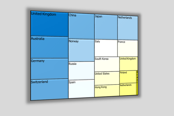
The color of the smaller units in the big square depends on how big of a weight (what values) they have in the starting list, which gives the basis of the chart.
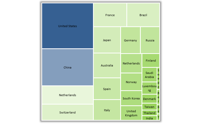
In this picture, you can see the result of a two-column list. Countries with higher values take up a bigger space from the whole square. We created this little program to freely choose the colors responding to the minimum and maximum values.
In the picture, dark blue represents higher values, white’s average, and the different shades of yellow represent the countries having smaller values.
Compare Sales Performance using treemaps
Let’s see another example. In the first column, you can find the names of sales representatives of a company, and in the second one, the achievements accomplished by them in percentile format.
The order is unimportant, so the list doesn’t have to be well-organized.
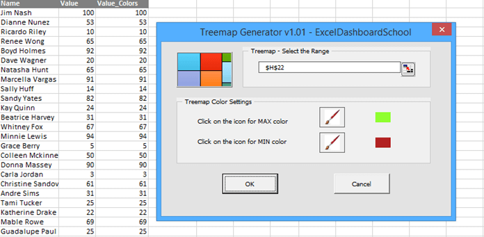
We will set the colors that the most poorly achieving will appear with red, the average will be white, and the above average will be green.
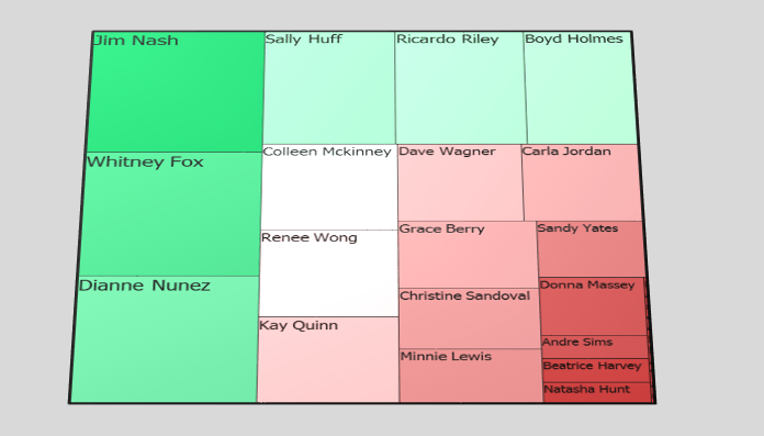
And the result is here! Only with a few clicks you’ll get a brand-new chart! So how do you like it?
TreeMaps and Risk Management
Among other things, the Treemap chart is capable of using risk management. We can see the departments of a company together with the related risk management (%).
After setting all the basic information, the tool will insert the new chart.
We have talked about this many times, but maybe not enough. Suppose we are using data visualization; we can quickly recognize the trends. In that case, we get an instant preview of the questionable / given indicator, and last but not least, we make our everyday life more straightforward.
Excel TreeMap Chart – The future
It would be hard to present only in one article how wide-ranging the fields of usage of the chart are. Some examples are sales, HR, and social media dashboards. However, this little application can stand its ground in any field and is worth trying!
Soon, Office 2016 will come out, which will bring more innovations than ever! For example, the presented chart will default to the Excel 2016 version. In the following weeks, we’ll have more articles about this subject. Stay tuned.
Excel TreeMap chart is, from now on, part of our data visualization tool, UDT.
Resources: