The conditional color chart is an interesting experiment for extending the Excel toolbox. Today’s article will help us solve a scarce but essential issue. So far, we could mostly have had the opportunity to use conditional formatting in Excel with cells. However, we can easily make a spectacular Excel chart template with some thinking.
What is this all about? We are talking about conditional formatting when we color or assign distinctive signs to the cells. Today’s presentation aims to display values by setting color codes larger or smaller than a given parameter (average).
Unfortunately, Excel doesn’t support this method, but there is a solution for displaying values different from the average (in the positive or negative direction). In the animation below can be seen the essence of this data visualization. You will use it more in the future because it is much better to see things in dynamics than static. We have represented the average by a broken blue line. We will compare to the points of daily values and differences. Thus, below average is symbolized by a red, and above average is green.
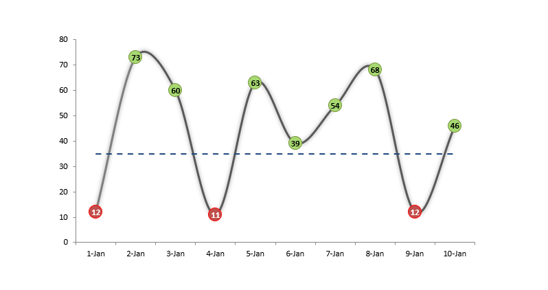
The animation shows how the display will change if we change the value of the ‘Target’ (average) field. At first glance, everything seems unchanged, which is true to some degree because values haven’t been altered. However, the average has changed, and data points have been colored according to this fact. For example, notice that the sixth data point from the left has changed! (Its value stayed 39).
Conditional Color Chart – Calculated Fields
We will create a four-part conditional color chart based on the data seen in the above picture. No, it is not a mistake. Only two can be seen here, but we need four of them.
In column ‘Period,’ we see those days’ results will be analyzed. The ‘Result’ column can mean income, expenditure, or anything else we want. The bottom line is that these are the daily values compared to the average in the ‘Target’ column.
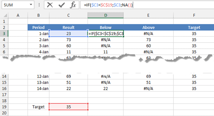
The most interesting for us is the columns’ Below’ and ‘Above.’ The Excel IF formula can easily decide if the ‘Result’ column’s values are larger or smaller than the average, namely the value of the ‘Target’ column.
Place two values in the ‘Below’ column; if Result < Target, then the formula gives a #N/A value, and if Result > Target, we will show the column value.
Also, place two values in the ‘Above’ column based on the previous method. The difference is only that the direction of the relation is opposite.
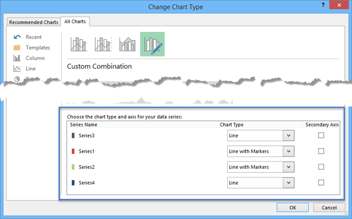
Conditional Color Chart – Multiple lines
Finally, the four columns are formed from which we will make the 1-1 line chart. You best imagine that the chart will be empty at the columns containing the values #N/A to draw anything. And this is what we need right now.
In this picture, you can see what components make up the final conditional color chart.
The ‘Result’ column’s values are represented by grey color. The red and green markers (Series 1 and Series 2) were shaped by the values of ‘Below’ / ‘Above’ columns, and ‘Series 4’ represents the average.
We hope you also liked today’s presentation. We have made a unique Excel chart that can be very useful even in situations that appear hard. The template uses conditional formatting. You can download the practice file here!
Resources: