Create an Excel frequency distribution table in seconds with the help of our free DataXL automation add-in! T
his is not new; we want to give you better and smarter tools daily. Read on; we are offering a very interesting Excel tutorial now.
What is the Excel frequency distribution table?
And how does it work? It’s not our goal to make things too complicated. Imagine a set of numbers that contains values between 0 and 100. The number of elements in the set can be arbitrary.
The point of the procedure is that we divide the elements of the set into equal sections (for example, 0-10, 11-20 …). In this example, we have chosen the interval to be 10. Of course, we can set this according to the task.
After this, we see how often the values fall into each interval. Statistics call this frequency distribution.
Why is it worth to make an Excel histogram?
Here are some examples from the weekdays. One of them is frequent questions that we can’t always answer immediately.
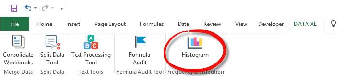
Have we sold more cheap or more expensive products? We can draw useful conclusions from the results of several thousand products. It does not seem like an easy task. Fortunately, the Data Explorer add-in is at our disposal. The whole procedure will only take a few seconds. In the picture, we can see the modified graphical user interface (GUI).
How to create an Excel frequency distribution table?
We have complemented the add-in with a frequency distribution table function. The Histogram icon appeared on the ribbon; we have marked this on the picture.
To “generate” the numbers, use the RANDBETWEEN () formula. The RANDBETWEEN () (0,100) will generate random numbers between 0 and 100, as many as you like!
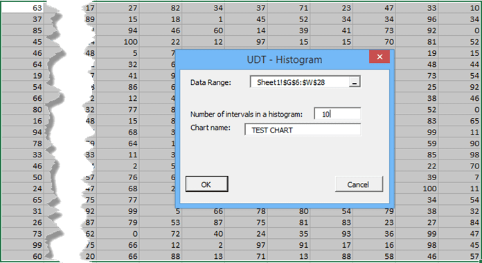
A user form or dialogue box with the most important information will appear by clicking the Histogram icon. The settings on the next picture are as follows. In the data range field, we highlight those ranges we will rank in 10 categories. In the next field, we set the number of classes into which we rank the values. There’s nothing left to do than to name the chart.
After pressing “OK,” the result will appear immediately. This, among many other things, is why we love the Excel add-in solutions!
The only thing we have to do is to follow the instructions on the screen. The Excel add-in and the VBA program will do the “dirty work” for us.
This is what the automatization of Excel tasks means!
It seems that we completed the given task in a much shorter time than using the traditional method.
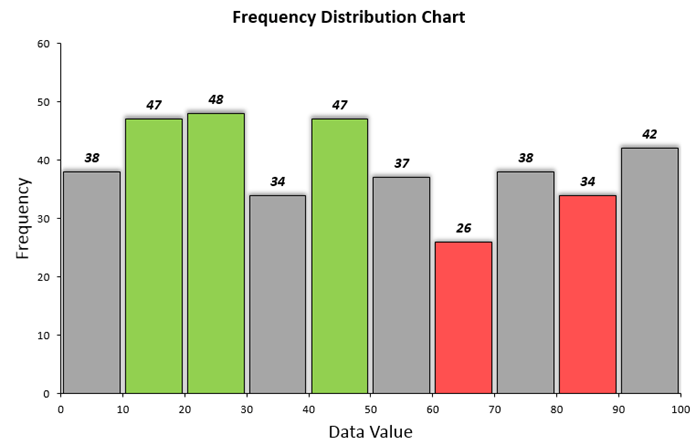
In the picture below, a frequency distribution table can be seen.
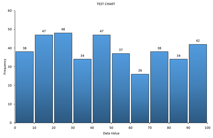
Let’s analyze the results! We have divided the values into 10 categories according to the previous settings. In seconds, we can see that most numbers fall between 20 and 30.
Following the same logic, we can see that the lowest numbers have fallen into the interval between 60 and 70.