
Use a heat map in Excel to create quick data visualizations! Today’s guide will be about how to build maps using conditional formatting.
What is a heat map?
A Heat Map is a perfect solution to highlight the crucial data points in a table or a range.
Let us see a simple example:
You have a data table that contains various data points (values) about the performance of five products by year. With a few clicks, you can use the heat map method to show the highs and lows (not least peaks).
In the next section, I will show you how to use a color map. Remember: a heat map can be a great choice if you’re working on an Excel dashboard.
Build Conditionally Formatted Heat Maps
Please take a look at this example below!
We want to get information about sales performance by product and year. Unfortunately, time is money, so we need to take a quick overview throughout the periods.
Finding the solution is easy if you want to find the best-performing product in 2020. But what if you have hundreds of different products? It looks like manual work can be a time-consuming project.
Why is manual work in a spreadsheet a waste of your time? You will get the same result if you follow the suitable old method – find the highest value in a given range and apply color to highlight it. Okay, now refresh or update your data! The cell color remains, and the data can be changed. So, avoid manual work!
We recommend you use conditional formatting to automatically highlight the key information ASAP based on a simple rule.
How to create a gradient heat map using color scales
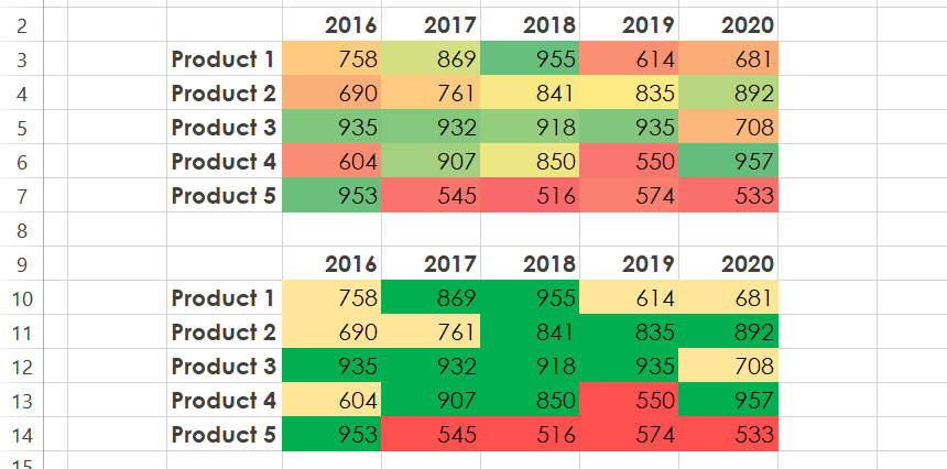
Our goal is to track changes in the given data table. If the cell value changes, the color scale must be followed by the changes. Check the prepared data table for the heat map in the picture below.
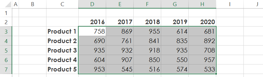
In the example, select the range D3:D7.
Click on the ribbon and locate the Home Tab.
Select ‘Conditional Formatting’ and apply ‘Color Scales’. Using built-in presets, you can pick your preferred combination. You can also create your scale for heat map visualization.
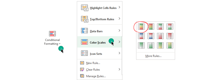
For simplicity, choose the most frequently used scale. For example, green is the highest value, yellow is the mid-range, and red is the lower range of values.
The table will look like this:
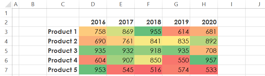
It’s easy to highlight and track the highest and lowest values for 2020. The highest value, 957, will be highlighted in green on the heat map. The lowest value is 533.
Take a closer look at the heat map! Which color defines the accurate mid-range? The yellow, light orange, or dark orange?
The main problem is the relative scale: if we use gradient color scales on the heat map, we cannot classify the data for high, mid, and low ranges.
Let’s talk about how to highlight the data differently. Use classification rules for your data to make the heat map visualization more accurate.
Use classification rules for group data
In the example, we’ll forget the color scale build intervals for a better result. So, first, identify the intervals; then, create three rules.
We’ll use multiple rules:
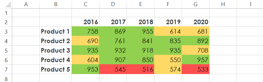
- Apply green shading if a cell contains a value greater than or equal to 800.
- If a cell contains a value between 600 and 799, the cell is yellow.
- For values that are under 500, we’ll use red.
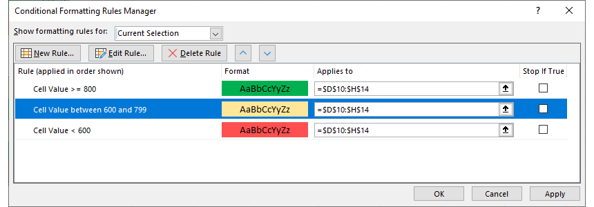
Check the result!
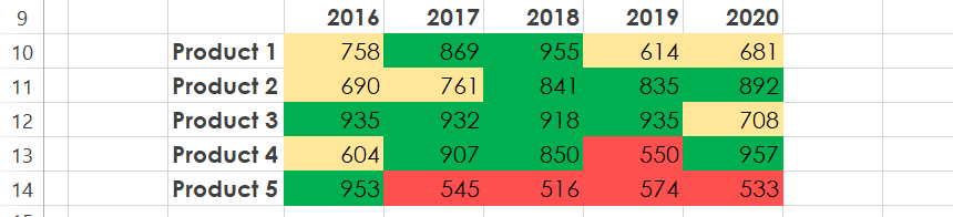
Compare the heat maps, and let’s see the differences. First, using the gradient scale, you’ll see the relationships between numbers without a clear structure.
If you group the values and split the range using conditional formatting rules, you will get an easy-to-read map.
Okay, which method should I prefer? It depends on your project; we recommend you use the second method.
Remove numbers from the Map
In some special cases, we don’t want to show the values on the map. How to do that? Believe it or not, the solution is straightforward.
First, press the ‘Ctrl+1’ keyboard shortcut!
The ‘Format Cell‘ window will appear. Next, click the Number Tab (on the left side of the box) and select the ‘Custom‘ option.
Download the sample workbook (Compatible with Excel 2010 and above)