This tutorial will show you how to create a Tornado chart in Excel using two clustered bar chart series and proper axis formatting.
What is a Tornado Chart? The chart is an improved version of a default bar chart. The difference is that the butterfly chart uses a sorted data set to show the categories vertically. This tutorial will show you how to design a tornado chart from the ground up using simple Excel charting technics. Furthermore, the main advantage of the chart is that you can perform a quick comparative analysis.
As usual, this template is a part of our ultimate charting guide.
Table of contents:
How to create a Tornado Chart in Excel
#1 – Prepare Data
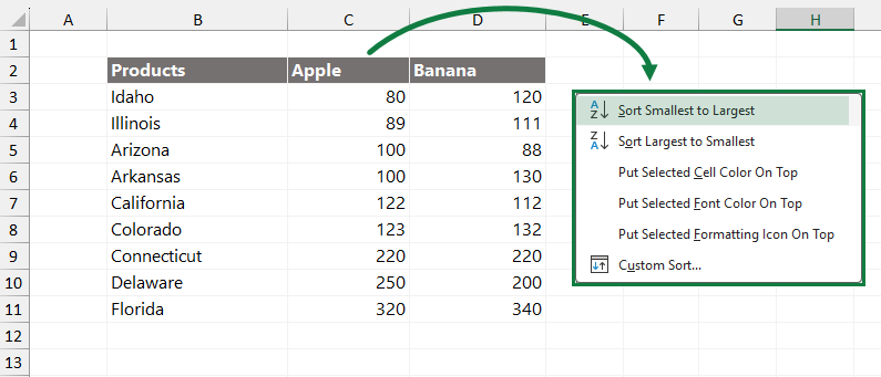
In the example, the data sets contain three columns. In column B, you can find the store locations. Columns C and D show the sales for the two main categories, Apple and Banana.
Select the column C and sort the data using the right-click > Sort > “Sort Smallest To Largest” command. Now, our data set is ready:
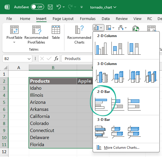
#2 – Insert a Clustered Bar Chart
Our data set is ready for the next step. The tornado chart is based on a clustered bar chart.
Steps to insert a bar chart:
- Select the range, in this case B2:B12
- Select the Insert Tab
- Choose the “Insert a Column or Bar chart” icon from the Chart Group
- Under the “2-D Bar section, select the “Clustered Bar”
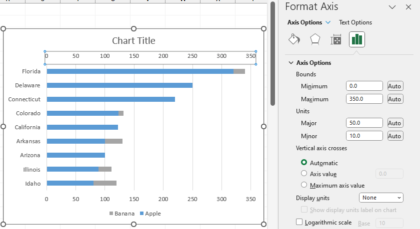
#3 – Modify Series Options: Add a secondary axis
We aim to build a tornado chart layout, so we must modify the Plot Series. Right-click the “Apple” series, then choose “Format Data Series” to display the task pane on the right side of the main window.
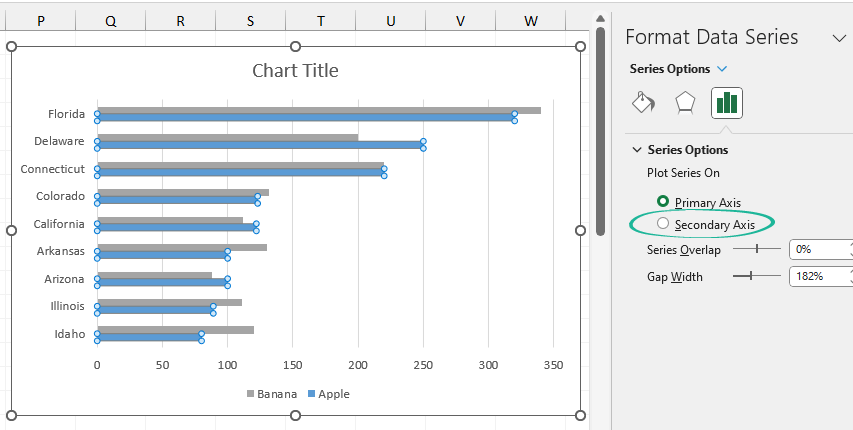
Select the “Series Options” group and change the primary axis to secondary by clicking the radio button.
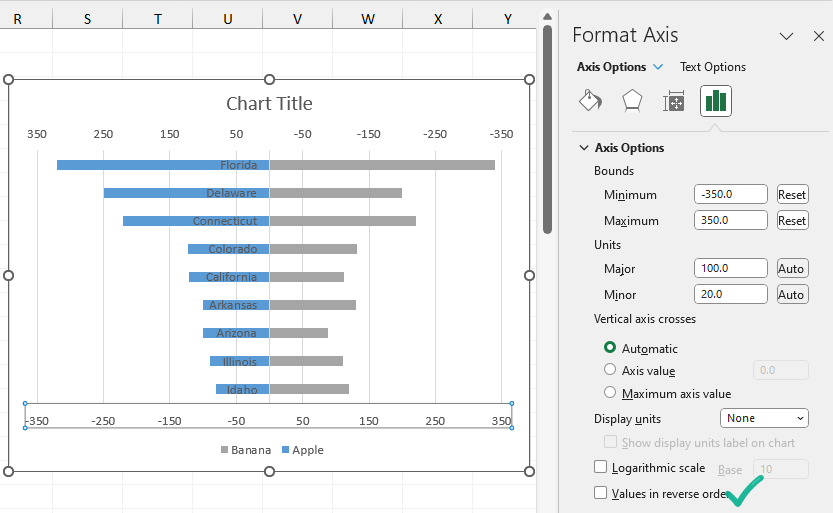
#4 – Change the secondary axis scale
The next step is to change the minimum and maximum bounds under the “Format Axis Options”. Right-click the secondary axis and use the following setup.
Change the upper bound to 350 and the minimum bound to -350. Check the “Values in reverse order” box to prepare the tornado chart layout.
Use the same setup for the primary axis. In this case, leave the “Values in reverse order” box untouched.
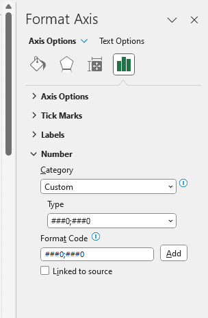
#5 – Change the primary axis number format
At this point, we have a properly formatted primary and secondary axis. It is time to apply a custom number format for the values.
- Select the primary axis; the task pane will appear
- Under the “Axis Options” group, click the Number drop-down list
- Select the “Custom” format in the “Category” menu.
- Choose the “###0;###0” formatting style from from the “Type” list
- Use “###0;###0” as a “Format Code”, then close the window
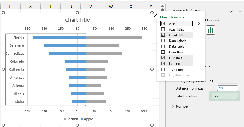
#6 – Change the Axis Label Position
To align the axis label position for the vertical labels, click on it. The “Format Axis” pane will appear. Check the “Axis Options” tab and set the “Label Position” to “Low“.
#7 – Format the Tornado Chart
Our chart is almost ready. To finalize the chart, apply some small transformations. First, remove the secondary axis! Right-click on the axis, then press the “Delete” key to remove it.
Next, you can add data labels. Add labels for your data to make our tornado chart easy to read. Creating labels is straightforward: right-click on the bars and choose “Add Data Labels”. For better readability, choose the “Inside End” option using the “Format Data Labels Pane“.
The last step is to set up the “Gap Width.” Wide bars make the tornado chart look better. Under the “Series Options” tab, you can set the “Gap Width.” Use 15% to improve the visual quality of the chart.
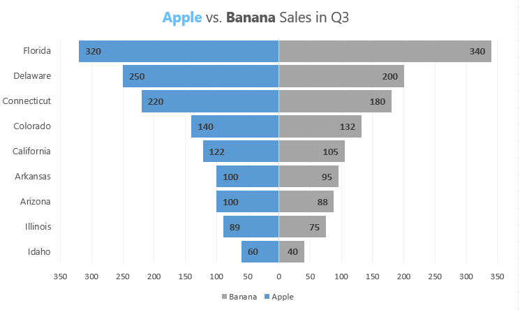
Here is the final result: