Discover our useful and free downloadable project management templates. Edit templates freely and provide high-quality project management dashboards!
Project Status Dashboard Template
Today’s featured project status template explains how to build a useful Excel project management solution.
We have combined the flexibility of KPI traffic light indicators with the power of the Gantt Chart. We can also use traffic lights to visualize product popularity further to measure the project status. This task is easy initially, but building such a template needs some attention. There can be some obstacles, but you can avoid them carefully by reading the tutorial. For example, looking at this figure, you can quickly review how a project works. But, of course, all projects work the same way.
Analyzing Project Tasks – Closer Look
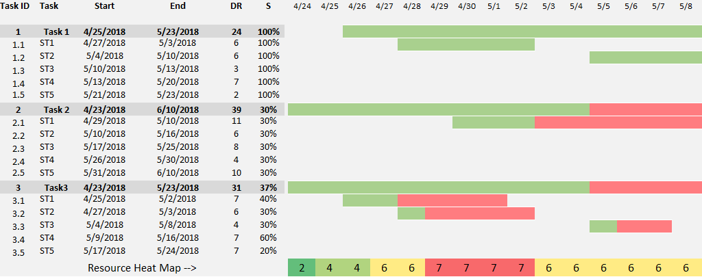
Take a closer look at the Excel template. The List column contains the name of the task list.
In our example, these are only marked as numbered Tasks.
It is obvious that real operations here must follow the activities that divide the project’s life cycle into four main stages: concept phase, development phase, execution phase, and transfer phase.
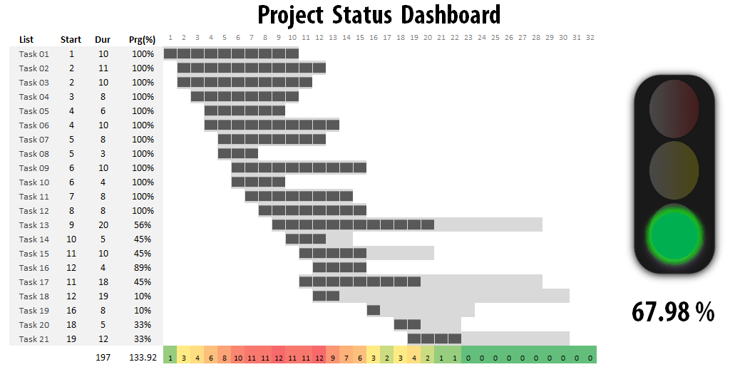
By specifying a completion rate between 0% (for a task that has not been launched) and 100% (for a completed process), we can review projected progress to real progress.
The name of the next column is ‘Start’. Use it to set the start date for sub-projects! The duration of a project’s key element is the number of days it takes from the beginning of the sub-projects to the point it is done.
The percentage complete (Done) fields provide the actual status of a task.
This Excel project status template helps communicate the goals of projects. For example, we can review planned progress to real progress by specifying a completion rate between 0% (for a task that has not been launched) and 100% (for a completed process).
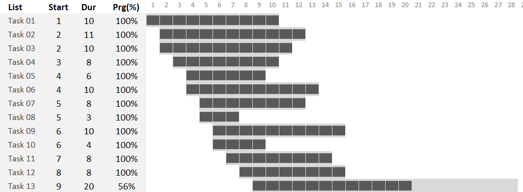
Effective Issue Tracking Using Gantt Chart
Here is a zoomed-in photo of the issue tracker. Now, you can see a series of status colors on the main task. When we complete a task, we mark it as finished using a blue marker. We will use grey if the task is running but not finished yet.
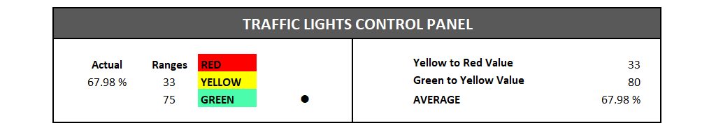
Now, set up the actual status using traffic lights!
We can use colors in the template to give important information about project health. For example, you can set up the red, yellow, and green ranges on the calculation sheet.
- If the key performance indicator is green, the project is under control, and the impact of problems is minimal.
- If the indicator is yellow, our plan may contain a few risks, but we have a strategy and experience to return the traffic light to green.
- Red light is a critical problem with a time frame, cost calculations, or the project is behind schedule.
In this picture, we can see the structure of the control panel.
You can determine for the ‘traffic light’ what color to use for what range. So, in this example, from the 33% to 75% completion rate, the light is yellow, and above 75% is green, the project’s status.
This is how we would summarize the operation of a project.
Modeling a Software Development Project
Project management templates provide an overview procedure in IT and software development. Okay, it’s time to discuss an exciting topic! Software development isn’t that we design a product; within two weeks, we develop it without any arising issues. There is no such thing!
We effectively support the developers’ work with an Excel template application. Also, it can be its further advantage in providing continuous feedback for the management. We should start with an interesting question.
Ticket status tracking
A ticket is a warning sign (not always necessarily a mistake!) indicating we must reconsider a particular activity or procedure. For example, imagine a software development studio where everyday activities are conducted.
After a module is done, it is carefully checked and tested. But, of course, nobody expects things to be perfect for the first time.
A ticket can have three statuses.
- The assigned means we have recognized the mistake and forwarded it to the development team for correction.
- We have corrected the mistake in the corrected phase, but it still needs testing.
- The closed phase is the best for all developers. The fixing and testing were successful, so the only thing to do is close the support ticket.
We’ve created the template from the ground up to reach all important information immediately.
Forms of Risks and their effects on Project Management:
Software bugs can be categorized into the following groups:
- Critical bugs can lead to a breakdown of the application or data loss. A workaround for the problem is impossible.
- High-level bugs result in raised damaged functionality. Unfortunately, a workaround won’t exist or is impossible.
- Mid-level bugs result in non-critical problems in the system. A sufficient workaround exists.
- Bugs with low flags mean low or very low impairment. An acceptable workaround exists.
In this section, we provide a possible solution for displaying mistake signs’ current and past status with the help of data visualization.
Add interactive controls for Project Management Templates
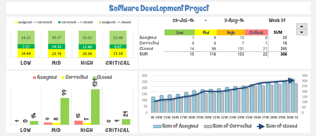
And now, we got to the part we love the most: the design! We have tried to plan the four charts for a high-quality and easily readable result. But first, let’s see the upper right corner!
In the picture below, you can see the risk-status matrix. First, you can see the actual status of risk factors signs and the corresponding risks. Next, we portray the possible effects using the previously mentioned four categories.
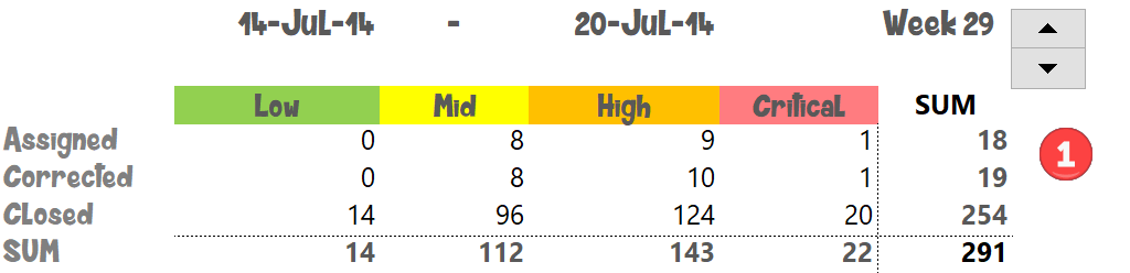
As you can see in the picture, we have portrayed the results of the 31st week. For simplicity’s sake, we have applied one year in the analysis.
With the help of a Scroll Bar (VBA form control), we can jump from week to week in the table.
It is important to note that this part of the template shows WEEKLY information. The other three charts show accumulated values!
Analyzing and tracking the actual status of the project
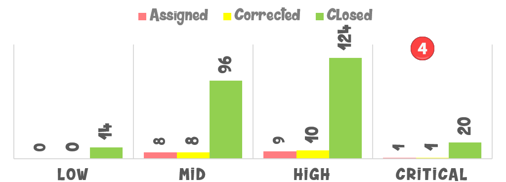
Let’s study the bottom right part closely! It’s also an important analysis. We can track the changes in support tickets’ status.
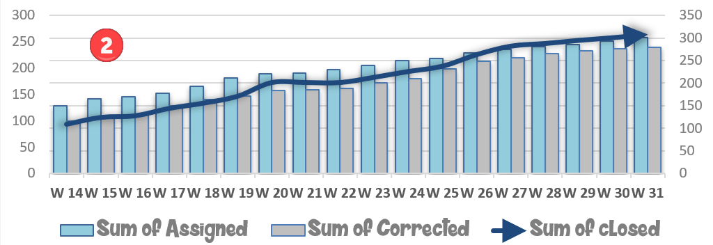
These are summarized values on the chart and show the changes through the period.
Now, look at the results of around the 20th and 22nd weeks! Again, we can see the assigned and corrected type of support tickets were dominating.
But the closed support tickets dominated by the end of the 31st week.
Project Risk Analysis – Create a Breakdown Chart
Let’s see the percentage breakdown also! So, we have disclosed the four risk categories. But we haven’t talked about the most important thing yet.
We also have to analyze the status changes of the support tickets! If we find a mistake in the development, we usually assign that to the developers/testers, and after successful testing, we close it.
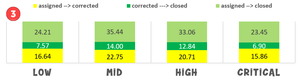
With the help of the Excel project management template, this little but essential information can also be tracked and followed. The fourth chart is almost entirely just like the previous one. There is only one important difference. Here, the support tickets’ quantity is indicated.
Change the scroll bar to display the changes dynamically.
Project Risk Template
Our project risk template will show you how to track and analyze risks. We don’t have to explain the risks linked to the project regarding business decisions. Using the now-introduced business spreadsheet, we will utterly simplify tasks.
Scope of analysis
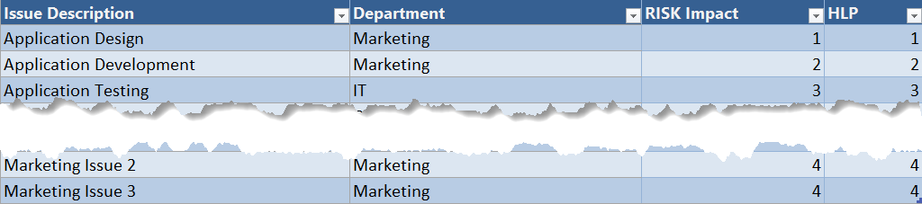
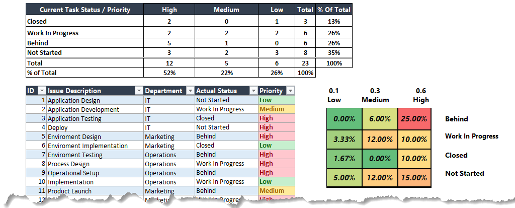
Let’s look closely at a company’s operation and related risks. In the first column (Issue Description), we can see the factor that, if it shows, generates risk.
The second column (Department) contains the departments currently operating at the company.
The third column (Risk Impact) marks the risk factor on a scale from 1 to 10, namely the negative effect that will come about if the risk occurs.
The fourth column is a helper column, and its function is that this has to be identical to the third column, which will help the creation of the template.
In the first analysis, with the help of a spectacular chart, we will show how the sum of certain factors (Issues) influences the risk.
We will examine specifically the factors that cause the risk. For now, we will not examine which department is its cause.
Start with the above macro application and highlight all the data boards and headings. Then, we will briefly show how to interpret the received results as soon as we are ready with the risk heat map.
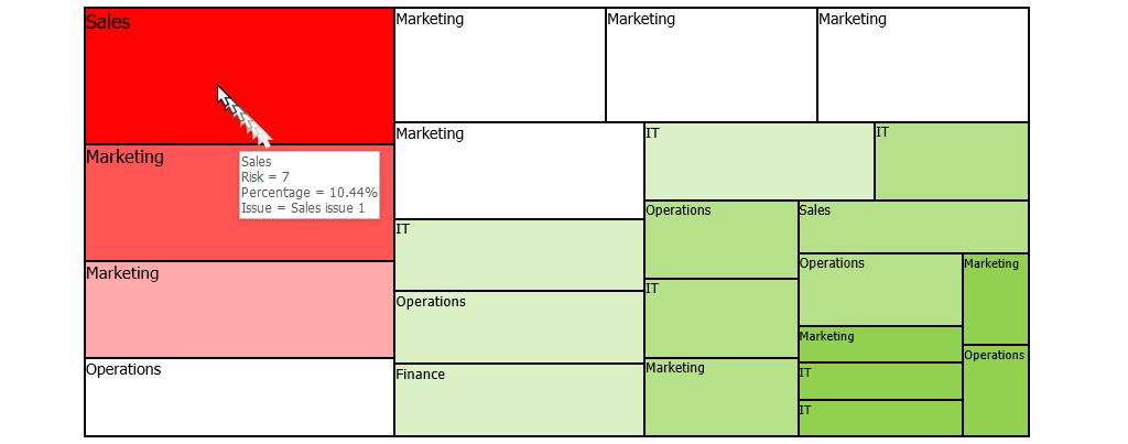
It is visible that the most significant risk concerns the Sales department, but Marketing also has considerable significance. Don’t forget that we are talking about Issue Level Analysis here, so one department can play a role several times.
The function of the chart is that we can identify the most crucial factors regardless of department.
The most significant risk factor is “Sales Issue 1”. It is enough to look at the chart; its risk impact is 7, the highest on the list.
According to the heat map, you can find the least risky operations in the bottom right corner of the square and green.
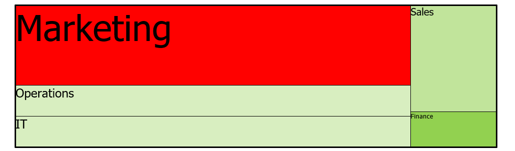
Department Level Analysis
In the second step, we summarized the risk factors of the operations of the departments. In this picture, you can see the initial setup made for the heat map.
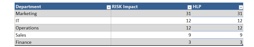
The heatmap shows a different picture once we are done, even though we discuss the same data sheet with unchanged values!
The risks added up on department levels, and we can establish that the most endangered department is Marketing, and this is Operations. Fortunately, there is a field where everything works well: Finance.
Why are the first and second heat maps showing such different pictures?
Let’s take the Sales department for example. It should appear by the first heatmap that Sales is the troubled department. However, if we look closely, we can see very much average risk factors related to the “Marketing” department.
The second treemap sums up these average values, and according to these, it is evident that in the operation of the given company, the biggest challenge is the “Marketing” field.
Naturally, the analysis shown here is only a possible example. If you are a business or risk analyst, you must look at the company’s processes and make such a study.
Are you interested in how to make the risk management template? The Risk Map Creator is a part of our Excel data visualization add-in.
How to build the project risk template using conditional formatting?
This section will show you how to build an Excel risk template. First, we used an exclusive ID to categorize the issue in the tracker. Next, populate the Issue column using the description of the problem.
Type the issue’s priority into the priority column, then select from categories defined by the risk management plan.
Effective choices include the following: High, Medium, and Low.
Instructions for Changing the Contents of drop-down lists:
Highlight the cell in which you wish to change the content of the drop-down menu. For example, from the file menu, click Data, then Validation, and you can change the content of the source field.
This is calculated once you select the priority and actual status. The matrix uses conditional formatting to display color.
The project risk template uses risk ranking to determine matrix scores. This is a priority (with weighted category) list determined by the relative ranking of the risks.
So, if you change the actual status of priority, the risk score is calculated automatically.
Issue Tracker Template
Issue Tracker Template is a visually oriented Excel project management tool that shows any project plan’s various tasks progress.
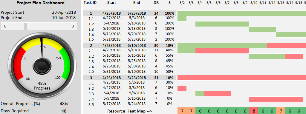
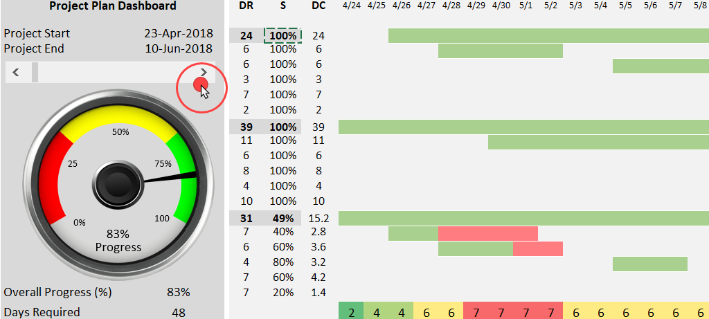
We divided the template into three sections: the Gantt chart area, the gauge area, and the resource heat map. A progress circle chart is valuable for measuring the actual project completion ratio.
Let’s get acquainted with some terms before we start the progress in detail.
Read more about how to manage projects in Excel.
What does issue tracking mean?
The most important thing we must know about it is they continuously track and analyze project-related activities.
Activities have the characteristic that they are executable parallel to each other. Next, we’re going to talk about the setbacks in the creation of the resource heat map.
What is the Gantt chart?
Why is it essential to create it in the planning phase? The Gantt chart has a double function: for one; we record the steps of one key process so that its realization can be whole. Secondly, the project manager will be able to track the project plan. We must not forget that it plays a significant role in tracking the realization plan – fact indicators.
Take a closer look to spot this project management report!
Issue Tracker Template – Overview
We could write down the creation process: first, we list all the activities and then determine their relations (if any). The next step is to assign each activity the related timeline and resources. The last task is to draw the Gantt chart.
We can analyze and report task status. Thus, we can easily follow project events. It automatically detects the inserted values into the column, showing them in percentage value. Just place them according to our plan.
The task timeline is the key component of a project status report. Our issue tracker template shows the expected completion and actual completion.
We use colors (green and red) in this section, which shows the finished or on-hold tasks in different colors.
Visualize the Plan vs. Actual variance using a Gauge chart
On the summary screen on the left-hand side, we can find crucial information about the project’s actual status. For example, here’s the project’s start -and end date, which we calculated based on all activities.
We used a slider to be able to scroll in one-step intervals the part of the screen containing the Gantt chart.
It is practical to handle the whole project in space-saving mode. It doesn’t matter if it spans 30 days or even one year. The day-by-day portrayal provides a detailed enough display.
With the help of a gauge chart, we portrayed the completion rate you can find in the Overall Progress field. Its values can be between 0% and 100%. Finally, the Days Required field shows the planned length of the project in days.
With the help of the gauge chart, we will visualize the completion of the overall procedure. Finally, the project status report shows you a short visual description of the important elements of the project.
Resource Planning – Human resource heat map
The third part of the Issue Tracker is the resource heat map. Again, you can make it easy with the knowledge of resources assigned to activities based on the Gantt chart.
There are many methods of making the heat map. We will show you one made by us and thought to be simple.
We have enlarged one part of the template to better understand the logic of making the resource heat map. So, we want to know what problems arise if we have to do several sub-tasks daily.
The classical conditional formatting shows the color chart at the bottom of the picture.
Number 7 indicates all the sub-tasks we must perform on that day according to plan.
For the other days, we do an average of 6 tasks.
With the help of the color chart, we can instantly see what days we may encounter some trouble because of a lack of resources.
Practice with our issue tracker template and create your project management tool using Excel!
Project Timeline Template – Milestones
With the help of the project timeline template, we will give you a tool to make the project task administration very easy. In today’s story, we will review this subject in detail.
In developing the Excel template, we used a visualization representation that was adrift from custom. Nevertheless, we want to give you something useful. We hope that we can be successful again.
A milestone is an event that marks the overall end of a primary process or processes related to each other. By definition, the project milestone is not associated with duration, doesn’t require effort, and doesn’t connect to work. Instead, the work plan acts as a control flag, showing that some other job has been done.
We use milestones as a control point of a project to approve project advancement and confirm the remaining work. The management uses it as a snapshot for the approval of project improvement. It is important to note that reaching a milestone often requires decision-making.
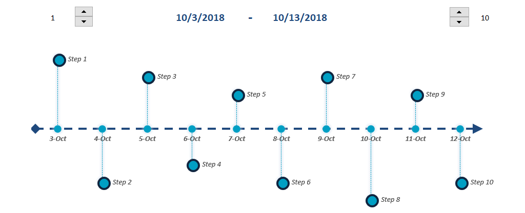
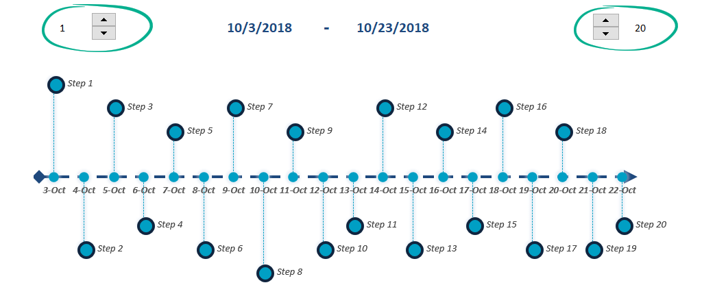
Create a Timeline using a dynamic chart
This section will show you how to create a timeline in Excel. We placed two variables on the dynamic timeline template.
You can set the number of timeline elements you want to display on the top left side. For example, if this parameter = 1, we can trace the project from the beginning. If the value is 5, we see the project from the fifth step.
In the top right corner, we can set how many tasks we can see on the dashboard. In this picture, we have maximized 20 the number of tasks that can be seen on the project timeline template.
You decide the most appropriate task, project, or process. In the middle, we presented a period. Its starting point is the beginning day of the first appearing task. Its closing point is the execution day of the last appearing task.
Project Tracking – How to Create the Milestone Plan?
Now, it’s worth paying attention to the following rules when creating a milestone plan:
- We should compose a maximum of 12-25 milestones; of course, the most critical factor is the size of the project.
- The chosen milestones should cover the whole life cycle of the project.
- The planned period between the realizations of the given milestones should be about the same.
- While planning, we should pay attention to the fact that it should be explicit, plain, and simple.
- Last but not least, the milestones’ results should characterize the project’s nature as far as possible.
Download Free Project Management Templates
Project Management is a complex topic, but we hope some novelties grab your attention and you will start creating a self-planned Excel template!
There is only one piece of advice for you worth considering. First, it is often enough to think our dashboard planning through before implementing it immediately.
So, walk slowly and live longer – this is true for Excel. These project management templates support various project-related tasks.
Download free Excel project management templates.
Take a closer look at stunning dashboard templates! Stay tuned.
Additional resources:
- Sales Tracking Templates
- Find various software options to help you on softwareforprojects.com.