This step-by-step tutorial will show you how to create a Quadrant chart in Excel to support SWOT analysis. Based on your criteria, we use the Quadrant chart to split values into four equal (and distinct) quadrants.
Excel has many built-in chart types and designs, but if you want to create a Quadrant chart, you need to build it manually. The good news is that implementing a SWOT analysis-ready chart is straightforward.
Steps to Build a Quadrant Chart in Excel
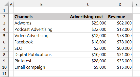
The example will show you how to display a cost/revenue analysis based on the marketing channels. Quadrants are equal-sized areas. Based on the Advertising Cost and Revenue, it is easy to categorize the highest and lowest-performing channels.
Here is our initial data set:
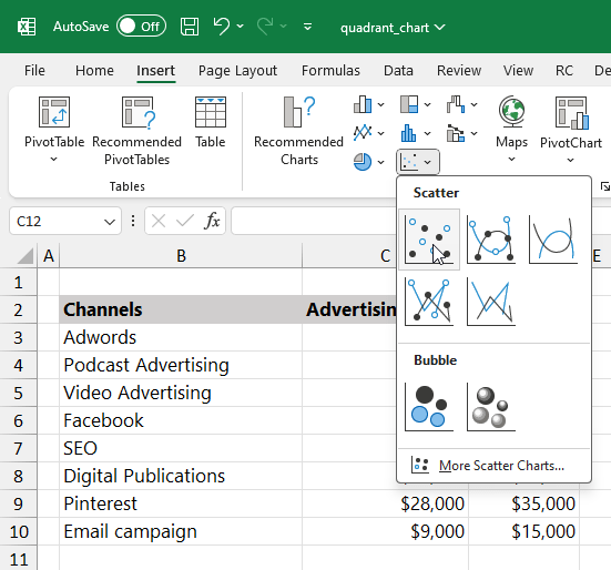
#1: Insert a new XY scatter chart
For data visualization purposes, insert a blank XY scatter chart first. After that, we will add the data step-by-step.
- Select an empty cell.
- Click the Insert tab, then select the “Insert Scatter (X, Y) Chart”.
- Choose the “Scatter” chart icon.
#2: Select Data for the Quadrant chart
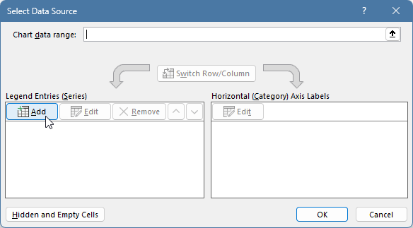
The picture below shows an empty chart. It is time to add the data. Right-click on the chart area and the context menu will appear. Choose “Select Data” from the list.
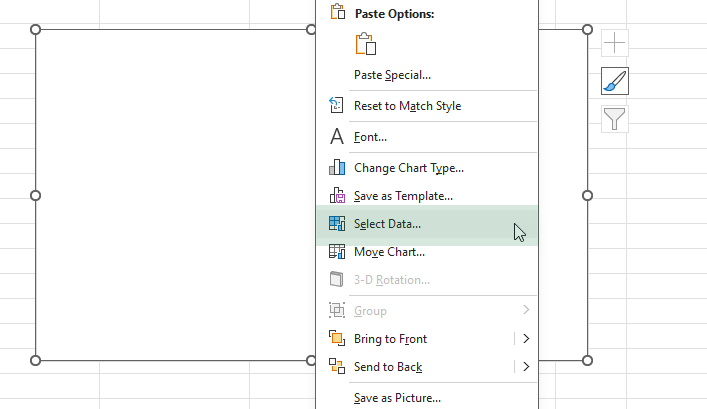
After clicking the “Select Data” option, the “Select Data Source” dialog box will appear. Under the Legend Entries (Series), click “Add”.
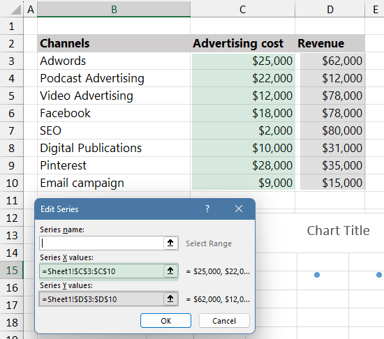
Configure the series:
- Series X values: Select C3:C10 in column Advertising Cost (Column C)
- Series Y values: Select D3:D10 in column Revenue (Column D).
- Click OK twice to set the series and close the “Select Data Source” dialog box
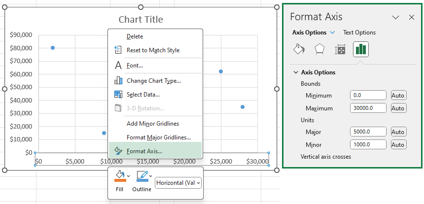
#3: Set upper and lower bounds of the horizontal axis
In most cases, Excel tries to set a scale based on your data set. So, we need to manually set the upper and lower bounds for the better readability. Select the horizontal axis to show the “Format Axis” task pane.
Apply the following setup:
- Click on the bar chart icon to reach the options.
- Apply 0 for the Minimum Bounds.
- Type 30 000 for the Maximum Bounds.
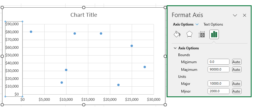
#4: Set the minimum and maximum scale values of the vertical axis
Now click on the vertical axis and change the minimum and maximum limits using the “Format Axis” task pane.
Apply the following setup:
- Apply 0 for the Minimum value.
- Type 90 000 for the Maximum value.
#5: Create dividers for the Quadrant Chart
The most important step is to split the chart area into four equal sections; we use a helper table. Use the data set below to align the dividers properly.
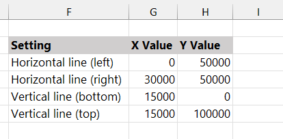
Here is a short guide on how to set the X and Y positions for the quadrant points.
- Horizontal line (left part): X = 0, Y = 50 000
- Horizontal line (right part): X =30 000, Y = 50 000
- Vertical line (bottom part): X = 15 000, Y = 0
- Vertical line (top part): X = 15 000, Y = 100 000
#6: Add the quadrant lines to the chart
Now we have the proper data set, right-click the chart and choose “Select Data”, then click “Add” to open the “Edit Series” dialog box. For the left and right horizontal lines, browse the range G3:G4 and H3:H4.
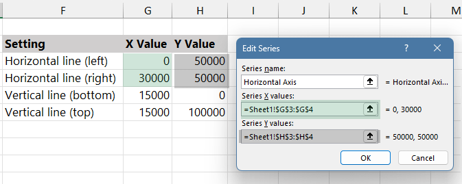
Click OK to close the dialog box.
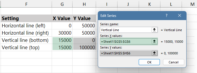
Now repeat the step mentioned above for the vertical parts. For the up and down parts of the vertical lines, browse the range G5:G6 and H5:H6. Click OK to close the “Edit Series” dialog box.
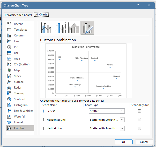
#7: Change the chart type
To change the chart type, right-click the chart area and click “Change Chart Type.” Then click “All Charts” and select the Combo chart icon.
For Series 1, select “Scatter” from the drop-down list. Apply the “Scatter with Smooth Lines” chart type for the “Horizontal Line” and “Vertical Line” series. Finally, click OK.
#8: Format Data Labels
Our quadrant chart is almost ready. One of the last steps is to add data labels to the chart. Right-click on any blue dots, then click “Add Data Labels”.
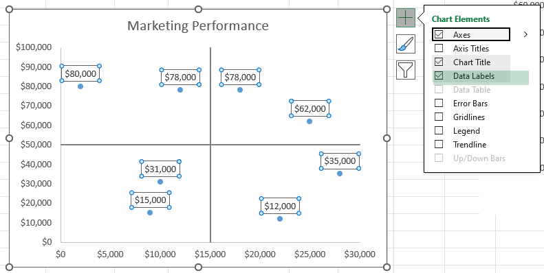
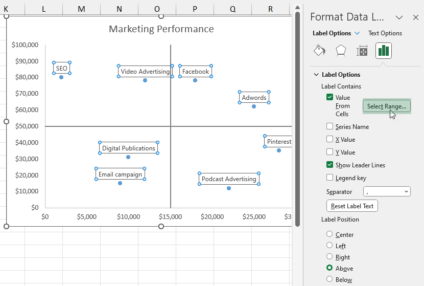
Instead of the numeric values, we will connect the dots with the names. Right-click on the label and choose “Format Data Labels”.
Use the setup below on the task pane:
- Select the Label Options tab.
- Make sure the “Value From Cells” box is checked.
- Browse the names from column B.
- Click “OK.”
- Leave the “Y Value” box unchecked.
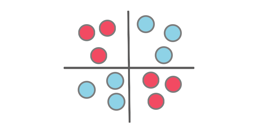
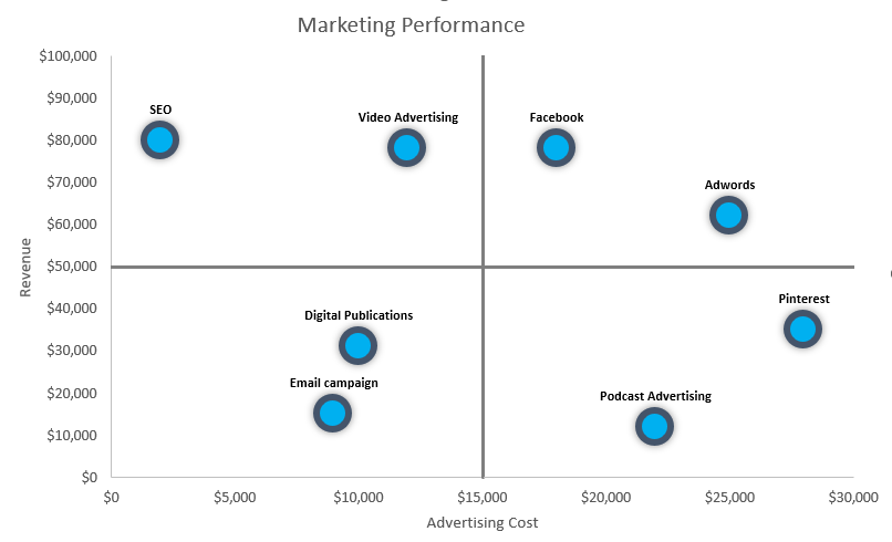
#9: Finalize the Quadrant Chart
The last step is to apply a custom formatting style for the dots. You can format the markers by changing the color and shape of the outline. The final chart looks like below:
Additional resources: