How to create a Waterfall chart in Excel (bridge chart) that shows how a start value is raised and reduced, leading to a final result.
Before diving into the details, we want to clarify that Excel 2013 does not support the waterfall chart by default (as a built-in type). In this case, you must invest more time in creating the chart. In Excel 2016 and above, the waterfall chart is ready to use when your Office package is installed.
Table of contents:
- What is a Waterfall Chart
- How to create a Waterfall Chart using Excel 2016, Excel 2019, or Microsoft 365
- How to build the chart using Excel 2010 and Excel 2013?
What is a Waterfall Chart?
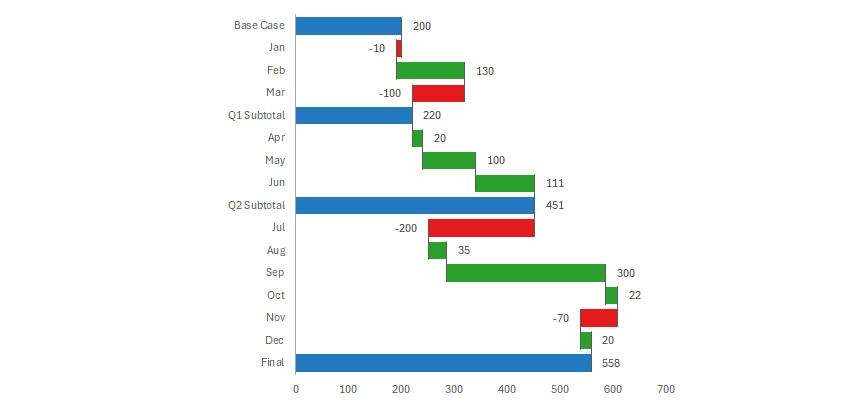
The Waterfall chart visualizes a starting value and the cumulative effect of a series of positive and negative values, leading to a final value. The bridge chart provides insight into the individual components (cost, sales, etc) or influences contributing to a change between the starting and the ending data points.
Before we create a bridge chart in Excel, we should take a closer look at the main parts of the chart.
- Starting value: The chart begins with a column (starting point) representing a baseline or initial value.
- Intermediate steps are a series of positive and negative changes. If we add a positive value (for example, the sales are higher than last month), a rising column shows it. Sometimes, we have negative changes; the height of the next column corresponds to the negative change. Each new column begins where the last one finishes, forming steps.
- End Point: The last column of the bridge chart shows the final amount, which is the start amount adjusted by all the changes in between.
You can use color-coded stacked column charts to recognize positive and negative values. This chart type is popular when you want to create P&L reports, income statement visualizations, or dashboards. This tutorial is a part of our chart templates series.
How to create a Waterfall chart in Excel?
Use this tutorial if you are working with Excel 2016, Excel 2019, or Microsoft 365.
We are using a waterfall chart for two purposes.
- Show the cumulative effect of a series of positive and negative values.
- We have data representing inflows and outflows, such as financial data.
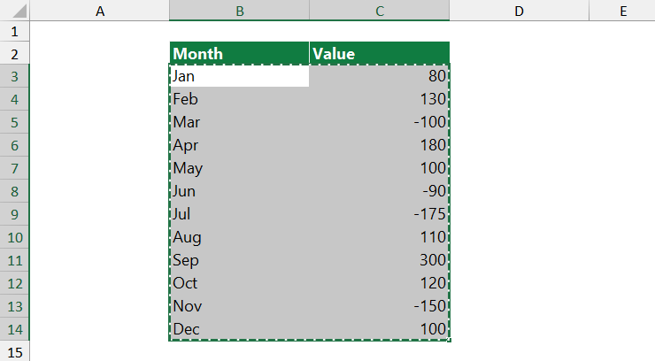
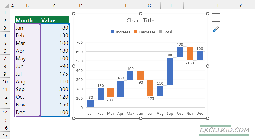
#1. Select the range containing the Data
In the example, we have the data in B3:14. The first step is to select the range.
#2. Click Insert Tab
Go to the ribbon and locate the Insert Tab. Locate the Charts Group.
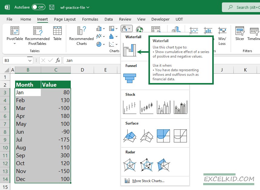
#3. Under the Charts Group, choose the Waterfall icon
Under the Charts Group, choose the Waterfall Chart icon to insert a new chart.
Your chart is ready, but take a closer look at the details. The default chart is a very basic implementation. For example, you can not use calculated fields. Furthermore, subtotals are missing by default. To improve the chart, you have to apply additional customizations.
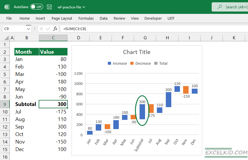
#4. Add Subtotals
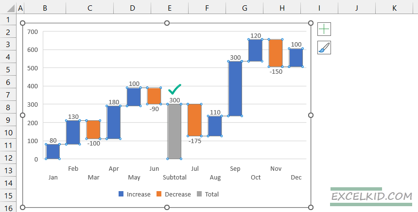
In the example, you want to add a calculated field to summarize the data between January and June. What are subtotals? Subtotals are visual checkpoints (milestones) in the chart, making the graph readable. Insert a new row and calculate the subtotal using the =SUM(F3:F8) formula. The chart will reflect quickly.
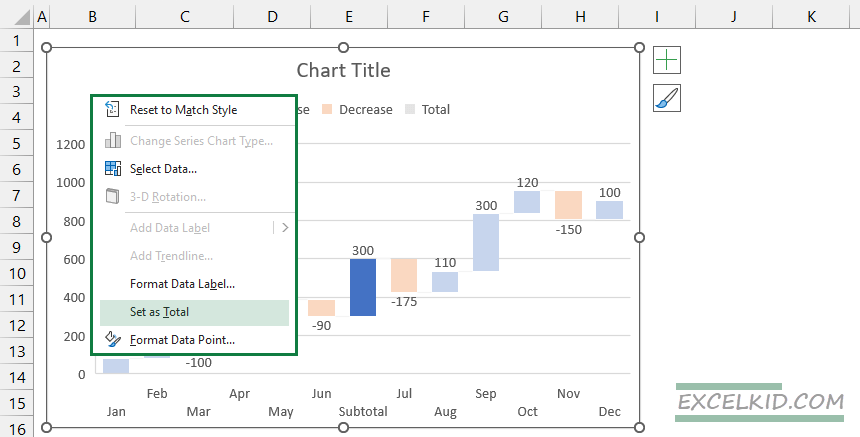
You can apply the ‘Set as Total’ function to change the inserted bar to the subtotal. Select the bar that you want to convert to a subtotal. Right-click on the selected bar. Finally, Select the ‘Set as Total’ command.
There is much room for improvement!
Build a Waterfall chart using Excel 2010 or Excel 2013
Sometimes, you must insert a waterfall chart but have an outdated Excel version. Okay, in this case, we do not have native support. There is no problem with that; use the following step-by-step tutorial to build a chart.
#1. Create a helper table
First, create a helper table and insert the following columns: ‘Cumulative,’ ‘Start/End,’ ‘Before,’ and ‘After.’ After that, use the following formulas to calculate the values:
- In cell D3, apply the =SUM($C$3:C3) formula.
- Start value (E3) = D3, End Value (E16) = D15
- Before series: =D3 and copy the formula down
- After series: =D4 and copy the formula down
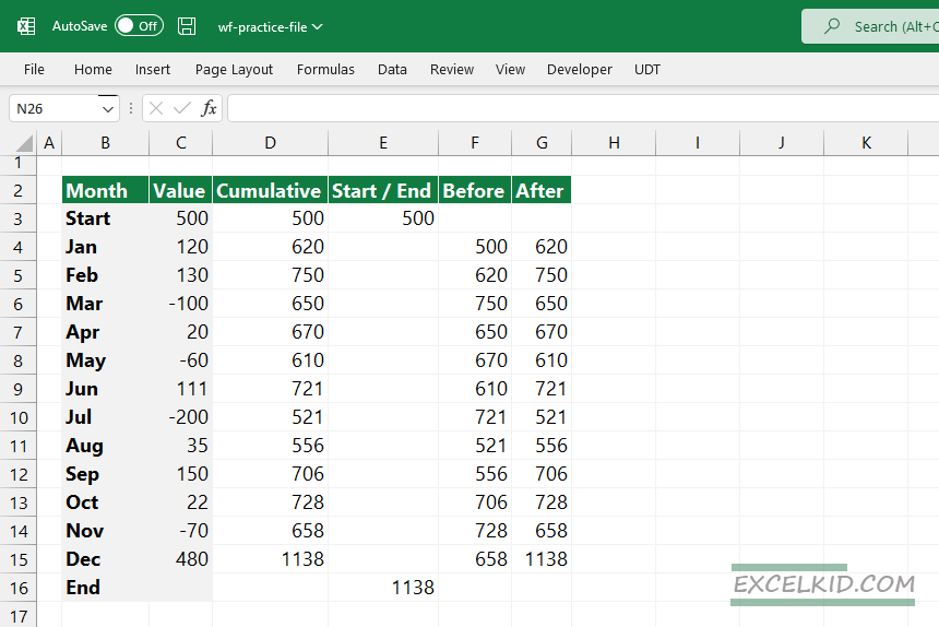
Press the Control key, hold down, and select four columns, as in the picture below.
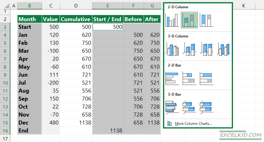
#2. Insert a stacked column chart
Next, locate the Insert Tab on the ribbon and insert a stacked column chart.
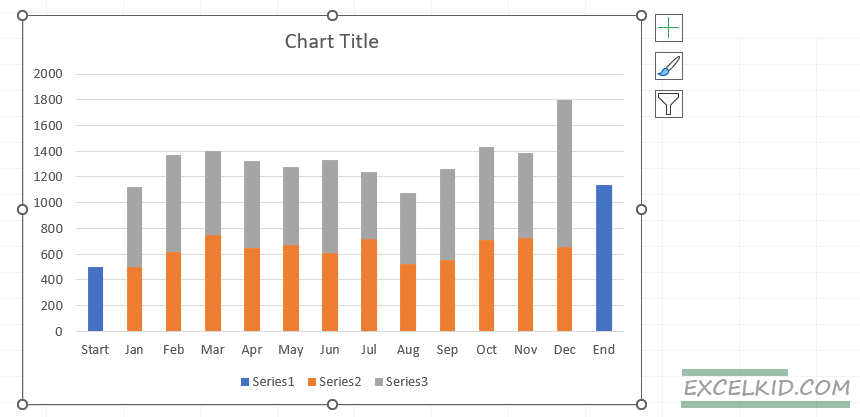
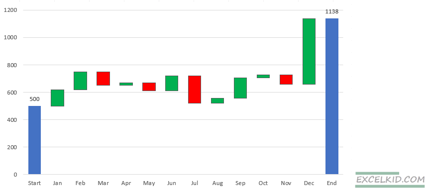
The result looks like the picture below:
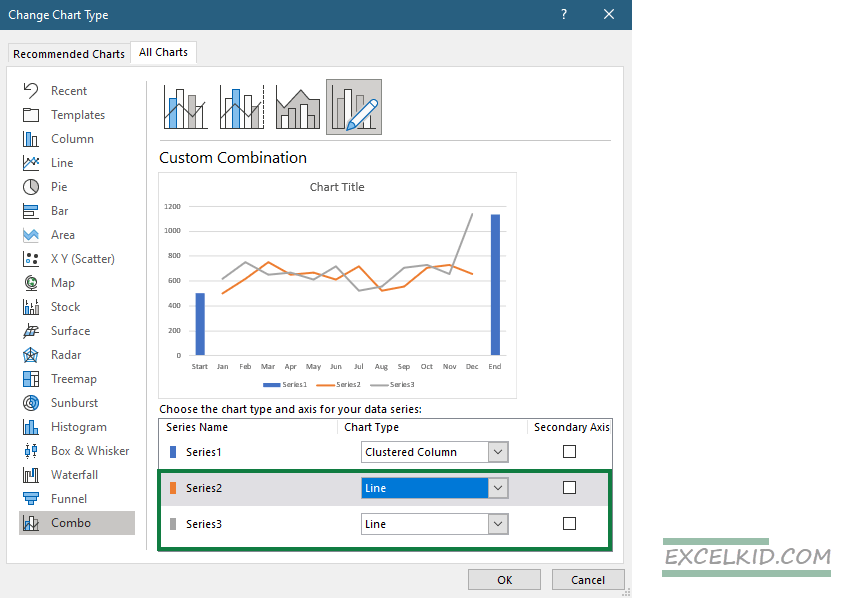
#3. Change the Chart Type and create a combo chart
Now we have three stacked column series, but we need columns only for the Start and end values, so we need to change the chart type. Right-click on the Chart and choose ‘Change Chart Type.’ Use line charts for the Before and after series. Next, we will use the combination chart to create the waterfall chart. Do not forget to leave the ‘Secondary Axis’ checkbox unchecked.
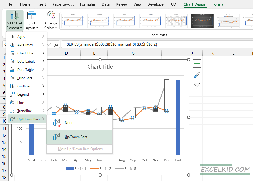
#4. Add Up / Down Bars
We must apply a trick to create “bars” from the line chart. First, select the line chart series. Next, select the “Chart Design” tab and add new chart elements, such as up/down bars.
#5. Format the chart
To get the bars closer, decrease the gap between the data points. Use the ‘Format Data Series’ task pane. Then, under the ‘Series Options,’ add 100% to the gap width.
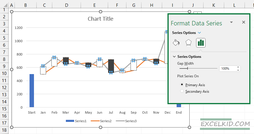
Finally, hide the line series. Then, under the ‘Series Options’, apply ‘No line’. The last step is to apply blue for the start and end bars, green for the positive bars, and red for the negative bars.
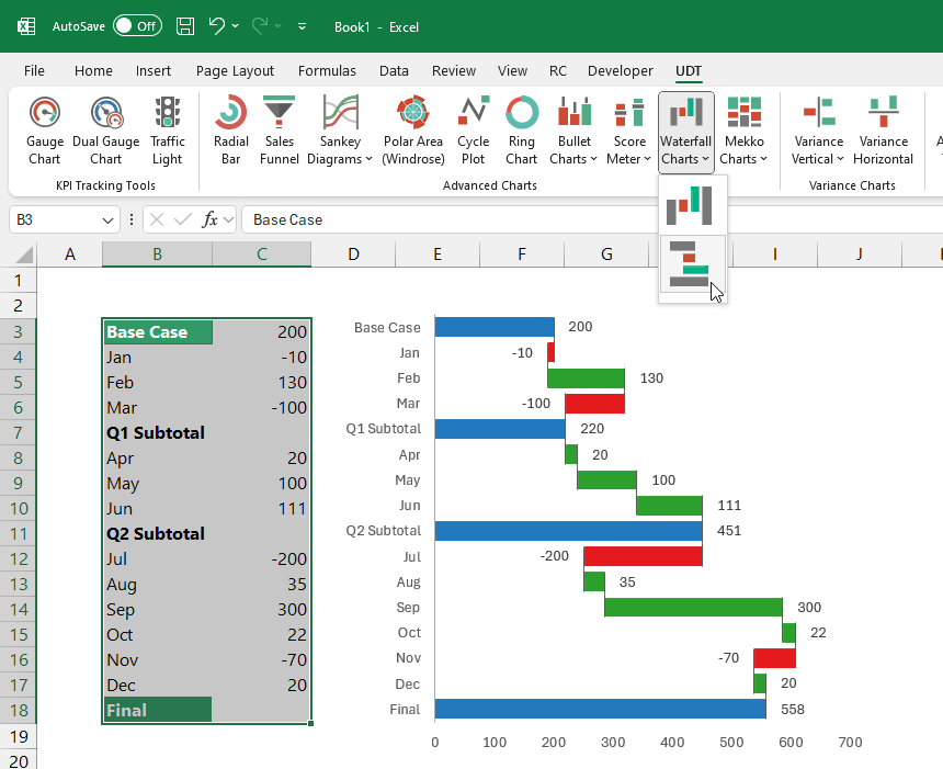
Waterfall Chart Add-in for Excel
If you have special requirements, use our advanced chart add-in. UDT fully supports the horizontal and vertical waterfall chart. You can build your bridge chart in seconds.
How do you insert a complex waterfall chart quickly without manual data entry? First, let’s see another example that uses multiple subtotals that we want to calculate using Excel.
- Select the range, then click on the UDT Tab.
- Next, select the Waterfall Chart icon, choose your style (horizontal or vertical), and click the icon.
- The add-in will calculate the subtotals, and you will get the result ASAP.
Great, isn’t it? The chart is compatible with Excel 2013 and newer versions.
Download the practice file, which contains both types of charts.
Conclusion
Waterfall charts are a dynamic tool in Excel’s visualization arsenal, offering nuanced insights into data that would be difficult to achieve with other chart types. Whether for financial analysis, project management, or operational review, waterfall charts provide a structured, clear, and impactful way to present data-driven stories.
Related articles: