Organizational Chart Template

The org chart template is nothing else than a snapshot of the organized corporate structure.
The org chart template is nothing else than a snapshot of the organized corporate structure.

We are using variance charts in everyday work in Excel. Comparing the planned value with the actual value is your goal if you are in sales.
The conditional color chart template is an interesting experiment for extending Excel toolbox.
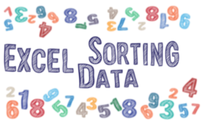
Excel Sorting Data Tips – With the help of Excel Sorting Data Tips we looking for solutions for very interesting problems today. How to sort dynamically a list containing two columns (‘Product’ and ‘Sales’ columns) at will only using excel functions? On the second worksheet we will show you a solution based on the on the fly sorting technique. It is well capable of give us help in creating an excel dashboard or other visualization tasks especially when available space is scarce.
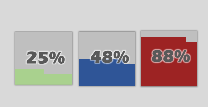
The Quick KPI Chart helps you to create small percentage graphs using conditonal formatting.
Our new chart utility is ready to use and works fine with Office 2013 a newer versions.
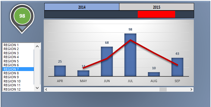
Dynamic charts are core elements of dashboards. In this tutorial, you will get great tips to build a timeline based data visualization. We have said many times that the best dashboards in Excel based on form controls. We love this topic because, in most cases, we have to transform large data sets into a small dashboard screen. At first glance, it is not an easy task.
Today’s goal is to create an interactive dashboard to track the key metrics. As first, place the initial data set. Above all, go to the Developer tab. Insert a blank list box. Fill the list box: right click on the control! Add the input range and the cell link. In the example, the input is the range that contains names.
Insert a column chart! Column charts are used to compare values across categories. Add a line chart. Under the trend options, choose the moving average. Finally, use two periods moving average.
We have collected some useful and most wanted excel macros that can help you daily without problems. In addition, Excel Dashboard School’s VBA macro collection contains very simple macros. See the code editor to understand Excel VBA logic and the core spreadsheet functions. We hate the manual data manipulations in excel so much. Most wanted VBA macro … Read more

The following excel job interview tips we have put together particularly for those who seek jobs. In the past 15 years we have written a few of them ourselves, there were more simple ones and complex ones also, we would like to share with you in this article the experiences about these interviews.
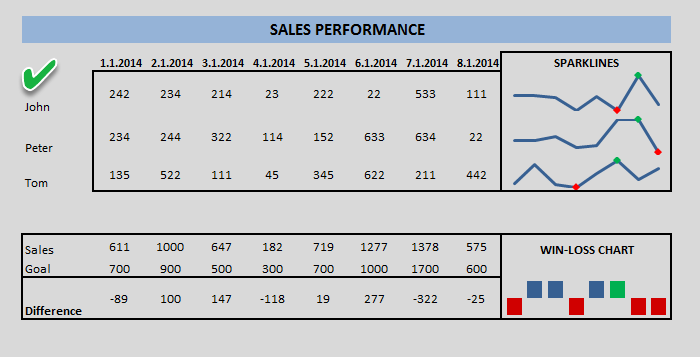
From Excel 2013, you can use a new chart type named sparklines. Sparkline is mini charts located in single cells. Each cell shows a series of data in your range. It helps bring meaning and context to numbers being reported. Select the data and insert chart!
This type of graph – compared with classic chart templates – is meant to be embedded into what they are reporting.
To create new styles, use the Design tab on the ribbon and customize your sparklines to match whatever visual style you need. If you find a space-saving method, use sparklines instead of charts.
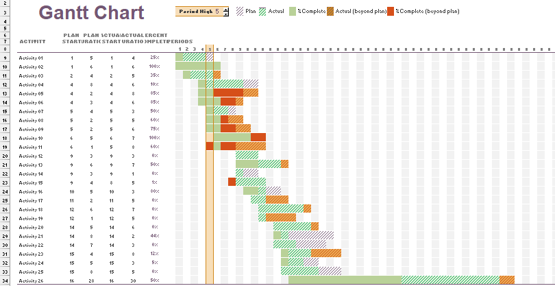
Gantt chart templates are useful tools for managing and scheduling projects in Excel. If you want to build a graph, you have two options. With a few steps, you can turn a simple bar chart into a Gantt Chart. In this case, Chart Formatting is important. As first, right-click on any of the bars on the chart to modify existing charts. Remove extra spaces between the graphs using the Gap Width. Another solution is based on conditional formatting. You can use different colors to highlight the task status.
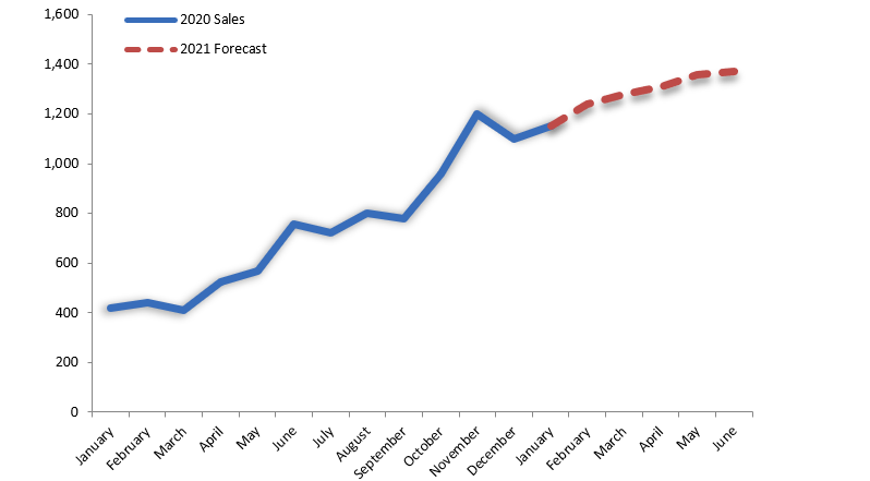
How to create a sales forecast chart in Excel? We need to show the actual value and the forecasted values on the same chart in some cases.