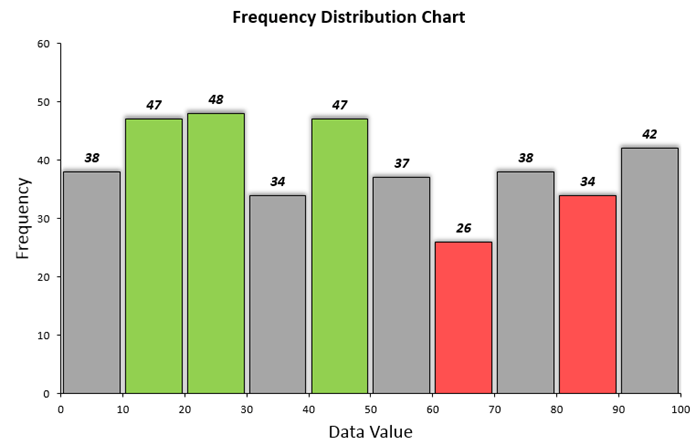
Percentile Rank Formula

percentile rank in excel classification

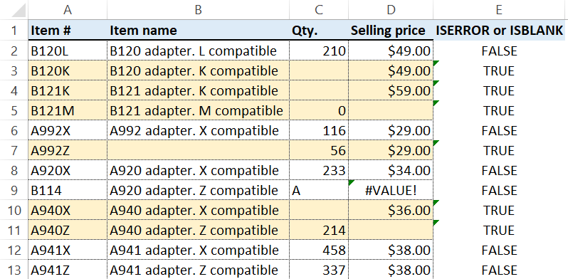
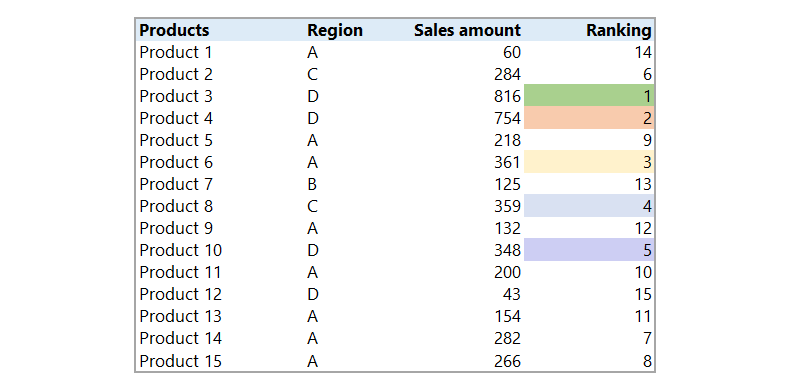
Learn how to use the percentile rank formula to classify data based on criteria. We use percentile ranks often in data analysis. Using this feature, we can check the target performance of the group as a whole. Highlight Data Based on Percentile rank The problem We have a list of 20 products with different sales. … Read more

Find errors in a range

find errors and blanks in a range excel

Learn how to find errors in a range using conditional formatting. We will apply a simple formula to identify missing or incorrect data.

Excel Add-in Ribbon Disappears

Excel Add-in Ribbon Disappears After Installation

A recent Microsoft Office update has caused add-in Ribbon Menu Bars to disappear when Excel is opened. This article explains the possible solutions to fix it.

How to install an Excel Add-in

how to install an excel add-in feat

Today’s article explains everything you need to know about how to install an excel add-in – or plugin, as it’s also known. We’ll show you what it is, why it’s important for Excel, how to install this type of Excel file. Read our step-by-step tutorial on how to install an Excel add-in quickly. Furthermore, download … Read more

How to Align and Group Shapes in Excel

align and group shapes

Discover how to align and group shapes in Excel! Learn how to use the ‘bring the front’ and the ‘send to back’ functions. Now that we have explained the role of the mockups in the dashboard design, it is time to talk about the realization. We should know about the mockups they’ve grouped vector objects, … Read more

Color ranking in Excel

color ranking excel

Learn how to use dynamic color ranking in Excel using conditional formatting and RANK function. In this article, we will discover how to apply the Rank function in Excel and where we need to use it in data. Use the RANK formula to return the ranking of any number in the data. Mostly we use … Read more

Dashboard UX Template

dashboard ux template

In this example, we’ll show you how to improve user experience using a dashboard UX template. The tutorial will show you how to create interactive screen tips in a few minutes. Furthermore, you’ll learn how to assign a VBA macro to a shape button and create interactive tips for your templates and reports.

Use the latest Microsoft 365 functions and apply icons to create impressive visualization. Make a clickable question mark icon to show or hide the contextual help easily. This feature can dramatically improve the user experience. Finally, in the last section, we’ll show you the best practices for managing large data sets and tables. Download our free dashboard template and check how to provide better support for users!

Create Heat Map in Excel

heat map

Use a heat map in Excel for rapid visualizations! We’ll show you various solutions to create heat maps and dynamic colored shapes. First, this tutorial will provide a detailed introduction the heat map optimization using Excel. Then, we will explain how to use advanced and straightforward solutions to improve the visual performance of your presentation. … Read more

Combine Multiple Workbooks

combine-multiple-workbooks-one

How to combine multiple workbooks into one worksheet? Our Excel data processing tools series continues! A short time ago we got acquainted with the Excel worksheet splitter that gave us a big help cutting up and grouping data tables.

SEO Analytics Dashboard

seo-analytics-dashboard-2019

SEO Analytics Dashboard Template – The aim of a good audit tool is telling a website owner whether their site meets the expectations of modern search engines. In other words, the main question is: Do we own a search engine friendly website?

The free template providing the owners with insights on how their website actually performs. What is SEO Analytics and how can we use it? Every website owner must (or at least should) rely on performance indicators when making decisions that help their site growing. The below table contains these indicators.

You can find the most important ones highlighted. These are the ones that provide us with the best insight on a site’s performance. The real challenge is transforming this data into easily comprehensible visuals.

Call Center Performance Template

call center template

Learn how to create a one-page template for tracking the actual status of key metrics. Furthermore, we will show you how to design a user friendly contextual help system using a VBA macro.

Before we start, we’ll introduce you the most used indicators in our detailed guide. Using these metrics, you can track and trace the overall service performance easily. In this lesson you will learn how to create and configure spin button in Excel and create a dynamic reoprts.

You can analyze weekly data by using the spin button to change periods. Our objective is to reduce the time to answer and abandon rate and increase the first call resolution.

Customer Analytics

customer analytics amp image

As you can see at first glance on the picture we’ve chosen an unusual arrangements and design, we have tried to use the opportunities provided by infographics which is wildly used these days. The customer analytics template is nothing else than a statement of customer habits from a relatively large excel data source.

Today’s article is an experiment on our part and its goal is to show a completely different free template from the already seen analyses. Another important standpoint is the well-chosen design. For example one that is different in its font can better the overall image. Check our free templates!

Convert Tabular Format into Excel Data Table

tabular format - 2

The Excel Table is relatively seldom used and underrated feature in Excel. But in today’s article we’ll show you the advantages of its use. It makes it easy for a user to manage data if it is in a tabular format. Just by converting a data range into a table its usage is even easier. After this little intro, let’s see the step by step tutorial!

Data Entry using UserForm and VBA

userform-data-entry-vba-intro

In today’s example we’ll introduce data entry with the help of the UserForm. Using UserForm can considerably improve the interaction with our users. Furthermore this way we can assist them to execute particular steps. They play a very important role in the automatization of Excel. In these days none of the business dashboards can be imagined without Form Controls. Let’s say a few words about today’s task. At times data entry can be very boring and by this can incline users to mistakes.

Show Developer Tab on the ribbon

show-developer-tab-ribbon-featured

How to show Developer tab on the Ribbon in Excel? This tab contains a lot of advanced features. We will show you how to enable it! The Developer tab can’t be found on the ribbon as a default. In today’s article we’ll show how can it be reached and what kind of functions it has. You wouldn’t even think how many things can be controlled by its use. Of its many advantages let’s see here some: we can launch macros, we can insert interactive controls. Thereby we give data visualization an effective support and can make our presentation more spectacular.

Bullet Chart in Excel

bullet chart graph excel

No one likes to work with useless reports. The Bullet Chart is one of the best usable chart types in Excel.

Drop-down list in Excel

drop-down list excel new

The Excel drop-down list is a great tool that belongs to the data validation group. Can be used almost all of the making of special dashboards or templates. Its main function is the limitation of data input, in a given cell we can only chose the elements of one fixed list. The drop-down list can be imagined like a little menu from where we can only chose the value that was previously specified. Just think about all the mistakes and errors we can avoid with the help of this method! There is no mistakenly entered name anymore, the specified list will not allow incorrect data entry.

Healthcare KPI Dashboard

healthcare kpi dashboard initial view

If you want to create an Excel dashboard using infographics, take a deep into our template! Today’s lesson will be about a custom business spreadsheet. Dynamic HR report is a part of our free excel template collection. This performance report is our first attempt to develop automated spreadsheet using male and female infographics parts.

We hope you will find this solution useful! Our goal is tracking and analyzing the most important healthcare quality information of human body. We’ll use an exclusive visual design and style which helps you to tracking the the overall performance.

Dynamic VBA Dashboard

dynamic vba dashboard feat

In this free example we will use sales data to create a scrolling chart using a simple macro.

Sales Dashboard

scrolling-dashboard-tutorial-featured

This tutorial will show you how to create a dynamic sales template in Excel. The dashboards use the OFFSET formula to create scrolling lists. This feature allows users to display a subset of a larger data table, such as displaying only five states.

The dashboard fits on a single page for simplicity and ease of use. We apply a slider (built-in form control) to scroll through data, saving space and focusing on essential data points; this benefits managers who need to grab information quickly. Colored markers indicate performance relative to expected achievements.

Frequency Distribution Table

frequency-distribution-table-feat01

Frequency Distribution Table – Create excel frequency distribution table in seconds with help of our free DataXL automation add-in! It is not a new thing that we want to give you better and smarter tools day by day. This is why we have created the website. The free Data Explorer add-in has again expanded with a great function! How can we make statistical analyzation even simpler? Read on, we are offering a very interesting Excel tutorial now! What is the Excel frequency distribution table? And how does it work?

Excel Formula Audit Tool

excel-formula-audit-feat

Our Excel Formula Audit tool is a part of free DataXL automation add-in. The Excel default formula audit tool caters only to the basic functions. If we work on large tables and many formulas then we have to find a much more effective solution. This is why we created the Excel formula audit add-in. We endeavored to keep the user experience in mind. The goal of the Excel productivity tool is to portray in visual format the connection between data. Please read through today’s lesson because you will become richer with useful information!

Split Excel Worksheet

split-excel-worksheet-featured

How to split Excel worksheet to separate workbooks or tabs? Our Excel data processing series continues with the introduction of a new Excel tool. We strongly believe that today’s presentation will bring data processing professionals again one step closer to success. The cleansing, merging and grouping of data frequently causes difficult moments but there is always effective solution! We don’t want to get cut up in clichés but time is scares and the workload is large! Keeping this in mind let’s start today’s lesson and by the end of the day it will be child’s play for you to handle large amount of data.

Scrolling Period Chart

scrolling chart

The scrolling period chart template helps you if you want to track a longer period and within it a highlighted period.

Product Metrics Dashboard

product metrics dashboard amp

How to create a dynamic product metrics template? It’s a crucial criteria in designing an Excel report that is should support valuable business decisions.
The interactive window on the right hand site is the most valuable part of the product metrics dashboard. For the chosen product we display the most important indicators on an interactive chart. We visualize the results for the marketing related to 15 different products.

Furthermore, we display trends and graphical elements so the report will be smarter. Sparklines is one of Excel’s most popular charts. It is excellent for displaying trends! For further details click here. We use the gauge chart here for the first time. We’ll learn a lot about that later!