Marimekko Chart
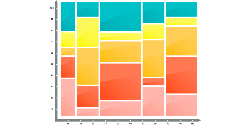
Today’s guide will explain how to create a Marimekko Chart in Excel 2007, 2010, 2013, 2016, 2019, and Microsoft 365 to display market segmentation maps using easy-to-understand visualization.
Today’s guide will explain how to create a Marimekko Chart in Excel 2007, 2010, 2013, 2016, 2019, and Microsoft 365 to display market segmentation maps using easy-to-understand visualization.
Use Excel Tables to simplify your work! Learn how to create dynamic ranges with easy-to-read formulas using tables.

Our definitive guide will show you 15 ways to clean data in Excel. Learn more about data cleansing through useful examples.
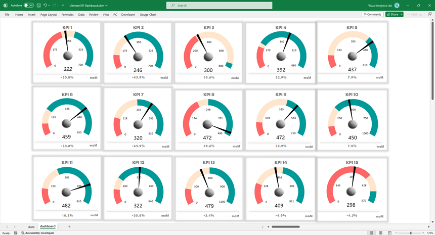
The Gauge Chart Add-in is a powerful tool for creating advanced Key Performance Indicator (KPI) dashboards in Excel.
To create stunning Excel Dashboard Templates you can easily use our free data visualization toool. The add-in enables users to create visually appealing dashboards quickly and efficiently.
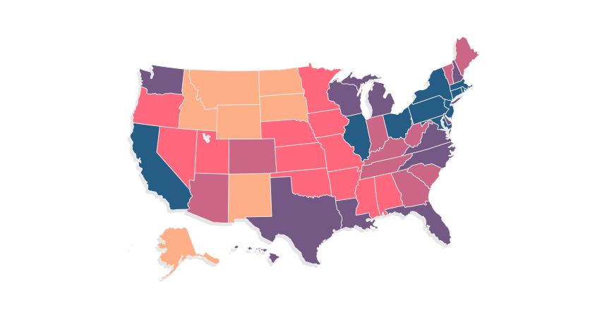
The tutorial provides a detailed guide on creating state map dashboard templates in Excel to visualize data. You can use geographical Excel maps as a multi-purpose analysis tool. The main dashboard template is divided into four parts: preparing shapes in Excel, creating data tables and textboxes, building a legend and defining color scales, and writing short VBA code.
The legend and color scale setup involves using statistical formulas to divide a range into groups for detailed visualization and using the PERCENTILE function to create categories.
We provide code snippets for customizing the maps, assigning colors to shapes, and refreshing maps based on data changes.
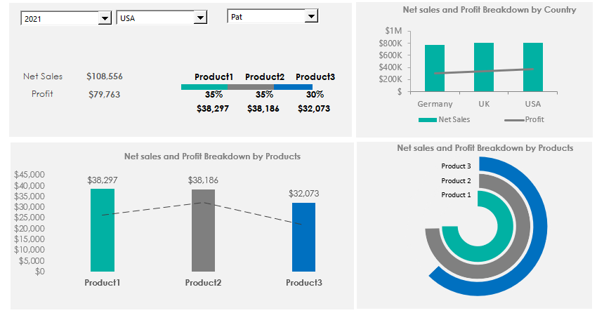
Learn how to create a Product Metrics Dashboard Template in Excel to track and monitor sales performance over different years, by region, and by sales representative. Take a closer look at the main metrics, like Net Sales and Profit, which aid decision-making. The template introduces form controls for analyzing large data sets, including drop-down lists allowing filtering data to display only the selected group.
Next, the dashboard ensures that all charts will automatically updated based on Year, Country, and SalesRep selections. A product-level breakdown compares Net Sales and Profit using column and dotted line charts for visualization.
Furthermore, a combo chart provides a country-level resolution, visualizing sales performance differences between countries.
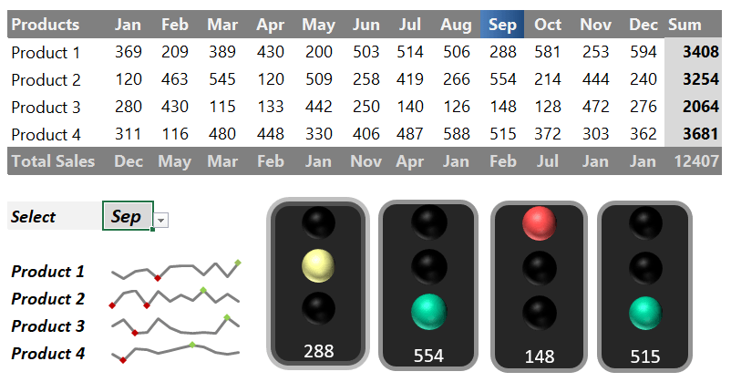
Using an Excel Traffic Light Dashboard Template can track your sales or project activity quickly and supports KPIs using stoplight indicators.
Use a Sales Tracking Dashboard Template to learn more about performance tracking in Excel. The following library contains useful examples, reports, charts, and maps. With its help, it is easy to set and track your key performance indicators and show them on a dashboard.
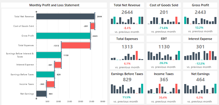
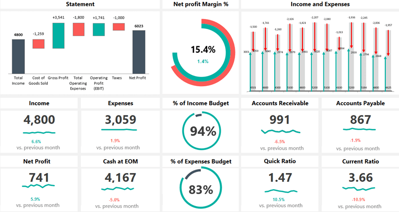
The Profit and Loss Statement Template is a great option for leaving boring reports behind. It is time to create a new type of visualization using a rotated Waterfall chart and sparklines. The spreadsheet supports the most common financial metrics and shows the result using a grid layout.
Tracking the main key performance indicators is not rocket science. You need to insert sparklines to show trends. You can highlight the highest and lowest months in the entire period using the built-in chart tool. To drill the data down, we are using a rotated waterfall chart. You can track the changes from the Total Net Revenue to the Net Earnings. We use conditional formatting and a drop-down list to make the dashboard template user-friendly.
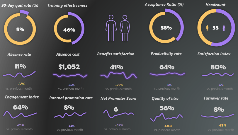
Discover our latest Human Resource KPI Dashboard Template! We built the spreadsheet in two versions: dark and light user interface. Using the template, you can track the most important key performance indicators in the HR department. Sometimes we should work on a small space; using cards combined with a modern grid layout is a good decision.
To track the performance month by month, we use conditionally formatted labels that clearly show the positive or negative changes regarding the selected KPI. To create a progress circle chart, combine two donut charts.
As usual, the template provides dynamic selection options through a drop-down list. If you want to take a closer look at the infographic-style dashboard, read the tutorial or download the free spreadsheets.
Discover our financial dashboard template! The spreadsheet will produce a one-page dynamic dashboard with a ribbon navigation control to switch between Worksheets easily. The template shows a month-by-month result using cards with growth comparisons. We show the trends using sparklines and apply a rotated waterfall chart to visualize the monthly profit and loss statement. The dashboard template supports a grid layout to show the main metrics and variance using a small space.
If you are using sparklines, you can highlight the lowest and highest data points without conditional formatting. The dashboard uses three core parts (metrics and groups): efficiency, liquidity, and profitability. The drop-down list ensures a dynamic view, and the template combines traditional financial information reports with charts of financial measures.

Excel dashboard widgets are valuable for several reasons. They make the dashboard more visually engaging. A well-designed gauge or score meter can draw attention to key metrics and make the data more accessible and interesting to users. A small widget provides a quick visual summary of data and allows users to measure whether performance is in a ‘good’, ‘average’, or ‘bad’ range. A well-designed widget is key for communicating performance against a target. Users can see how close the current value is to a goal or limit, making it easier to understand where attention is needed.
Interactive dashboards allow users to engage with the data, such as drilling down for more details. In summary, widgets and charts enhance data presentation and lead to more effective decision-making processes. You can download all demonstrated dashboard templates for free.

This article will explain how to build a well-designed Excel Dashboard template to show main activities and significant key performance indicators. This tutorial will explain using shape-based mockups to design a report layout. A well-designed prototype demonstrates the final wireframe for the given organization unit. Another advantage of a good dashboard design is that the activity can save time and cost for the company.
In Excel, we have various tools to build effective dashboard designs. You can use grouped shapes to create charts or table mockups. Furthermore, building and displaying form controls to show the drill-down options is worth using. Please take a closer look at our templates!

This guide will show how to create a Sankey Diagram in Excel. Use the UDT chart add-in to create stunning data visualization in seconds.
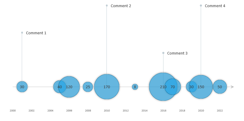
The timeline template uses a custom bubble chart, a great Excel visualization tool if you want to show data over time.
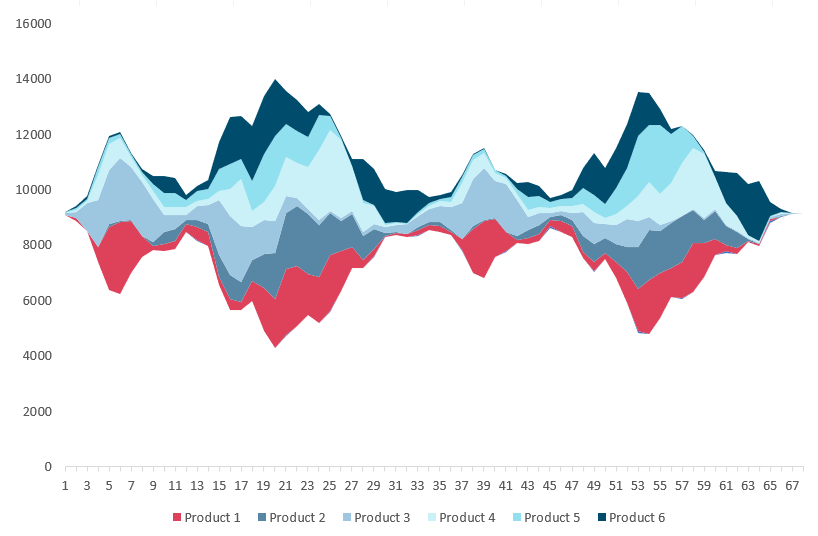
To visualize a huge amount of data, use the stream graph. The graph is based on a stacked area chart and represents the evolutions of numeric values.
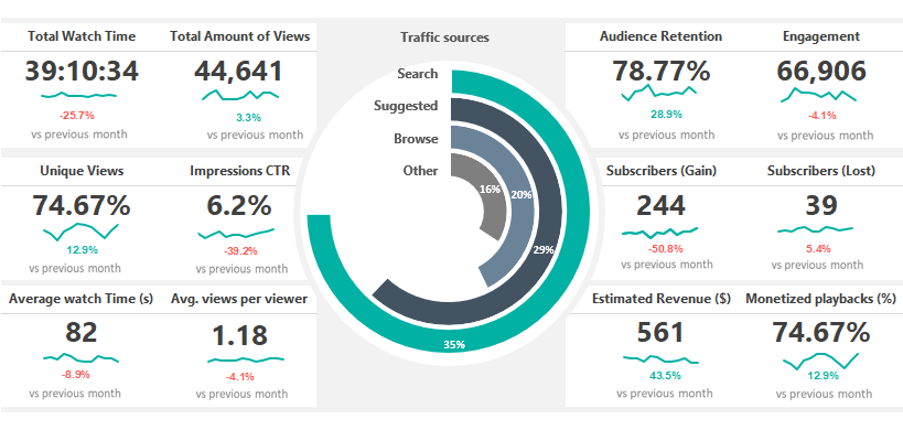
Download the free Social Media Dashboard Template! Youtube provides in-depth analytics on its native platforms. But again, many users need more details in Excel to analyze data using an easier way. It’s important to understand how all of these metrics work. It’s important to look at all your data in a single location.
Our report lets you stay on top of social media analytics from all your favorite channels. Just replace your initial data, and you can create various reports for Twitter, Pinterest, or Facebook analytics. Boost your productivity using ready-to-use solutions.
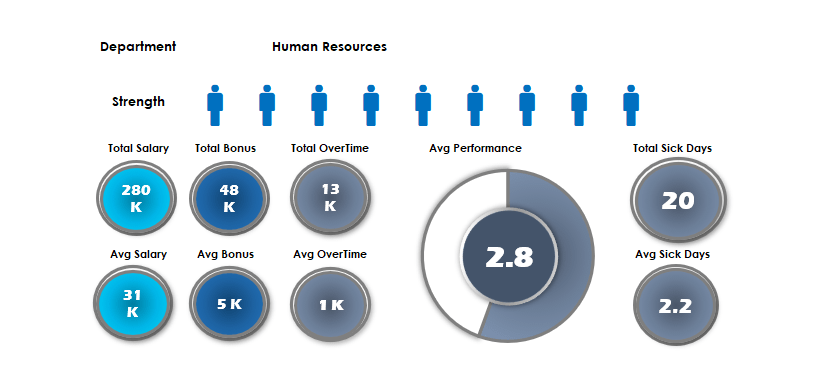
It is important to keep an eye on the HR resources of the company. In this article, we will show you how to use various methods to build a human resource dashboard. Furthermore, you can find and download two free ready-to-use templates. The first template provides a quick overview of six organizational departments. These are the following: Accounting, Administration, Customer Support, Finance, Human Resources, IT, Marketing, R&D, and Sales. Our goal is to track and display the most used HR key performance indicators: Total Salary, Total Bonus, Total Overtime, and Total Sick Days. Using the REPT function, we will build a custom people graph instead of using charts.
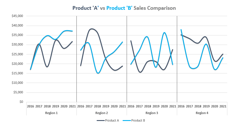
The second template uses a drop-down list and the linked picture method in Excel. We split the spreadsheet into two sections. The first part contains the drop-down list and the main data set. The second part shows a plan versus actual performance comparison based on the selection. We use multiple line charts to create a dynamic template.
In this guide, you’ll learn how to create a chart template using a cycle plot. The chart is great for comparison purposes.
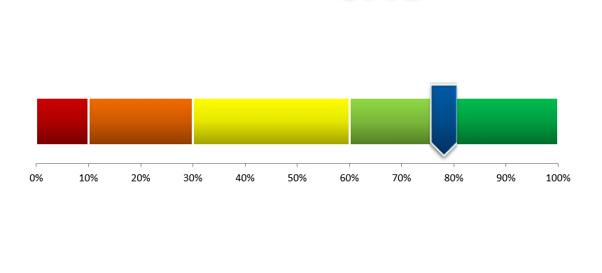
The score meter chart template is a smart chart that helps you to display values on a quality scale.

This quick guide will explain the best practices when working on a dashboard. To create an effective template, you should know the fundamentals. From the ground up, the first task is to plan how many indicators you want to use. After that, you have to pick the right chart that are fit the requirements. At this point, you need to clean up your data set. When it’s done, it is time to create a wireframe and pick the data sources since we need to feed the dashboard.
We have the final structure; it is time to implement your charts and widgets. An Excel Dashboard Template is a multipurpose tool: it should be simple and attention-grabbing. Finally, take a closer look at the compatibility. The spreadsheet has to work on different Microsoft Excel versions. So, read more and try to use the best practices to create a template.

The following dashboard example is a step-by-step tutorial. We will build a sales dashboard template in Excel that uses various tools, like conditional formatting and form controls. Furthermore, the sales spreadsheet provides sorting options and illustrates managing a large data set using a small space. It is a real challenge for all Excel users. Building a dynamic dashboard template is not rocket science.
Apply a custom formula based on the OFFSET and CHOOSE functions to retrieve the given position of the actual value. Then link the cell value to a vertical or horizontal slider. Under the hood, we will show you how to connect a simple macro to a picture. Using this method, you can dramatically improve your dashboard usability. As usual, you can download the template for free at the end of the article.
The following project dashboard template will show you how to build a dashboard using Excel form controls to manage a project. Our goal is to keep the information on a one-page dashboard. We use radio buttons to switch the view between Projects and Human Resources. Sliders play an important role if you want to show a larger period.
Insert a list box to switch the view between different periods, like day, month, and week. Conditional formatting enables you to create a heatmap-style visualization using different colors.
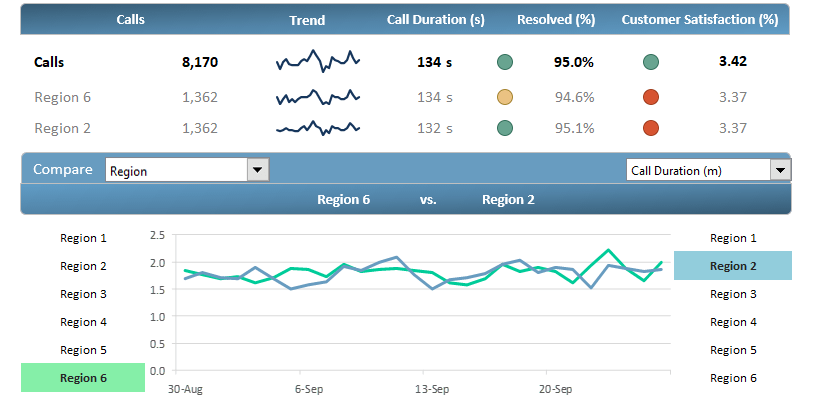
Customer service is a marketing field where we have to make quick decisions so we can intervene on time. Analyze your call center performance and trends using Customer Service Template!
First, we are using a drill-down method; you can transform your data into a custom view. It’s easy to display your custom query from overall branch performance to products and client categories. A further standpoint is to show the classified data in an easily understandable format.
We aim to improve the overall call center performance and take a snapshot of the plan vs. actual ratio for future improvements. We’ll track and measure the following metrics: Calls, Resolved Calls, and Customer Satisfaction.
For the sake of interest, we note that the free template can process a huge data set. In the report, there are data for more than 8000 outgoing calls!

Learn how to use the XLOOKUP function under Excel 2010, Excel 2013, or newer versions. Using a small trick, we keep the backward compatibility.
Improve user experience (UX) using the ribbon navigation menu. Learn how to create stunning navigation with minimal programming knowledge.