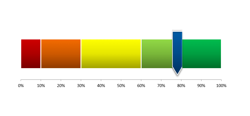
Gauge Chart

Learn how to create a Gauge Chart in Excel using a combo chart: a doughnut shows the zones, and the pie section indicates the actual value.
Excel Chart Templates offer valuable tools for creating engaging and informative data visualizations. These dynamic and interactive charts can enhance data storytelling and provide clear insights for decision-making. In this section, you’ll discover techniques and resources to help you craft visualizations that effectively communicate your data and capture your audience’s attention.
Learn how to create a Gauge Chart in Excel using a combo chart: a doughnut shows the zones, and the pie section indicates the actual value.
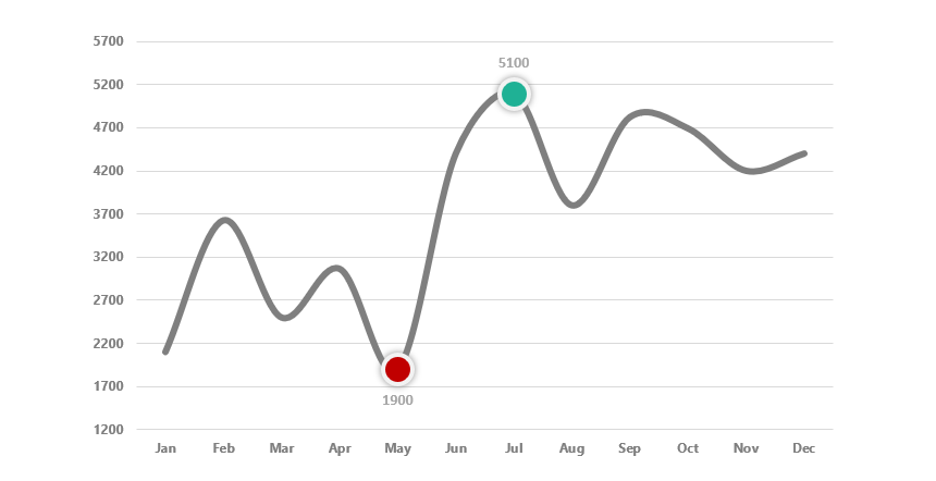
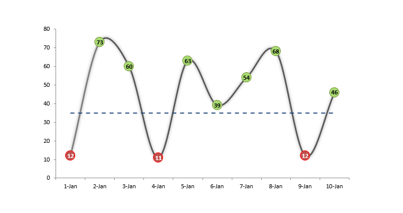
Learn how to highlight data points (high and low points) in an Excel chart using custom formulas and multiple chart series.

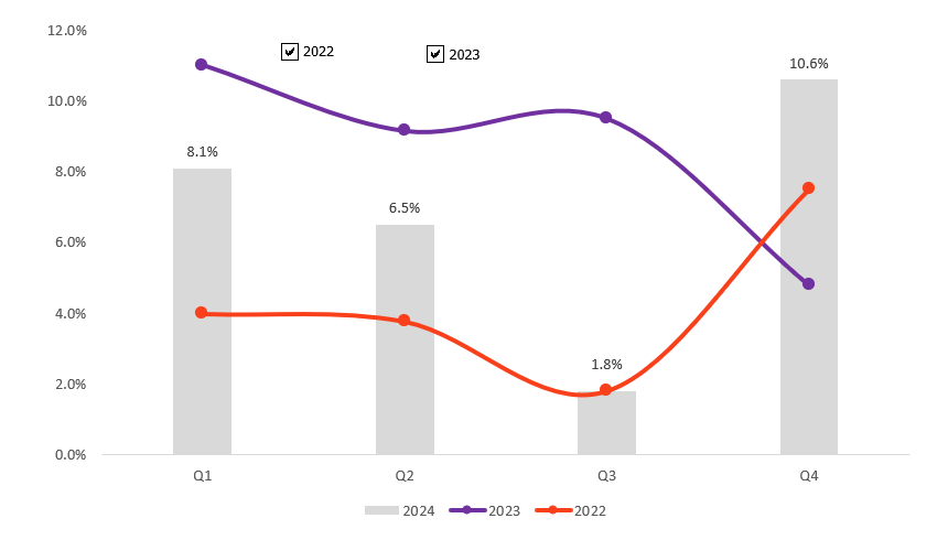
The plan-actual variance chart visually represents the monthly variances between planned and actual values throughout the year.

Learn how to create a multi-layer doughnut chart in Excel using advanced data visualization for dashboards and reports.

Learn how to create an Excel dumbbell chart (dot plot) to emphasize the change between two points across multiple categories.
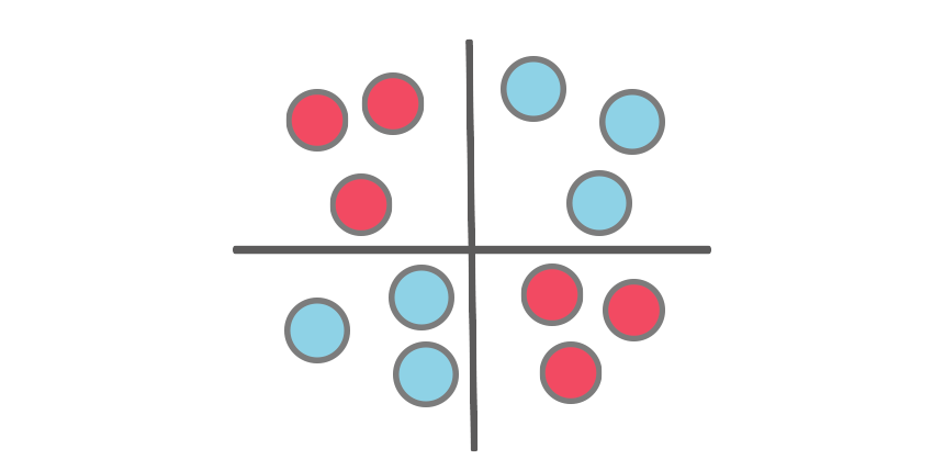
This step-by-step tutorial will show you how to create a Quadrant chart in Excel to support SWOT analysis. Based on your criteria, we use the Quadrant chart to split values into four equal (and distinct) quadrants.
Learn how to build a forecast chart in Excel! It is a custom combination chart with one column and two line charts.

This tutorial will show you how to create a radial bar chart in Excel using stunning visualization to compare sales performance.
Dynamic charts in Excel help us to improve the quality of data visualization by allowing users to update and interact with data.
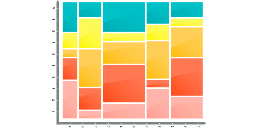
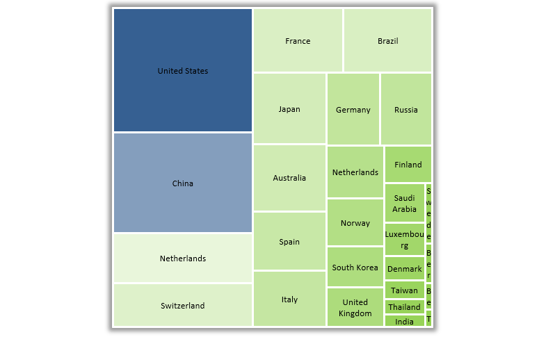
Today’s guide will explain how to create a Marimekko Chart in Excel 2007, 2010, 2013, 2016, 2019, and Microsoft 365 to display market segmentation maps using easy-to-understand visualization.
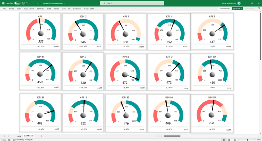
The Gauge Chart Add-in is a powerful tool for creating advanced Key Performance Indicator (KPI) dashboards in Excel.

This guide will show how to create a Sankey Diagram in Excel. Use the UDT chart add-in to create stunning data visualization in seconds.
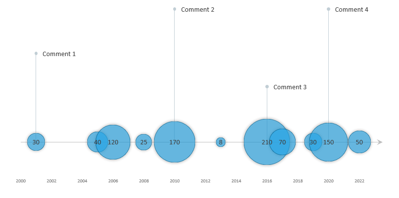
The timeline template uses a custom bubble chart, a great Excel visualization tool if you want to show data over time.
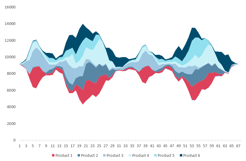
To visualize a huge amount of data, use the stream graph. The graph is based on a stacked area chart and represents the evolutions of numeric values.
In this guide, you’ll learn how to create a chart template using a cycle plot. The chart is great for comparison purposes.
The score meter chart template is a smart chart that helps you to display values on a quality scale.
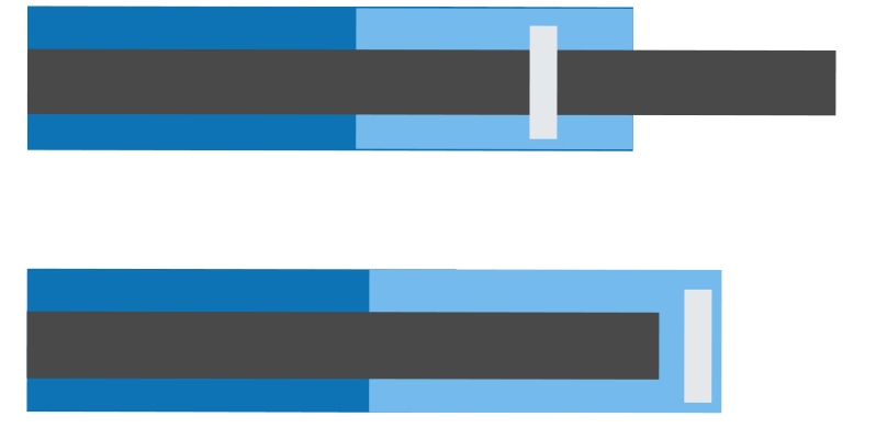
No one likes to work with useless reports. The Bullet Chart is one of the best usable chart types in Excel.
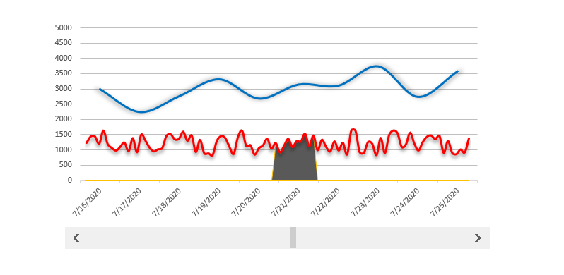
The scrolling period chart template helps you if you want to track a longer period and within it a highlighted period.

The org chart template is nothing else than a snapshot of the organized corporate structure.

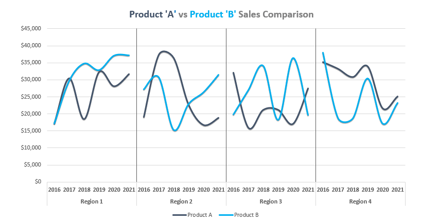
We are using variance charts in everyday work in Excel. Comparing the planned value with the actual value is your goal if you are in sales.
The conditional color chart template is an interesting experiment for extending Excel toolbox.
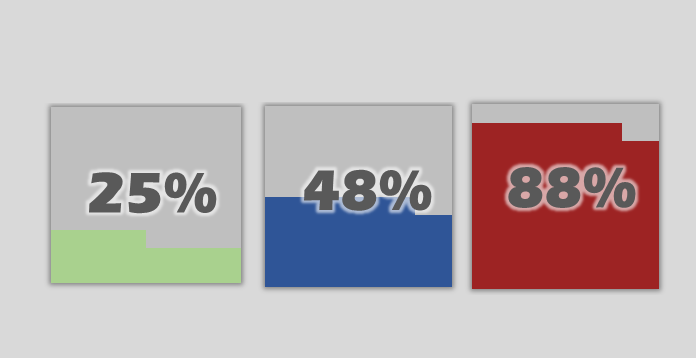
The Quick KPI Chart helps you to create small percentage graphs using conditonal formatting.
Our new chart utility is ready to use and works fine with Office 2013 a newer versions.